Tuesday, May 25, 2010

Proust's Madeleine

As a fan of fine literature and food, I was curious when I first ran across Edmund Levin's article for Slate "The Way the Cookie Crumbles: How much did Proust know about Madeleines?" 


In Remembrance of Things Past, the narrator tastes some crumbs from the bottom of his teacup and experiences a flood of childhood memories: 
"I raised to my lips a spoonful of the tea in which I had soaked a morsel of the cake. No sooner had the warm liquid mixed with the crumbs touched my palate than a shudder ran through me and I stopped, intent upon the extraordinary thing that was happening to me. An exquisite pleasure invaded my senses."
In his article, Levin argues that Proust pretty much made the whole thing up. A typical madeleine leaves no crumbs he argues, and worse yet, he claims that the crumbs have no taste. 

Like Proust's child narrator, I've loved madeleines since I was a kid. When I was a young girl growing up in Olympia, my mom would take me to Batdorf and Bronson after ballet or violin and I'd always have one of their delicious madeleines (I think I tried the cookies with pretty much every beverage there - but tea was the best). My mom and I would chat about art, music and all manner of delightfully grown-up topics while taking in the aroma of roasting coffee beans and thumbing through independent newspapers. Those are fabulous memories. 


At least I thought they were! 


For a moment after reading Levin's article, I questioned my childhood experiences. Were Proust and I both crazy? I knew I'd tasted those crumbs, but it had been a while. Surely this food writer must be right, and I wrong. There's no way he would have made this up...right? 


To see if I could replicate some childhood memories and have a "Proust moment" of my own, I sat down with Julia Child's recipe from The Way to Cook and the madeleine pan I received for Mother's day. I figure that if anyone could settle this once and for all, it was Julia. 


Here's Julia's recipe (more or less). 


2 large eggs, lightly beaten
2/3 c. sugar
1 c. flour + 1 T for preparing pans
5 oz. butter
pinch of salt
zest of 1 lemon
juice of 1/2 lemon
1/2 t. vanilla


Now, while I fiddle with Julia's ingredients a bit (she calls for "drops of lemon juice and vanilla" - whatever that means), I stick to her preparation guide fairly religiously: 
  • Preheat the oven to 375 degrees Fahrenheit. 
  • Measure 1/4 c. eggs into bowl. Beat in sugar and flour. Blend and allow to rest for 10 minutes. Madelines 015
Meanwhile: 
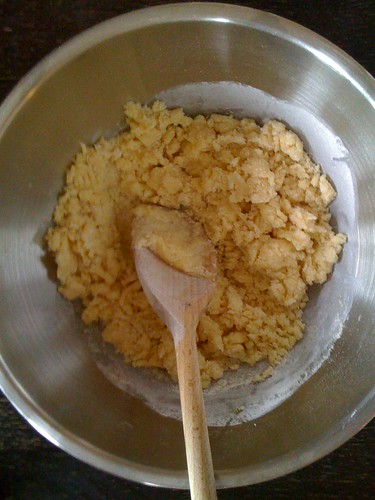
  • Melt butter in saucepan. Bring to a boil and let brown slightly (it should be a lovely caramel colour). Place 1 1/2 T. in a bowl and set aside (very important!)
  • Stir the rest of the butter over ice until cool but still liquid
  • Blend the cooled butter with the reserved 1/4 c. of the eggs into the butter with the salt, lemon juice, rind and vanillaMadelines 019
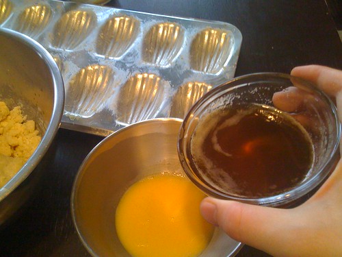
  • Mix remaining butter (1T) with the 1T of flour you have reserved, and use the mixture to prepare the madeleine pans. 
  • Divide batter into 24 lumps of 1 T each (okay, so I don't follow this part so religiously - measuring 1 T for each madeleine should do the trick)Madelines 010
  • Bake 13-15 minutes or until browned around the edges and a teensy bit on top!Madelines 005
I love this recipe. I put a fair bit of lemon juice in my madeleines. I like them that way - they smell positively divine when they come out of the oven! And Julia's trick of mixing the melted butter with the flour and using the mix to prep the pans is pure genius - there's never so much as a speck of batter left clinging to the pan. All you need to do afterwards is rinse the pans with warm water. Don't use any detergent - it's unnecessary, and can harm the seasoning of the pan. Also, don't buy a nonstick madeleine pan! It's a terrible waste - not only are most nonstick pans junk, but even the expensive ones won't allow your madeleines to brown properly.


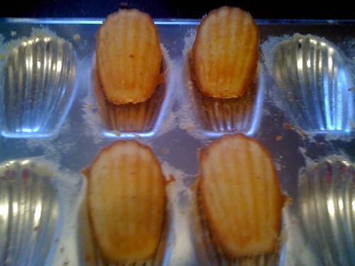
These delightful cookies are pure poetry, and will leave delightfully perfumed crumbs in the bottom of your teacup after dunking. Feel free to use your spoon to capture a few, a la Proust, when no-one's looking!


Now to the controversy. Levin extrapolates several things about Proust's madeleines from the text, all of which seem silly to me. Most importantly, he argues that Proust's madeleine would have needed to be very dry, in order produce such a quantity of crumbs. Now, this is plain nonsense. Has this guy ever dunked a donut? 


I could go on... but for now, I think I'll just enjoy my madeleines. 


Tuesday, May 18, 2010

Art and the iPad

Apple's iPad will be coming to Canada on May 28, and it is already making waves in the United States. Touted by Apple as "the best way to experience the web," the iPad is everything we've come to expect from Apple - sleek, sexy and designed to inspire envy. But what impact will the iPad have on the art world?

Digital artists are already excited about the art apps being offered for the iPad, which allow users to draw using either fingers or a stylus using any number of digital brushes. This enthusiasm is hardly surprising, given that last June an illustration done entirely on the iPhone using the iTunes Brushes app graced the cover of The New Yorker. The magazine's art editor, later told The New York Times he appreciated the fact that the cover didn't feel digital, and that the image was "free flowing...poetic and magical." The artist, Jorge Colombo, confessed that one of the biggest attractions of working in this medium was its low profile and portability, which permitted him to stand for over an hour on 42nd Street in Manhattan without being bothered by curious onlookers. Obviously, that would have been a rather more difficult task, if he'd been working on an easel! (or even with a sketchbook).


Of course, not everyone is thrilled. Performance artist Kenny Irwin of dOvtastic Microwave Theatre has already engaged artistically with the iPad - by microwaving it. Yup, there are some who feel that the best response to this new technology is to destroy it using less advanced technology (or perhaps I've missed the point - if there even is one).

But others are making more optimistic use of the iPad.  Claudio Arango of Bogotá, Colombia, has become the first known artist to conduct an exhibit of his artwork using the iPad.  

Below you can see a film of Arango demonstrating his art to passersby using the iPad:


On his blog, Arango states that his goal is for his artwork to be "móvil, remezclado, y libre" ("mobile, remixed and free"). It's a noble manifesto, and one that seems appropriate for art created on such exciting new technology. Of course, some will note that the people who encounter Arango on the street may be more interested in the iPad than what's on it. This is a valid point, but I am intrigued by Arango's art, and by his forward thinking approach. Arango does digital artwork, primarily female nudes, and he is highly tech-savvy (he blogs and is on flickr, twitter, YouTube, tumblr and Facebook). With more and more artists taking advantage of the sort of presence social media affords, it won't be long before technologies like the iPad are as important to artists as paintbrushes were in the past. The web has already become the primary medium in which people encounter art, how long before it becomes the principal tool for creating art? Of course, as an art blogger, I may be a bit biased, but when you consider today's architects and designers, most simply could not function without computer aided design, and artists are quickly joining the ranks of the technology- dependent. This may be disturbing to some, but then again, thousands of years ago, artists who painted on cave walls were making use of frightening new technology!

Now, I'm not sure if digital art is the future of art, but it will certainly be a key component of the art world of the future. And how could it not play a pivotal role? Representing yet another portable, web-friendly device, the iPad ensures that art will never be more than a click away. It will change the way an entire generation interacts with visual media. It's strange, but the iPad may very well be the first place my daughter creates her own art.

What do you think? What place does emerging technology like the iPad have in the art world, and how might it change the way we look at art? I'd love to hear your thoughts (and if you are an artist who is already brainstorming ways to take advantage of this new medium, or others like it, please join in!).

Thursday, May 6, 2010

Utopia Matters: from Brotherhoods to Bauhaus


From May 1 - July 25, 2010, the Guggenheim museum in Venice will be presenting "Utopia Matters: From Brotherhoods to Bauhaus." The exhibit is headed by Vivien Greene, who curates the 19th and early 20th century Art at the Guggenheim Museum in New York.

Utopia Matters will examine "the evolution of utopian ideas in modern Western artistic thought and practice" and features over 70 works of art drawn from the decorative arts, design, photography, paintings and sculpture.  A broad spectrum of historical Utopian art movements will be examined, including the Pre-Raphaelite Brotherhood, Primitivism, the German Nazarenes, William Morris and the Arts and Crafts movement, Neo-Impressionism, De Stijl, Bauhaus and Constructivism. The exhibit will end with works from the 1930s, when the Bauhaus was closed. 


If you haven't noticed (the title of this blog is pretty much a dead giveaway), I'm quite the fan of Utopian artistic movements, so this is one exhibit I would dearly love to see. I've always been fascinated by the intersection of art and idealism, and there are countless fascinating historical examples of artistic groups and individuals who have sought to improve life through art. 


Utopia Matters was first seen from January 22-April 11, 2010 at the Deutsche Guggenheim Berlin, so if you were lucky enough to attend that exhibit, be sure to leave a comment and let us know what you thought! I'm afraid a trip to Venice before July probably isn't in the cards for me, but I would love to hear what others have to say about their visits. 


Image is Piet Mondrian's Composition 10, courtesy Wikimedia. 

Wednesday, April 28, 2010

Marine Building, Vancouver

Last month my husband and I went to Vancouver with our daughter. We were only there for a few short days, but we had a wonderful time taking in the sights. Fortunately, the weather was fabulous, and we enjoyed walking around Stanley Park and the downtown area. We even made it for the final weekend of the  Olympic Winter Games, as you can see in the photo above (we actually didn't know that the Paralympic Games were still in progress when we arrived - it's sad they get so little press).

Although I'd spent lots of time in Vancouver back in my undergraduate days, it was quite a change to visit as a 'grown-up'! As a student, I spent most of my time in Vancouver shopping for bargains and eating crepes and pizza on the street (it felt sort of weird to go to sit-down restaurants). While we were planning our trip to the city, Javier asked me which places we should go to, and I couldn't really tell him anything! That's when I realized that even though I lived in Greater Vancouver for 5 years, I'd never really seen the city.


During a long walk through the downtown area, we passed by Vancouver's historic Marine Building. My husband and I kept commenting on how much the Art Deco style of the building reminded us of The Daily Planet from CW's Smallville. Of course, we later discovered that that's because it is The Daily Planet (on the TV show they make the building look taller via CGI and superimpose the Planet globe on top).


The Marine Building was completed in 1930 and is a beautiful example of Art Deco architecture. The building was designed by the Vancouver-based architecture firm of McCarter Nairne. John Y. McCarter (an engineer) and George C. Nairne (an architect) built two Art Deco skyscrapers for the city of Vancouver: the first was the Medical Dental Building, which was demolished in 1988, and the second was the Marine Building.

Interestingly, when the building opened, the city was in the throes of the Great Depression. Although the structure had cost over $2.3 million to build, it was sold to the Guinness family (yes, that Guinness family), for a mere $900,000. Such a deal!


My favourite feature of the building is the elaborate entrance, with its fabulous Art Deco details.


Below you can see the rest of the entrance (unfortunately I couldn't get the whole thing with my iPhone, so I had to take two separate shots!). Take a close look at those angelic winged creatures: they're Canadian Geese! I don't think I've ever seen Canadian Geese looking so regal.


 It is certainly one of the prettiest buildings in downtown Vancouver, and I'm amazed I'd never visited it before. Now I really want to take a peek inside. I guess I'll have to wait till next time!

Tuesday, April 20, 2010

Modern Wallpaper


Wallpaper has been going through a huge resurgence in recent years, thanks in part to high-profile fans like designers like Colin McAllister and Justin Ryan of HGTV Canada's Home Heist.

While wallpaper went through a period of disfavor - thanks to tacky borders, dull patterns and an abscence of color - it has regained popularity for two reasons: wallpaper adds instant life to a room and it also helps unite a color scheme. In this day and age, few of us hire professional decorators. Wallpaper does much of the difficult work for you. You simply choose an attractive pattern, and then pull colors from the design to use in decorating the surrounding space. As an added plus, more and more companies have been designing contemporary patterns.

Still, even with fabulous modern papers, you'd be wise not to overdo it. William Morris, one of the most prolific wallpaper designers of all time, preferred simple whitewashed walls to wall coverings, and used wallpaper sparingly in his own homes. In this, as in most cases, less is more.

One big no-no (if you are looking for a more modern, streamlined look) is ornate borders. Borders look lovely when you are looking through wallpaper sample books, but they are largely unnecessary, especially if you have wainscotting. In fact, I would argue that, unless you are doing an historical reproduction, its best to forgo borders altogether.

I think William Morris would appreciate the "accent wall" approach to wallpaper. Use decorative papers on one wall to highlight it, and keep the rest of the room simple. I love looking at wallpaper, but entire areas covered in patterns can make me feel a little dizzy. Having an accent wall also makes it a lot easier to remove wallpaper in case you tire of it.

Another thing I like about the modern approach to wallpaper is that many designers are taking advantage of the brilliant new colours that are being used in decoration today. One company that has been taking traditional floral designs and giving them a new lease on life is Flavor Paper. I love their designs! This is not your grandmothers wallpaper. I first ran across Flavor Paper a few months ago on the William Morris Fan Club blog. The design featured below is called "Party Girl." I love the way it has been paired with the modish Eero Saarinen Tulip table and chair:


Flavor Paper is hand printed, which makes customization much easier for them. Their website advertises that the the ink colors from all their patterns are interchangeable, and that designs can be printed on any stock grounds without additional fees. Of course, the initial price tag is rather hefty, with designs starting at $150 a roll, although trade discounts are available.

Another company that has adapted well to changing times is Sanderson and its sister company, Harlequin Harris. Sanderson's PomPom collection, designed by Maggie Levien, is both beautiful and relevant. This photo from the Sanderson website (below), illustrates a modern approach to using wallpaper. You can see how the designer has pulled the colours from the wallpaper and used them to decorate the room. Also, I love what they have done with the mounted panels of wallpaper. It makes the paper look more like art, and less like traditional wallpaper. A nice trick for an accent wall, especially since great wallpaper can be rather pricey!


Images courtesy Sanderson and Flavor Paper.

Friday, April 16, 2010

Edmonton Arena District

I'm a huge believer in mixed use development in urban centers. My husband and I live in Central Edmonton and we love being able to take advantage of proximity to work, shops, and the beautiful river valley. As a result, I'm very excited about the proposed Edmonton Arena District, a mixed development project that includes a new arena for the Edmonton Oilers, plus residential housing, a community rink, a new casino, retail space and a winter garden. The project is being led by the Katz Group.

The video below features Daryl Katz, owner of the Edmonton Oilers and chairman of the Katz Group. It's a very frank discussion of why a project like the Arena District is of vital importance in attracting investment to the city:


Mr. Katz has announced his intention to contribute $100 million to the project, but I immediately noticed that a lot of the comments on YouTube suggest Mr. Katz ought to pay for the entire arena himself. This sentiment is echoed on Edmonton City Councillor Don Iveson's blog, where Iveson contends that the city shouldn't have to borrow the $400 million needed to finance the project. This sort of attitude always seems to be on display when a business person suggests a project that would improve life in the city.

I'm originally from Washington State, and I still remember the public outcry over billionaire philanthropist Paul Allen's proposal to construct the Qwest arena. There were dozens of letters written to local papers complaining that Allen should pay for the arena himself, rather than "leaving taxpayers with the bill." Of course, today most people will recognize that Mr. Allen's work in Seattle has helped to ensure its continued status as a world class city.

Of course, it's not just the cost of the project that has some Edmontonians concerned. The project has been criticized by Edmonton architect Barry Johns, who is concerned about the proposed location of the Arena District and LRT (light rail transit) access. I absolutely understand his reservations. Currently, the area that can be described as the "core" of downtown Edmonton is just a few blocks in diameter, and the proposed building site for the arena is a few blocks away. Also, the LRT does not currently run to the proposed site.

I think the hurdles Johns mentions can be easily overcome, however. While I strongly feel that approval of the development should be contingent on the addition of the LRT station, I am much less concerned about the notion of "extending" the downtown area, because, after all, that is the entire aim of the project!

The debate surrounding who should pay for the Arena District reminds me of the classic children's tale, "The Little Red Hen." I'm sure you will recall this story from your childhood. In it, the Little Red Hen finds a grain of wheat and has the idea of planting it and using the wheat to make bread. She asks the other farm animals to help her at each stage of production (planting, harvesting, milling, baking), but no-one offers. Of course, in the end, they all want to help eat the bread. City development projects always seem to work that way. People grumble about the cost, but in the end, they don't seem to have a problem using the services they didn't want to pay for.

Edmonton has the potential of being a world class city, but this will take genuine commitment on the part of the city government, private citizens and businesses. The Edmonton Arena District is a fabulous idea that will  beautify our city and help combat urban sprawl. Edmonton desperately needs some world class architecture to set the city apart and to attract people and investment. The completion of the Alberta Art Gallery this winter was a great start, but we need to build on the momentum that is being created if Edmonton is going to be able to compete with cities like Calgary for investment dollars.

For more information, please visit the Edmonton Arena District website.

Friday, April 9, 2010

Roger Scruton - Why Beauty Matters

Last year, philosopher Roger Scruton's did a televised essay for BBC Two entitled "Why Beauty Matters." In the program, Scruton lays waste to contemporary and modern art and architecture and the value system behind it. He argues that humans need beauty, that modern art is not beautiful and that a hasty return to classic aesthetic values is necessary if we are to save Western Civilization from perishing in a spiritual desert of ugliness.


In his documentary, Scruton uses extreme examples of shocking conceptual art, such as Sarah Lucas, Tracey Emin and Gilbert and George, to prove that modern art is ugly. He then goes on to blame their prominence in the art world on (among other things) democracy, popular culture and modernism (this seems faintly ridiculous, because, while there are a number of words one might choose to describe the work of Emin and her contemporaries, "popular" is not among them).

Scruton takes no prisoners in his critique of the aesthetic values of the modern world. And while he heaps plenty of contempt on contemporary art, he saves his most devastating critique for modern architecture, which he labels as "the greatest crime against beauty that the world has yet seen." He sneers at the phrase "form follows function," arguing that buildings created with an emphasis on utility soon become useless. He supports this statement with a walking tour of the graffiti covered modernist architecture. Scruton grew up near Reading, which once was "a charming Victorian town with terraced streets and Gothic churches." According to Scruton's account, the once-beautiful city was effectively defaced by the addition of some ugly modern buildings in the 1960s. He goes on to point to an abandoned building and remarks that it has been left empty because it is "damned ugly." I realize he is trying to prove a point, but isn't possible that there are some economic factors involved here as well?

I received an interesting email from my grandfather the other day showing photos of Hiroshima today (a vibrant, bustling city filled with optimistic modern architecture) and comparing them to pictures of Detroit, with its dilapidated turn-of-the-century architecture. Below is an image from a new book entitled The Ruins of Detroit, by Yves Marchand and Romain Meffre. You can see how this photo captures the disintegration of the once beautiful Lee Plaza Hotel. How would Scruton account for this?

Detroit Devastation,Yves Marchand,Romain
Meffre

Of course, contrary to Scruton’s assertions, traditional architecture cannot prevent a building from eventually falling prey to the harsh realities of an economic collapse.

Most conceptual art is not beautiful, and I completely understand Scruton's disappointment with it. The shock value has worn off, and most of it has become rather dull.  However, I feel he is mistaken in pointing to popular culture as the bogeyman in all of this. Democracy and popular culture are not the enemies of true art. Ludditism is. 

Hear me out. Critics and philosophers like Scruton feel threatened by the modern age, because their opinion no longer carries the weight it once did. Today, people look to numerous sources for critical input. In the past, you might have gone to traditional media, like the newspaper, to find out what people were saying about an art show. Nowadays you might be just as likely to discuss art via blogs, online forums and social networks like Facebook and Twitter.

Similarly, just as we now have multiple avenues from which to access critical discourse, we also have more access to art and images than at any time in human history. For centuries, the only art you probably would have ever seen (aside from the handcrafted objects in your home), would have been at your place of worship (and over the last few centuries, in newsprint and on public buildings).

As a result of the explosion of access to art, contemporary artists like Damien Hirst are likewise threatened by the digital age. Face it, not many people are willing to pay to see flies swarming around a cow’s head, as in Hirst’s work A Thousand Years. Consequently, conceptual artists rely heavily on critics, wealthy patrons and government funding in order to stay afloat. And they are very much dependent on the shock value of their work, because it attracts much needed press and keeps warm bodies heading to the galleries, if only out of morbid curiosity.

I believe the reason groups like the Young British Artists are compelled to create shocking art is that they are stuck in the past and committed to an unholy alliance with art critics. This marriage was created for the purpose of telling the public what they should and shouldn’t like, and as a means of artificially preserving the notion of elite tastes. But today, due to (among other things) the rise of technology, capitalism and social networks, the public today has little need for close-minded critics and self-marginalizing art. As a result, all that is left for critics is to praise the most counterintuitive art possible, in the hopes of preserving the scarcity of what can be considered “high art” (and thereby increasing its value). Honestly, how would you know that “A Light Going on and Off” was art, unless an Art Critic told you? You probably wouldn’t, so it’s a great way for outmoded tastemakers to hang onto their jobs.

Popular art, in the form of modern industrial design and commercial art, is one of the greatest threats to groups like the Young British Artists. And this is a good thing. As human beings, we are hard-wired to appreciate symmetry, bright, attractive colors and pleasant lines. And industrial designers and the corporations behind them are eager to offer us what we want. Computer aided design and modern production techniques have made beautiful, useful objects more accessible than ever before. All we need to do as consumers is to demand a more beautiful world.

For centuries, critics have felt they are intercessors for the people, giving them access to beauty. But technology has changed this dynamic forever. The people are no longer required to worship beauty through the intercessory magic of the artist and intellectual. We are living in a new era, where works by talented (and commercially successful) artists like Dale Chihuly are widely available and wildly popular. Chihuly’s public installations give the people exactly what they want: beautiful objects that invite contemplation and pure enjoyment.  

Dale Chihuly,Glass

Finally, I would like to say that Scruton's aim is admirable, and I respect what he is attempting to do in the film. Nevertheless, I take exception to his implied assertion that modern=ugly. Admittedly, examples of ugly modern and contemporary art abound. But the existence of ugly art does not mean artists need to return to traditional art or architecture. Artists today need to embrace democracy and the digital age and chart a new way forward. 

Many thanks to Grace at The Beautiful Necessity introducing me to Scruton’s essay!

For more of the fabulous photos by Marchand and Meffre, please visit their website

Photo of installation of Dale Chihuly's work courtesy Wikimedia Commons.