
I'm a huge believer in mixed use development in urban centers. My husband and I live in Central Edmonton and we love being able to take advantage of proximity to work, shops, and the beautiful river valley. As a result, I'm very excited about the proposed Edmonton Arena District, a mixed development project that includes a new arena for the Edmonton Oilers, plus residential housing, a community rink, a new casino, retail space and a winter garden. The project is being led by the Katz Group.
The video below features Daryl Katz, owner of the Edmonton Oilers and chairman of the Katz Group. It's a very frank discussion of why a project like the Arena District is of vital importance in attracting investment to the city:
Mr. Katz has announced his intention to contribute $100 million to the project, but I immediately noticed that a lot of the comments on YouTube suggest Mr. Katz ought to pay for the entire arena himself. This sentiment is echoed on Edmonton City Councillor Don Iveson's blog, where Iveson contends that the city shouldn't have to borrow the $400 million needed to finance the project. This sort of attitude always seems to be on display when a business person suggests a project that would improve life in the city.
I'm originally from Washington State, and I still remember the public outcry over billionaire philanthropist Paul Allen's proposal to construct the Qwest arena. There were dozens of letters written to local papers complaining that Allen should pay for the arena himself, rather than "leaving taxpayers with the bill." Of course, today most people will recognize that Mr. Allen's work in Seattle has helped to ensure its continued status as a world class city.
Of course, it's not just the cost of the project that has some Edmontonians concerned. The project has been criticized by Edmonton architect Barry Johns, who is concerned about the proposed location of the Arena District and LRT (light rail transit) access. I absolutely understand his reservations. Currently, the area that can be described as the "core" of downtown Edmonton is just a few blocks in diameter, and the proposed building site for the arena is a few blocks away. Also, the LRT does not currently run to the proposed site.
I think the hurdles Johns mentions can be easily overcome, however. While I strongly feel that approval of the development should be contingent on the addition of the LRT station, I am much less concerned about the notion of "extending" the downtown area, because, after all, that is the entire aim of the project!
The debate surrounding who should pay for the Arena District reminds me of the classic children's tale, "The Little Red Hen." I'm sure you will recall this story from your childhood. In it, the Little Red Hen finds a grain of wheat and has the idea of planting it and using the wheat to make bread. She asks the other farm animals to help her at each stage of production (planting, harvesting, milling, baking), but no-one offers. Of course, in the end, they all want to help eat the bread. City development projects always seem to work that way. People grumble about the cost, but in the end, they don't seem to have a problem using the services they didn't want to pay for.
Edmonton has the potential of being a world class city, but this will take genuine commitment on the part of the city government, private citizens and businesses. The Edmonton Arena District is a fabulous idea that will beautify our city and help combat urban sprawl. Edmonton desperately needs some world class architecture to set the city apart and to attract people and investment. The completion of the Alberta Art Gallery this winter was a great start, but we need to build on the momentum that is being created if Edmonton is going to be able to compete with cities like Calgary for investment dollars.
For more information, please visit the Edmonton Arena District website.
Friday, April 16, 2010
Edmonton Arena District


Friday, April 9, 2010
Roger Scruton - Why Beauty Matters


Friday, April 2, 2010
Anish Kapoor's Orbit - English Eiffel Tower?
Anish Kapoor's design for the London Orbit Tower, intended to be the dominating structure of the London 2012 Olympic Games, was unveiled earlier this week.
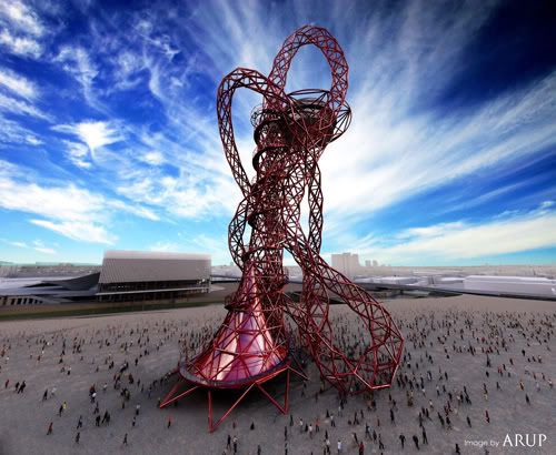
When completed, the structure will stand over 115 meters tall - 22 meters higher than the Statue of Liberty, 19 meters higher than Big Ben, and considerably shy of the Eiffel Tower - the 340 meter high building to which the Orbit is already drawing comparisons.
Kapoor has created numerous well-known sculptures, including Chicago's Cloud Gate. Explaining his inspiration for the design, Kapoor remarked in an interview with the BBC that he wanted to "look again at the whole idea of a tower" replacing its traditional Cartesian lines with something more orbital, with a "flowing, coiling form". Moreover, he hopes "to create a sensation of a certain kind of instability' for the viewer.”
Mr. Kapoor, who admittedly has all the humility of Howard Roark, confesses that he makes art to please himself, although he has a viewer in mind. While statements like this have led some art critics to dismiss him as an egoist, I appreciate his honesty. Genuine humility would make innovation impossible. It requires a great deal of confidence to see one's work come to fruition, and I don't really see the point in artists pretending that their work is for the people. In fact, which is more arrogant: admitting that your work pleases you, or proudly asserting that it is meant please others?
For this reason, the Orbit/Eiffel Tower comparison actually works on a certain level. Much like the Orbit, the Eiffel Tower was an unapologetically modern structure that utilized revolutionary techniques in building construction. It was the tallest building in the world for 41 years, until the Chrysler building was completed in 1930. The Orbit does not attempt to compete with the Eiffel Tower in height (which would be rather pointless, since there many tall buildings). Nor does it have the concern with utility that dominated Gustave Eiffel’s work. Instead, Mr. Kapoor seems to feel that the next frontier in construction lies in manipulating the conceptual framework of structures like the tower. His plan for the Orbit puts a tremendous strain on the engineers involved, demanding a building that looks like it might topple over, but doesn't! Kapoor hopes that the innovations he has made in the Orbit's design will make it "truly 21st century."
The Orbit seems based on a visual conception of the relationship between man’s achievements and his limitations. The "leaning tower" can easily be interpreted to represent the instability of modern man. This is emphasized by the sinuous coils of the structure, which call to mind the tenuously twisted spirals of the DNA’s double helix. Of course, the entire structure appears to be on the verge of either collapse or ascent.
My biggest reservation about the project is its full name: the ArcelorMittal Orbit; so named after ArcelorMittal, the company which will be donating the structural steel required to complete the project (perhaps explaining the choice of building material?). I'm a bit disappointed with the red portion of the tower, which appears to be painted steel. How often the tower will need to be repainted? The Eiffel Tower was constructed out of cast iron, and has to be repainted every seven years to prevent corrosion (it takes about 60 tonnes of paint each time). Contemporary construction projects should be made greener by utilizing new materials that are more resistant to corrosion.
So, will the ArcelorMittal Orbit be London's landmark for the 21st century? I'm reserving judgement. People thought the Eiffel Tower was an eyesore when it first opened, so I know better than to criticize the Orbit based on its looks! That said, does the design have staying power? My answer would be yes, because I think that, upon completion, it will be the most prominent example of an honest contemporary architecture that at once embraces the technologies of the 21st century, while calling attention to a dominating sense of uncertainty about the future and our place within it.
Friday, March 26, 2010
Christopher Dresser: Industrial Design Pioneer
Considered by some to be the first industrial designer, Christopher Dresser (1834-1904) was a contemporary of William Morris and is best known for popularizing Japanese minimalism in the West. A designer who had also been trained as a botanist, Dresser was drawn to the simplicity and natural inspiration of Japanese design. Like Morris, Dresser was dissatisfied with the excessive ornamentation used in Victorian design. However, when it came to applying technology to design, Dresser and Morris parted ways.
As you may recall, Morris was highly suspect of any sort of technology that removed production from the hands of the craftsman. While Morris' low-tech approach can be considered more romantic by some, it is interesting to note that Morris himself struggled with the necessarily high price of his designs. It was not until companies like Liberty began mass producing Morris' work that it became affordable to the general public. Dresser, on the other, saw that technology would play a crucial role in design. His dedication to industrial production methods made his work more accessible and affordable.

In addition to his brilliant industrial design work, Dresser was an early champion of the notion of neutral backgrounds in interior design. After his tour of Japan, Dresser became convinced that walls and flooring should be done in neutral tones, and that bright splashes of colour should be reserved for accessories and accent pieces (Rompilla, 52).
A true innovator, Dresser's designs still seem fresh and new today. His design mantras, like "maximum effect with minimum means" continue to inspire contemporary industrial designers. Today, one of Dresser's philosophies--that design should address current needs with cutting-edge technologies--is more relevant than ever. It's surprising, then, that (unlike Morris) Dresser is not particularly well known outside of design circles. Nevertheless, his work is worth revisiting, and I hope that museums will take note! It would be wonderful to see an exhibit of his designs. Please contact me if you know of one in the works!
Photo courtesy http://designmuseum.org/design/christopher-dresser/. Please visit their website for more information, and for many more photographs of Dresser's work.
See also: Ethel Rompilla, Color for Interior Design (New York: Harry N. Abrams, Inc., 2005).
Friday, March 19, 2010
Decorating and the Death of Ivan Ilych

Looking at the yet unfinished drawing room he could see the fireplace, the screen, the what-not, the little chairs dotted here and there, the dishes and plates on the walls, and the bronzes, as they would be when everything was in place.--The Death of Ivan Ilyich
Friday, March 12, 2010
Julia Child's Beurre Blanc
For the past few months, I've been a little more obsessed than usual about cooking. It started when my husband and I went to go see Julie and Julia a little while before the baby was born. We both loved the movie, and it inspired me to be a little more adventurous in the kitchen.
I've always loved to cook, but I've historically been rather timid when it comes to sauces. I tended to make a very good, but very safe, bechamel (and its variations) over and over again. This has changed! I have discovered that sauces are really quite simple, and so I've been charting new territory (for me) in the sauce department.
As part of my culinary inspiration, I've been reading Julia Child's My Life in France (even better than the movie!). If that book doesn't make you want to cook (or at least eat) really well, nothing will!
Sauce Beurre Blanc
1/4 cup white-wine vinegar
1/4 cup dry white wine or dry white vermouth ( I used a Sauvignon Blanc)
1 tablespoon finely minced shallots or scallions
Salt and freshly ground white pepper
8 to 12 ounces [1 to 1 1/2 cups, or 2 to 3 sticks]
chilled best-quality unsalted butter, cut into 16 or 24 pieces
1. Begin by boiling the liquids.
2. Add the shallots and salt and pepper to taste.
3. Continue to simmer on a low heat until most of the liquid has evaporated.
4. Remove from heat.
5. Add butter to this mixture a piece or two at a time, taking time after each addition to whisk the mixture vigorously until the butter has been completely absorbed into the sauce before adding more butter.
The secret to getting sauces right is having all of the ingredients prepared ahead of time! Now when I cook I try to always have everything chopped and portioned ahead of time in little containers - it makes a world of difference!
Now, beurre blanc is amazing with fish, and I had two sea bass fillets that had been sitting in the freezer for weeks. You see, I can count on one hand the number of times that I ate fish at home as a child, and I've always been afraid of it. It always seemed like it would be immensely complicated.
Sea Bass Fillets with Mushrooms- Inspired by Julia, but with some revisions.
2 teaspoons butter
2 Tablespoons minced shallot
2 fillets of fish
salt and white pepper
juice of 1/2 fresh lemon (Julia wants you to use 2/3 cup white wine and 1/3 cup fish stock)
1 c thinly sliced crimini mushrooms (I just think they look better on the fish than white mushrooms).
1. Set pan over medium heat and add butter.
2. Sprinkle shallots and cook slowly to soften without colouring.
3. Remove from heat
4. Season fillets on both sides with salt and pepper.
5. Lay in pan skin side down (where skin used to be - the skin should be removed)
6. Pour in lemon juice (should be enough to cover fish 1/2 way).
7. Lay sliced mushrooms over the fillets.
8. Put parchment paper over the pan.
9. Put on lid and bring liquid to a simmer and hold for 5 minutes. Make sure fish is cooked throughout. Serve topped with the beurre blanc.
Now, Julia's recipe (which is for sole) calls for fish stock and 2/3 cup wine, rather than the lemon juice. I'm sure she's rolling in her grave, but I didn't happen to have any fish stock lying around, and I wasn't about to use another 2/3 cup wine in the fish. Moreover, as I mentioned earlier, this was the first time I've cooked fish, and I've never had ANY fish that I really liked, so I thought the lemon juice might make it less fishy.
Well, I will stand by my own recipe for two reasons: firstly, I LOVED it. Amazing! If I do say so myself. I have no more fear of cooking fish! Secondly, even though I used the juice of 1/2 lemon, the fish did not have an overpowering lemon flavour. At all.
Now, I'm a lousy food blogger, because I have no pictures. It looked so good, and we ate it immediately. Well, almost immediately - I had my dear husband stand in the kitchen and stir the sauce for about 20 minutes while I fed the baby and put her to sleep! So, you'll have to use your imaginations, or better yet, make your own beurre blanc!
Oh, one more thing: this is a really rich sauce. I'm not sure how Julia managed to tuck into 1/2 cup of butter at a sitting, but we had a couple of tablespoons of sauce each and I ended up feeling just a wee bit ill. A cup of tea took care of that, but I'm going to have to work on my butter tolerance, as it appears I'm a bit of a lightweight in the beurre department.
Bon Appetit!
Friday, March 5, 2010
Ring House Nagano, Japan
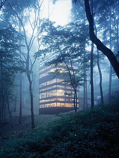
I ran across the Ring House, designed by Takei-Nabeshima-Architects (TNA) the other day, and was enchanted. This blog tends to focus on the history of the Arts and Crafts movement, but I'm always on the lookout for modern design that reflects the principles of beauty, simplicity and utility that the Arts and Crafts movement celebrated.
Just looking at this lovely home is relaxing! Created from rings of glass and wood, the Ring House was completed in 2006 and has a 360-degree view of the forest. Because of the rings of windows, you are able to look directly through the house from every side to the woods beyond.
In his writings, William Morris continuously emphasised the importance of creating new architecture that celebrated the best of the simple medieval aesthetic, while discouraging historical reproductions (faux gothic and the like). In the past, I've struggled with this particular aspect of Morris' writing. After all, we've all seen pretty terrible examples of contemporary architecture. I've often asked myself, why not just reproduce things from the past that were beautiful and useful? I'm slowly coming around to a different point of view, however. In my view, the Ring House is an example of how we can live in and celebrate contemporary architecture while respecting the best of design traditions.
For more information, please visit the TNA website. Photo by Daici Ano courtesy www.worldarchitecturenews.com

