Wednesday, April 28, 2010

Marine Building, Vancouver

Last month my husband and I went to Vancouver with our daughter. We were only there for a few short days, but we had a wonderful time taking in the sights. Fortunately, the weather was fabulous, and we enjoyed walking around Stanley Park and the downtown area. We even made it for the final weekend of the  Olympic Winter Games, as you can see in the photo above (we actually didn't know that the Paralympic Games were still in progress when we arrived - it's sad they get so little press).

Although I'd spent lots of time in Vancouver back in my undergraduate days, it was quite a change to visit as a 'grown-up'! As a student, I spent most of my time in Vancouver shopping for bargains and eating crepes and pizza on the street (it felt sort of weird to go to sit-down restaurants). While we were planning our trip to the city, Javier asked me which places we should go to, and I couldn't really tell him anything! That's when I realized that even though I lived in Greater Vancouver for 5 years, I'd never really seen the city.


During a long walk through the downtown area, we passed by Vancouver's historic Marine Building. My husband and I kept commenting on how much the Art Deco style of the building reminded us of The Daily Planet from CW's Smallville. Of course, we later discovered that that's because it is The Daily Planet (on the TV show they make the building look taller via CGI and superimpose the Planet globe on top).


The Marine Building was completed in 1930 and is a beautiful example of Art Deco architecture. The building was designed by the Vancouver-based architecture firm of McCarter Nairne. John Y. McCarter (an engineer) and George C. Nairne (an architect) built two Art Deco skyscrapers for the city of Vancouver: the first was the Medical Dental Building, which was demolished in 1988, and the second was the Marine Building.

Interestingly, when the building opened, the city was in the throes of the Great Depression. Although the structure had cost over $2.3 million to build, it was sold to the Guinness family (yes, that Guinness family), for a mere $900,000. Such a deal!


My favourite feature of the building is the elaborate entrance, with its fabulous Art Deco details.


Below you can see the rest of the entrance (unfortunately I couldn't get the whole thing with my iPhone, so I had to take two separate shots!). Take a close look at those angelic winged creatures: they're Canadian Geese! I don't think I've ever seen Canadian Geese looking so regal.


 It is certainly one of the prettiest buildings in downtown Vancouver, and I'm amazed I'd never visited it before. Now I really want to take a peek inside. I guess I'll have to wait till next time!

Tuesday, April 20, 2010

Modern Wallpaper


Wallpaper has been going through a huge resurgence in recent years, thanks in part to high-profile fans like designers like Colin McAllister and Justin Ryan of HGTV Canada's Home Heist.

While wallpaper went through a period of disfavor - thanks to tacky borders, dull patterns and an abscence of color - it has regained popularity for two reasons: wallpaper adds instant life to a room and it also helps unite a color scheme. In this day and age, few of us hire professional decorators. Wallpaper does much of the difficult work for you. You simply choose an attractive pattern, and then pull colors from the design to use in decorating the surrounding space. As an added plus, more and more companies have been designing contemporary patterns.

Still, even with fabulous modern papers, you'd be wise not to overdo it. William Morris, one of the most prolific wallpaper designers of all time, preferred simple whitewashed walls to wall coverings, and used wallpaper sparingly in his own homes. In this, as in most cases, less is more.

One big no-no (if you are looking for a more modern, streamlined look) is ornate borders. Borders look lovely when you are looking through wallpaper sample books, but they are largely unnecessary, especially if you have wainscotting. In fact, I would argue that, unless you are doing an historical reproduction, its best to forgo borders altogether.

I think William Morris would appreciate the "accent wall" approach to wallpaper. Use decorative papers on one wall to highlight it, and keep the rest of the room simple. I love looking at wallpaper, but entire areas covered in patterns can make me feel a little dizzy. Having an accent wall also makes it a lot easier to remove wallpaper in case you tire of it.

Another thing I like about the modern approach to wallpaper is that many designers are taking advantage of the brilliant new colours that are being used in decoration today. One company that has been taking traditional floral designs and giving them a new lease on life is Flavor Paper. I love their designs! This is not your grandmothers wallpaper. I first ran across Flavor Paper a few months ago on the William Morris Fan Club blog. The design featured below is called "Party Girl." I love the way it has been paired with the modish Eero Saarinen Tulip table and chair:


Flavor Paper is hand printed, which makes customization much easier for them. Their website advertises that the the ink colors from all their patterns are interchangeable, and that designs can be printed on any stock grounds without additional fees. Of course, the initial price tag is rather hefty, with designs starting at $150 a roll, although trade discounts are available.

Another company that has adapted well to changing times is Sanderson and its sister company, Harlequin Harris. Sanderson's PomPom collection, designed by Maggie Levien, is both beautiful and relevant. This photo from the Sanderson website (below), illustrates a modern approach to using wallpaper. You can see how the designer has pulled the colours from the wallpaper and used them to decorate the room. Also, I love what they have done with the mounted panels of wallpaper. It makes the paper look more like art, and less like traditional wallpaper. A nice trick for an accent wall, especially since great wallpaper can be rather pricey!


Images courtesy Sanderson and Flavor Paper.

Friday, April 16, 2010

Edmonton Arena District

I'm a huge believer in mixed use development in urban centers. My husband and I live in Central Edmonton and we love being able to take advantage of proximity to work, shops, and the beautiful river valley. As a result, I'm very excited about the proposed Edmonton Arena District, a mixed development project that includes a new arena for the Edmonton Oilers, plus residential housing, a community rink, a new casino, retail space and a winter garden. The project is being led by the Katz Group.

The video below features Daryl Katz, owner of the Edmonton Oilers and chairman of the Katz Group. It's a very frank discussion of why a project like the Arena District is of vital importance in attracting investment to the city:


Mr. Katz has announced his intention to contribute $100 million to the project, but I immediately noticed that a lot of the comments on YouTube suggest Mr. Katz ought to pay for the entire arena himself. This sentiment is echoed on Edmonton City Councillor Don Iveson's blog, where Iveson contends that the city shouldn't have to borrow the $400 million needed to finance the project. This sort of attitude always seems to be on display when a business person suggests a project that would improve life in the city.

I'm originally from Washington State, and I still remember the public outcry over billionaire philanthropist Paul Allen's proposal to construct the Qwest arena. There were dozens of letters written to local papers complaining that Allen should pay for the arena himself, rather than "leaving taxpayers with the bill." Of course, today most people will recognize that Mr. Allen's work in Seattle has helped to ensure its continued status as a world class city.

Of course, it's not just the cost of the project that has some Edmontonians concerned. The project has been criticized by Edmonton architect Barry Johns, who is concerned about the proposed location of the Arena District and LRT (light rail transit) access. I absolutely understand his reservations. Currently, the area that can be described as the "core" of downtown Edmonton is just a few blocks in diameter, and the proposed building site for the arena is a few blocks away. Also, the LRT does not currently run to the proposed site.

I think the hurdles Johns mentions can be easily overcome, however. While I strongly feel that approval of the development should be contingent on the addition of the LRT station, I am much less concerned about the notion of "extending" the downtown area, because, after all, that is the entire aim of the project!

The debate surrounding who should pay for the Arena District reminds me of the classic children's tale, "The Little Red Hen." I'm sure you will recall this story from your childhood. In it, the Little Red Hen finds a grain of wheat and has the idea of planting it and using the wheat to make bread. She asks the other farm animals to help her at each stage of production (planting, harvesting, milling, baking), but no-one offers. Of course, in the end, they all want to help eat the bread. City development projects always seem to work that way. People grumble about the cost, but in the end, they don't seem to have a problem using the services they didn't want to pay for.

Edmonton has the potential of being a world class city, but this will take genuine commitment on the part of the city government, private citizens and businesses. The Edmonton Arena District is a fabulous idea that will  beautify our city and help combat urban sprawl. Edmonton desperately needs some world class architecture to set the city apart and to attract people and investment. The completion of the Alberta Art Gallery this winter was a great start, but we need to build on the momentum that is being created if Edmonton is going to be able to compete with cities like Calgary for investment dollars.

For more information, please visit the Edmonton Arena District website.

Friday, April 9, 2010

Roger Scruton - Why Beauty Matters

Last year, philosopher Roger Scruton's did a televised essay for BBC Two entitled "Why Beauty Matters." In the program, Scruton lays waste to contemporary and modern art and architecture and the value system behind it. He argues that humans need beauty, that modern art is not beautiful and that a hasty return to classic aesthetic values is necessary if we are to save Western Civilization from perishing in a spiritual desert of ugliness.


In his documentary, Scruton uses extreme examples of shocking conceptual art, such as Sarah Lucas, Tracey Emin and Gilbert and George, to prove that modern art is ugly. He then goes on to blame their prominence in the art world on (among other things) democracy, popular culture and modernism (this seems faintly ridiculous, because, while there are a number of words one might choose to describe the work of Emin and her contemporaries, "popular" is not among them).

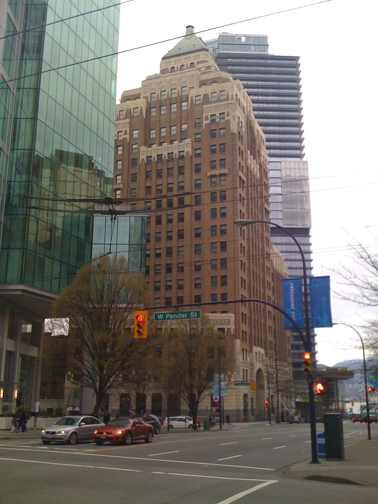
Scruton takes no prisoners in his critique of the aesthetic values of the modern world. And while he heaps plenty of contempt on contemporary art, he saves his most devastating critique for modern architecture, which he labels as "the greatest crime against beauty that the world has yet seen." He sneers at the phrase "form follows function," arguing that buildings created with an emphasis on utility soon become useless. He supports this statement with a walking tour of the graffiti covered modernist architecture. Scruton grew up near Reading, which once was "a charming Victorian town with terraced streets and Gothic churches." According to Scruton's account, the once-beautiful city was effectively defaced by the addition of some ugly modern buildings in the 1960s. He goes on to point to an abandoned building and remarks that it has been left empty because it is "damned ugly." I realize he is trying to prove a point, but isn't possible that there are some economic factors involved here as well?

I received an interesting email from my grandfather the other day showing photos of Hiroshima today (a vibrant, bustling city filled with optimistic modern architecture) and comparing them to pictures of Detroit, with its dilapidated turn-of-the-century architecture. Below is an image from a new book entitled The Ruins of Detroit, by Yves Marchand and Romain Meffre. You can see how this photo captures the disintegration of the once beautiful Lee Plaza Hotel. How would Scruton account for this?

Detroit Devastation,Yves Marchand,Romain
Meffre

Of course, contrary to Scruton’s assertions, traditional architecture cannot prevent a building from eventually falling prey to the harsh realities of an economic collapse.

Most conceptual art is not beautiful, and I completely understand Scruton's disappointment with it. The shock value has worn off, and most of it has become rather dull.  However, I feel he is mistaken in pointing to popular culture as the bogeyman in all of this. Democracy and popular culture are not the enemies of true art. Ludditism is. 

Hear me out. Critics and philosophers like Scruton feel threatened by the modern age, because their opinion no longer carries the weight it once did. Today, people look to numerous sources for critical input. In the past, you might have gone to traditional media, like the newspaper, to find out what people were saying about an art show. Nowadays you might be just as likely to discuss art via blogs, online forums and social networks like Facebook and Twitter.

Similarly, just as we now have multiple avenues from which to access critical discourse, we also have more access to art and images than at any time in human history. For centuries, the only art you probably would have ever seen (aside from the handcrafted objects in your home), would have been at your place of worship (and over the last few centuries, in newsprint and on public buildings).

As a result of the explosion of access to art, contemporary artists like Damien Hirst are likewise threatened by the digital age. Face it, not many people are willing to pay to see flies swarming around a cow’s head, as in Hirst’s work A Thousand Years. Consequently, conceptual artists rely heavily on critics, wealthy patrons and government funding in order to stay afloat. And they are very much dependent on the shock value of their work, because it attracts much needed press and keeps warm bodies heading to the galleries, if only out of morbid curiosity.

I believe the reason groups like the Young British Artists are compelled to create shocking art is that they are stuck in the past and committed to an unholy alliance with art critics. This marriage was created for the purpose of telling the public what they should and shouldn’t like, and as a means of artificially preserving the notion of elite tastes. But today, due to (among other things) the rise of technology, capitalism and social networks, the public today has little need for close-minded critics and self-marginalizing art. As a result, all that is left for critics is to praise the most counterintuitive art possible, in the hopes of preserving the scarcity of what can be considered “high art” (and thereby increasing its value). Honestly, how would you know that “A Light Going on and Off” was art, unless an Art Critic told you? You probably wouldn’t, so it’s a great way for outmoded tastemakers to hang onto their jobs.

Popular art, in the form of modern industrial design and commercial art, is one of the greatest threats to groups like the Young British Artists. And this is a good thing. As human beings, we are hard-wired to appreciate symmetry, bright, attractive colors and pleasant lines. And industrial designers and the corporations behind them are eager to offer us what we want. Computer aided design and modern production techniques have made beautiful, useful objects more accessible than ever before. All we need to do as consumers is to demand a more beautiful world.

For centuries, critics have felt they are intercessors for the people, giving them access to beauty. But technology has changed this dynamic forever. The people are no longer required to worship beauty through the intercessory magic of the artist and intellectual. We are living in a new era, where works by talented (and commercially successful) artists like Dale Chihuly are widely available and wildly popular. Chihuly’s public installations give the people exactly what they want: beautiful objects that invite contemplation and pure enjoyment.  

Dale Chihuly,Glass

Finally, I would like to say that Scruton's aim is admirable, and I respect what he is attempting to do in the film. Nevertheless, I take exception to his implied assertion that modern=ugly. Admittedly, examples of ugly modern and contemporary art abound. But the existence of ugly art does not mean artists need to return to traditional art or architecture. Artists today need to embrace democracy and the digital age and chart a new way forward. 

Many thanks to Grace at The Beautiful Necessity introducing me to Scruton’s essay!

For more of the fabulous photos by Marchand and Meffre, please visit their website

Photo of installation of Dale Chihuly's work courtesy Wikimedia Commons.  

Friday, April 2, 2010

Anish Kapoor's Orbit - English Eiffel Tower?

Anish Kapoor's design for the London Orbit Tower, intended to be the dominating structure of the London 2012 Olympic Games, was unveiled earlier this week.


When completed, the structure will stand over 115 meters tall - 22 meters higher than the Statue of Liberty, 19 meters higher than Big Ben, and considerably shy of the Eiffel Tower - the 340 meter high building to which the Orbit is already drawing comparisons.

Kapoor has created numerous well-known sculptures, including Chicago's Cloud Gate. Explaining his inspiration for the design, Kapoor remarked in an interview with the BBC that he wanted to "look again at the whole idea of a tower" replacing its traditional Cartesian lines with something more orbital, with a "flowing, coiling form". Moreover, he hopes "to create a sensation of a certain kind of instability' for the viewer.”

Mr. Kapoor, who admittedly has all the humility of Howard Roark, confesses that he makes art to please himself, although he has a viewer in mind. While statements like this have led some art critics to dismiss him as an egoist, I appreciate his honesty. Genuine humility would make innovation impossible. It requires a great deal of confidence to see one's work come to fruition, and I don't really see the point in artists pretending that their work is for the people. In fact, which is more arrogant: admitting that your work pleases you, or proudly asserting that it is meant please others?

For this reason, the Orbit/Eiffel Tower comparison actually works on a certain level. Much like the Orbit, the Eiffel Tower was an unapologetically modern structure that utilized revolutionary techniques in building construction. It was the tallest building in the world for 41 years, until the Chrysler building was completed in 1930. The Orbit does not attempt to compete with the Eiffel Tower in height (which would be rather pointless, since there many tall buildings). Nor does it have the concern with utility that dominated Gustave Eiffel’s work. Instead, Mr. Kapoor seems to feel that the next frontier in construction lies in manipulating the conceptual framework of structures like the tower. His plan for the Orbit puts a tremendous strain on the engineers involved, demanding a building that looks like it might topple over, but doesn't! Kapoor hopes that the innovations he has made in the Orbit's design will make it "truly 21st century."

The Orbit seems based on a visual conception of the relationship between man’s achievements and his limitations. The "leaning tower" can easily be interpreted to represent the instability of modern man. This is emphasized by the sinuous coils of the structure, which call to mind the tenuously twisted spirals of the DNA’s double helix. Of course, the entire structure appears to be on the verge of either collapse or ascent.

My biggest reservation about the project is its full name: the ArcelorMittal Orbit; so named after ArcelorMittal, the company which will be donating the structural steel required to complete the project (perhaps explaining the choice of building material?). I'm a bit disappointed with the red portion of the tower, which appears to be painted steel. How often the tower will need to be repainted? The Eiffel Tower was constructed out of cast iron, and has to be repainted every seven years to prevent corrosion (it takes about 60 tonnes of paint each time). Contemporary construction projects should be made greener by utilizing new materials that are more resistant to corrosion.

So, will the ArcelorMittal Orbit be London's landmark for the 21st century? I'm reserving judgement. People thought the Eiffel Tower was an eyesore when it first opened, so I know better than to criticize the Orbit based on its looks! That said, does the design have staying power? My answer would be yes, because I think that, upon completion, it will be the most prominent example of an honest contemporary architecture that at once embraces the technologies of the 21st century, while calling attention to a dominating sense of uncertainty about the future and our place within it.


Image courtesy ARUP/Getty Images, under fair use guidelines.