Tuesday, April 20, 2010
Modern Wallpaper
Wallpaper has been going through a huge resurgence in recent years, thanks in part to high-profile fans like designers like Colin McAllister and Justin Ryan of HGTV Canada's Home Heist.
While wallpaper went through a period of disfavor - thanks to tacky borders, dull patterns and an abscence of color - it has regained popularity for two reasons: wallpaper adds instant life to a room and it also helps unite a color scheme. In this day and age, few of us hire professional decorators. Wallpaper does much of the difficult work for you. You simply choose an attractive pattern, and then pull colors from the design to use in decorating the surrounding space. As an added plus, more and more companies have been designing contemporary patterns.
Still, even with fabulous modern papers, you'd be wise not to overdo it. William Morris, one of the most prolific wallpaper designers of all time, preferred simple whitewashed walls to wall coverings, and used wallpaper sparingly in his own homes. In this, as in most cases, less is more.
One big no-no (if you are looking for a more modern, streamlined look) is ornate borders. Borders look lovely when you are looking through wallpaper sample books, but they are largely unnecessary, especially if you have wainscotting. In fact, I would argue that, unless you are doing an historical reproduction, its best to forgo borders altogether.
I think William Morris would appreciate the "accent wall" approach to wallpaper. Use decorative papers on one wall to highlight it, and keep the rest of the room simple. I love looking at wallpaper, but entire areas covered in patterns can make me feel a little dizzy. Having an accent wall also makes it a lot easier to remove wallpaper in case you tire of it.
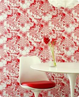
Another thing I like about the modern approach to wallpaper is that many designers are taking advantage of the brilliant new colours that are being used in decoration today. One company that has been taking traditional floral designs and giving them a new lease on life is Flavor Paper. I love their designs! This is not your grandmothers wallpaper. I first ran across Flavor Paper a few months ago on the William Morris Fan Club blog. The design featured below is called "Party Girl." I love the way it has been paired with the modish Eero Saarinen Tulip table and chair:
Flavor Paper is hand printed, which makes customization much easier for them. Their website advertises that the the ink colors from all their patterns are interchangeable, and that designs can be printed on any stock grounds without additional fees. Of course, the initial price tag is rather hefty, with designs starting at $150 a roll, although trade discounts are available.
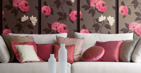
Another company that has adapted well to changing times is Sanderson and its sister company, Harlequin Harris. Sanderson's PomPom collection, designed by Maggie Levien, is both beautiful and relevant. This photo from the Sanderson website (below), illustrates a modern approach to using wallpaper. You can see how the designer has pulled the colours from the wallpaper and used them to decorate the room. Also, I love what they have done with the mounted panels of wallpaper. It makes the paper look more like art, and less like traditional wallpaper. A nice trick for an accent wall, especially since great wallpaper can be rather pricey!
Images courtesy Sanderson and Flavor Paper.
Posted by
Margaret
at
12:51 PM
![]()
![]()
Labels: decorating, wallpaper, william morris
Subscribe to:
Post Comments (Atom)


5 comments:
While I love the look of the modern papers, I don't think I will ever be tempted to use paper again. It is such a pain to take down!
One of the decorating tricks that is often used in television programmes is to take different amounts of wall papers, frame them up and put them on the UNpapered walls in a cluster.
It is cheaper than using paintings or prints, and it has the advantage of highlighting the room's colours and patterns, within the frames.
What do you think?
Hi Helen!
I've seen that a lot on decorating shows as well. I think it's a good idea, and it's really safe, because even if you choose a dreadful pattern, it's easy to get rid of. This solves the problem Steviewren was mentioning - the difficulty of removing the wallpaper when you have decided to move on.
these are great! the 'asian' ones too have been wonderful!
I love wallpaper but i had a giant nightmare getting rid of not wallpapers but just borders. Husband and I suffered for days then as stripping solutions were so toxic and these were the only ones available. That said..I doubt if I ever will get any part of the home wallpapered..am quite to see those beautiful ones online for now :) Happy week to you and the little princess at home..hugs/M
Post a Comment