Showing posts with label reviews. Show all posts

Wednesday, March 2, 2011

Artfinder.com

There has been a lot of exciting news over the past few months about art on the web. Google recently launched their Art Project, Twitter is teeming with artists, art lovers and art historians, and H Niyazi of Three Pipe Problem just launched the Art History Database, which permits visitors to search some of the best art and history sites on the web for relevant art-related content.

Yesterday, another exciting entrant launched the beta version of their site. Artfinder.com aims to connect visitors to new art through their website. Many of you are likely familiar with Pandora - the music service that automatically builds playlists for listeners based on their preferences. Artfinder.com aims to offer the ability do something similar, helping visitors discover new artists by using their "magic tour."

The magic tour works by showing you a set of four paintings, from which you choose your favorite (or you can skip the entire set if you don't like any of them).  This is done 3-4 times, after which a slide show is created based on your earlier choices.


The site mentions plans to develop applications for mobile and tablet devices, with the goal of sharing profits with the museums, galleries and artists featured on the site. Since there will be no cost to museums and galleries, this could be a really wonderful way for museums to increase revenues - especially when times are tough and arts funding is in so much jeopardy across the globe.

I was a bit disappointed that the website is weighted so heavily in the direction of pre-20th century art, although there are works by early 20th century artists like Matisse. Of course, as anyone who blogs knows all too well, it can be tough to get permission to show modern and contemporary works. This is a shame, but I hope things will change going forward. Obviously, Artfinder doesn't want to get slapped with a copyright suit their first day in business! Hopefully once artists (or their estates) are aware of the site, they will be willing to consider allowing their images to be displayed.

I really like the concept. The website has begun with 250,000 artworks, and you have the option to share paintings (right now it's just paintings and sketches, though they have said that they will be adding sculpture in the future) with friends through social media, such as Facebook and Twitter.

I was a bit disappointed with the magic tour, which is probably largely due to the fact that I am in a bit of a modern/contemporary art mood at the moment, and there is little of that on the website. So, I chose a few 19th century paintings. The results seemed a bit random, but I did find a few artists I was not familiar with. I liked most of what I saw, but I'm not sure if that was because of the accuracy of the "magic tour", or because I'm not that picky!

Overall, I think it's a great site and I'm very impressed with what Artfinder is trying to do. It's still in beta, so there are some wrinkles to be sorted out. However, I would definitely recommend it to readers of this blog, and I am very excited to see that art is alive and thriving in our web 2.0 world.

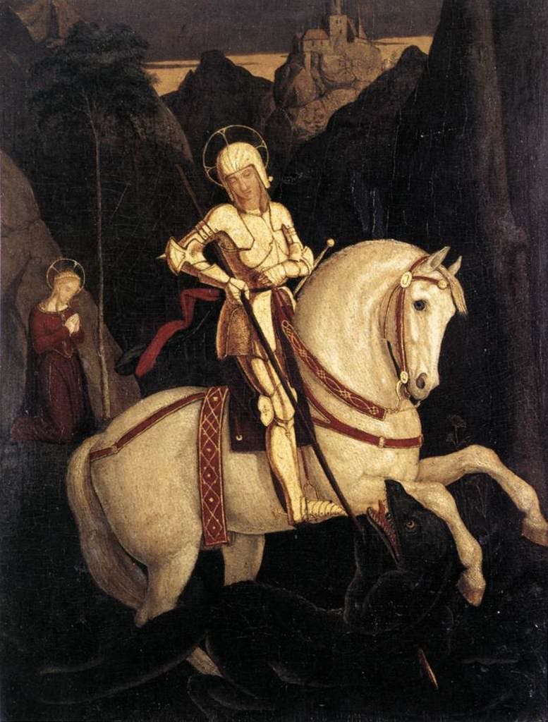
St. George and the Dragon, 1811 by Franz Pforr, Image courtesy Wikimedia

Friday, October 1, 2010

October Issue of the Art History Carnival

Welcome to the October 1, 2010 edition of art history carnival! I received a wide variety of submissions this month - everything from classic art history articles to a review of DNA art. And while I confess that I'm still a little confused about the DNA art, I have a feeling my husband would probably find it interesting.

architecture


Brenda Chapman has written an introductory piece on the 10 Essential Architectural Movements of the 20th Century. Name as many architectural movements as you can before you go to the website, and see how many are listed!

Alexandra Korey presents Michelangelo's Laurentian Library, Mannerist Tendencies posted at Arttrav.com

art


Helen Webberley has done a fascinating portrait of the life of artist Reuven Rubin  posted at ART and ARCHITECTURE, mainly

Gábor Endrődi shares a post written by Zsombor Jékely on the subject of the medieval fresco decoration of The medieval parish church of Pest (part II.) - A remarkable discovery posted at Medieval Hungary.

Hermes has done a fascinating review of John Everett Millais' The Romans Leaving Britain on Pre-Raphaelite Art

H Niyazi has shared a great piece by art historian Monica Bowen entitled boy bitten by a lizard: posner vs. gilbert posted at Alberti's Window, saying, "Monica Bowen explores the allegory of Caravaggio's Boy Bitten by A Lizard, discussing prevalent and controversial theories that surround the Baroque Master."

H Niyazi also submitted an interesting piece called A Grey Heron posted at Tempesta News, saying, "Dr Frank DeStefano uncovers a stunning piece of evidence supporting the spiritual reading of Giorgione's mysterious 'Tempesta'." (Thank you for all the great articles, Hasan!).

Emily Brand presents The Many Guises of Marie Antoinette posted at The Artist's Progress....

Helen Webberley presents Che Guevara and the suffering Christ posted at ART and ARCHITECTURE, mainly, saying, "Che Guevara probably would have been thought of as a Christ-like figure in devoutly Catholic Bolivia anyhow. But there was an important post-mortem photo that was remarkably similar to Rembrandt's The Anatomy Lesson of Dr. Nicolaes Tulp 1632 and Andrea Mantegna's Lamentation over the Dead Christ 1490. This reinforced the image of Guevara's corpse as being Christ-like in its suffering."

Susan Benford presents an overview of some of Michelangelo's best-known paintings. posted at Famous Paintings Reviewed - An Art History Blog

Kendall Roberts presents The Evolution of Pop Art in the Twenty First Century - Neo DNAism posted at Neo DNAism.

Finally, if you are in the mood for a bit of a mystery, Dr Ben Harvey presents a bit of an art history thriller with his post on the poem Art's Quota (part one) located at Emanata.

exhibits


Alexandra Korey provides a fascinating insight to restorations at the Chiostro dello Scalzo in Florence, including descriptions and images of some rarely seen frescoes in his Chiostro dello Scalzo – hidden frescoes in Florence! | TuscanyArts posted at Tuscany Arts, 

That concludes this edition. I would like to apologize if anyone missed the deadline due to a dating problem on the Blog Carnival website. I'm not sure exactly what was going on, but I created an upcoming edition numerous times and it didn't seem to show up on the site. I'm glad that so many people submitted their articles anyway! Submit your blog article to the next edition of
art history carnival
using our
carnival submission form.
Past posts and future hosts can be found on our

blog carnival index page
.


Technorati tags:
, , .

Tuesday, May 25, 2010

Proust's Madeleine

As a fan of fine literature and food, I was curious when I first ran across Edmund Levin's article for Slate "The Way the Cookie Crumbles: How much did Proust know about Madeleines?" 


In Remembrance of Things Past, the narrator tastes some crumbs from the bottom of his teacup and experiences a flood of childhood memories: 
"I raised to my lips a spoonful of the tea in which I had soaked a morsel of the cake. No sooner had the warm liquid mixed with the crumbs touched my palate than a shudder ran through me and I stopped, intent upon the extraordinary thing that was happening to me. An exquisite pleasure invaded my senses."
In his article, Levin argues that Proust pretty much made the whole thing up. A typical madeleine leaves no crumbs he argues, and worse yet, he claims that the crumbs have no taste. 

Like Proust's child narrator, I've loved madeleines since I was a kid. When I was a young girl growing up in Olympia, my mom would take me to Batdorf and Bronson after ballet or violin and I'd always have one of their delicious madeleines (I think I tried the cookies with pretty much every beverage there - but tea was the best). My mom and I would chat about art, music and all manner of delightfully grown-up topics while taking in the aroma of roasting coffee beans and thumbing through independent newspapers. Those are fabulous memories. 


At least I thought they were! 


For a moment after reading Levin's article, I questioned my childhood experiences. Were Proust and I both crazy? I knew I'd tasted those crumbs, but it had been a while. Surely this food writer must be right, and I wrong. There's no way he would have made this up...right? 


To see if I could replicate some childhood memories and have a "Proust moment" of my own, I sat down with Julia Child's recipe from The Way to Cook and the madeleine pan I received for Mother's day. I figure that if anyone could settle this once and for all, it was Julia. 


Here's Julia's recipe (more or less). 


2 large eggs, lightly beaten
2/3 c. sugar
1 c. flour + 1 T for preparing pans
5 oz. butter
pinch of salt
zest of 1 lemon
juice of 1/2 lemon
1/2 t. vanilla


Now, while I fiddle with Julia's ingredients a bit (she calls for "drops of lemon juice and vanilla" - whatever that means), I stick to her preparation guide fairly religiously: 
  • Preheat the oven to 375 degrees Fahrenheit. 
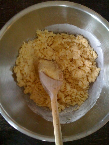
  • Measure 1/4 c. eggs into bowl. Beat in sugar and flour. Blend and allow to rest for 10 minutes. Madelines 015
Meanwhile: 
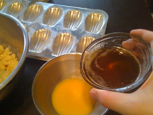
  • Melt butter in saucepan. Bring to a boil and let brown slightly (it should be a lovely caramel colour). Place 1 1/2 T. in a bowl and set aside (very important!)
  • Stir the rest of the butter over ice until cool but still liquid
  • Blend the cooled butter with the reserved 1/4 c. of the eggs into the butter with the salt, lemon juice, rind and vanillaMadelines 019
  • Mix remaining butter (1T) with the 1T of flour you have reserved, and use the mixture to prepare the madeleine pans. 
  • Divide batter into 24 lumps of 1 T each (okay, so I don't follow this part so religiously - measuring 1 T for each madeleine should do the trick)Madelines 010
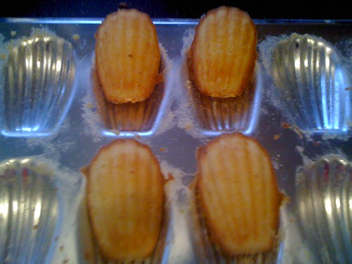
  • Bake 13-15 minutes or until browned around the edges and a teensy bit on top!Madelines 005
I love this recipe. I put a fair bit of lemon juice in my madeleines. I like them that way - they smell positively divine when they come out of the oven! And Julia's trick of mixing the melted butter with the flour and using the mix to prep the pans is pure genius - there's never so much as a speck of batter left clinging to the pan. All you need to do afterwards is rinse the pans with warm water. Don't use any detergent - it's unnecessary, and can harm the seasoning of the pan. Also, don't buy a nonstick madeleine pan! It's a terrible waste - not only are most nonstick pans junk, but even the expensive ones won't allow your madeleines to brown properly.


These delightful cookies are pure poetry, and will leave delightfully perfumed crumbs in the bottom of your teacup after dunking. Feel free to use your spoon to capture a few, a la Proust, when no-one's looking!


Now to the controversy. Levin extrapolates several things about Proust's madeleines from the text, all of which seem silly to me. Most importantly, he argues that Proust's madeleine would have needed to be very dry, in order produce such a quantity of crumbs. Now, this is plain nonsense. Has this guy ever dunked a donut? 


I could go on... but for now, I think I'll just enjoy my madeleines. 


Tuesday, May 18, 2010

Art and the iPad

Apple's iPad will be coming to Canada on May 28, and it is already making waves in the United States. Touted by Apple as "the best way to experience the web," the iPad is everything we've come to expect from Apple - sleek, sexy and designed to inspire envy. But what impact will the iPad have on the art world?

Digital artists are already excited about the art apps being offered for the iPad, which allow users to draw using either fingers or a stylus using any number of digital brushes. This enthusiasm is hardly surprising, given that last June an illustration done entirely on the iPhone using the iTunes Brushes app graced the cover of The New Yorker. The magazine's art editor, later told The New York Times he appreciated the fact that the cover didn't feel digital, and that the image was "free flowing...poetic and magical." The artist, Jorge Colombo, confessed that one of the biggest attractions of working in this medium was its low profile and portability, which permitted him to stand for over an hour on 42nd Street in Manhattan without being bothered by curious onlookers. Obviously, that would have been a rather more difficult task, if he'd been working on an easel! (or even with a sketchbook).


Of course, not everyone is thrilled. Performance artist Kenny Irwin of dOvtastic Microwave Theatre has already engaged artistically with the iPad - by microwaving it. Yup, there are some who feel that the best response to this new technology is to destroy it using less advanced technology (or perhaps I've missed the point - if there even is one).

But others are making more optimistic use of the iPad.  Claudio Arango of Bogotá, Colombia, has become the first known artist to conduct an exhibit of his artwork using the iPad.  

Below you can see a film of Arango demonstrating his art to passersby using the iPad:


On his blog, Arango states that his goal is for his artwork to be "móvil, remezclado, y libre" ("mobile, remixed and free"). It's a noble manifesto, and one that seems appropriate for art created on such exciting new technology. Of course, some will note that the people who encounter Arango on the street may be more interested in the iPad than what's on it. This is a valid point, but I am intrigued by Arango's art, and by his forward thinking approach. Arango does digital artwork, primarily female nudes, and he is highly tech-savvy (he blogs and is on flickr, twitter, YouTube, tumblr and Facebook). With more and more artists taking advantage of the sort of presence social media affords, it won't be long before technologies like the iPad are as important to artists as paintbrushes were in the past. The web has already become the primary medium in which people encounter art, how long before it becomes the principal tool for creating art? Of course, as an art blogger, I may be a bit biased, but when you consider today's architects and designers, most simply could not function without computer aided design, and artists are quickly joining the ranks of the technology- dependent. This may be disturbing to some, but then again, thousands of years ago, artists who painted on cave walls were making use of frightening new technology!

Now, I'm not sure if digital art is the future of art, but it will certainly be a key component of the art world of the future. And how could it not play a pivotal role? Representing yet another portable, web-friendly device, the iPad ensures that art will never be more than a click away. It will change the way an entire generation interacts with visual media. It's strange, but the iPad may very well be the first place my daughter creates her own art.

What do you think? What place does emerging technology like the iPad have in the art world, and how might it change the way we look at art? I'd love to hear your thoughts (and if you are an artist who is already brainstorming ways to take advantage of this new medium, or others like it, please join in!).

Friday, April 9, 2010

Roger Scruton - Why Beauty Matters

Last year, philosopher Roger Scruton's did a televised essay for BBC Two entitled "Why Beauty Matters." In the program, Scruton lays waste to contemporary and modern art and architecture and the value system behind it. He argues that humans need beauty, that modern art is not beautiful and that a hasty return to classic aesthetic values is necessary if we are to save Western Civilization from perishing in a spiritual desert of ugliness.


In his documentary, Scruton uses extreme examples of shocking conceptual art, such as Sarah Lucas, Tracey Emin and Gilbert and George, to prove that modern art is ugly. He then goes on to blame their prominence in the art world on (among other things) democracy, popular culture and modernism (this seems faintly ridiculous, because, while there are a number of words one might choose to describe the work of Emin and her contemporaries, "popular" is not among them).

Scruton takes no prisoners in his critique of the aesthetic values of the modern world. And while he heaps plenty of contempt on contemporary art, he saves his most devastating critique for modern architecture, which he labels as "the greatest crime against beauty that the world has yet seen." He sneers at the phrase "form follows function," arguing that buildings created with an emphasis on utility soon become useless. He supports this statement with a walking tour of the graffiti covered modernist architecture. Scruton grew up near Reading, which once was "a charming Victorian town with terraced streets and Gothic churches." According to Scruton's account, the once-beautiful city was effectively defaced by the addition of some ugly modern buildings in the 1960s. He goes on to point to an abandoned building and remarks that it has been left empty because it is "damned ugly." I realize he is trying to prove a point, but isn't possible that there are some economic factors involved here as well?

I received an interesting email from my grandfather the other day showing photos of Hiroshima today (a vibrant, bustling city filled with optimistic modern architecture) and comparing them to pictures of Detroit, with its dilapidated turn-of-the-century architecture. Below is an image from a new book entitled The Ruins of Detroit, by Yves Marchand and Romain Meffre. You can see how this photo captures the disintegration of the once beautiful Lee Plaza Hotel. How would Scruton account for this?

Detroit Devastation,Yves Marchand,Romain
Meffre

Of course, contrary to Scruton’s assertions, traditional architecture cannot prevent a building from eventually falling prey to the harsh realities of an economic collapse.

Most conceptual art is not beautiful, and I completely understand Scruton's disappointment with it. The shock value has worn off, and most of it has become rather dull.  However, I feel he is mistaken in pointing to popular culture as the bogeyman in all of this. Democracy and popular culture are not the enemies of true art. Ludditism is. 

Hear me out. Critics and philosophers like Scruton feel threatened by the modern age, because their opinion no longer carries the weight it once did. Today, people look to numerous sources for critical input. In the past, you might have gone to traditional media, like the newspaper, to find out what people were saying about an art show. Nowadays you might be just as likely to discuss art via blogs, online forums and social networks like Facebook and Twitter.

Similarly, just as we now have multiple avenues from which to access critical discourse, we also have more access to art and images than at any time in human history. For centuries, the only art you probably would have ever seen (aside from the handcrafted objects in your home), would have been at your place of worship (and over the last few centuries, in newsprint and on public buildings).

As a result of the explosion of access to art, contemporary artists like Damien Hirst are likewise threatened by the digital age. Face it, not many people are willing to pay to see flies swarming around a cow’s head, as in Hirst’s work A Thousand Years. Consequently, conceptual artists rely heavily on critics, wealthy patrons and government funding in order to stay afloat. And they are very much dependent on the shock value of their work, because it attracts much needed press and keeps warm bodies heading to the galleries, if only out of morbid curiosity.

I believe the reason groups like the Young British Artists are compelled to create shocking art is that they are stuck in the past and committed to an unholy alliance with art critics. This marriage was created for the purpose of telling the public what they should and shouldn’t like, and as a means of artificially preserving the notion of elite tastes. But today, due to (among other things) the rise of technology, capitalism and social networks, the public today has little need for close-minded critics and self-marginalizing art. As a result, all that is left for critics is to praise the most counterintuitive art possible, in the hopes of preserving the scarcity of what can be considered “high art” (and thereby increasing its value). Honestly, how would you know that “A Light Going on and Off” was art, unless an Art Critic told you? You probably wouldn’t, so it’s a great way for outmoded tastemakers to hang onto their jobs.

Popular art, in the form of modern industrial design and commercial art, is one of the greatest threats to groups like the Young British Artists. And this is a good thing. As human beings, we are hard-wired to appreciate symmetry, bright, attractive colors and pleasant lines. And industrial designers and the corporations behind them are eager to offer us what we want. Computer aided design and modern production techniques have made beautiful, useful objects more accessible than ever before. All we need to do as consumers is to demand a more beautiful world.

For centuries, critics have felt they are intercessors for the people, giving them access to beauty. But technology has changed this dynamic forever. The people are no longer required to worship beauty through the intercessory magic of the artist and intellectual. We are living in a new era, where works by talented (and commercially successful) artists like Dale Chihuly are widely available and wildly popular. Chihuly’s public installations give the people exactly what they want: beautiful objects that invite contemplation and pure enjoyment.  

Dale Chihuly,Glass

Finally, I would like to say that Scruton's aim is admirable, and I respect what he is attempting to do in the film. Nevertheless, I take exception to his implied assertion that modern=ugly. Admittedly, examples of ugly modern and contemporary art abound. But the existence of ugly art does not mean artists need to return to traditional art or architecture. Artists today need to embrace democracy and the digital age and chart a new way forward. 

Many thanks to Grace at The Beautiful Necessity introducing me to Scruton’s essay!

For more of the fabulous photos by Marchand and Meffre, please visit their website. 

Photo of installation of Dale Chihuly's work courtesy Wikimedia Commons.  

Friday, April 2, 2010

Anish Kapoor's Orbit - English Eiffel Tower?

Anish Kapoor's design for the London Orbit Tower, intended to be the dominating structure of the London 2012 Olympic Games, was unveiled earlier this week.


When completed, the structure will stand over 115 meters tall - 22 meters higher than the Statue of Liberty, 19 meters higher than Big Ben, and considerably shy of the Eiffel Tower - the 340 meter high building to which the Orbit is already drawing comparisons.

Kapoor has created numerous well-known sculptures, including Chicago's Cloud Gate. Explaining his inspiration for the design, Kapoor remarked in an interview with the BBC that he wanted to "look again at the whole idea of a tower" replacing its traditional Cartesian lines with something more orbital, with a "flowing, coiling form". Moreover, he hopes "to create a sensation of a certain kind of instability' for the viewer.”

Mr. Kapoor, who admittedly has all the humility of Howard Roark, confesses that he makes art to please himself, although he has a viewer in mind. While statements like this have led some art critics to dismiss him as an egoist, I appreciate his honesty. Genuine humility would make innovation impossible. It requires a great deal of confidence to see one's work come to fruition, and I don't really see the point in artists pretending that their work is for the people. In fact, which is more arrogant: admitting that your work pleases you, or proudly asserting that it is meant please others?

For this reason, the Orbit/Eiffel Tower comparison actually works on a certain level. Much like the Orbit, the Eiffel Tower was an unapologetically modern structure that utilized revolutionary techniques in building construction. It was the tallest building in the world for 41 years, until the Chrysler building was completed in 1930. The Orbit does not attempt to compete with the Eiffel Tower in height (which would be rather pointless, since there many tall buildings). Nor does it have the concern with utility that dominated Gustave Eiffel’s work. Instead, Mr. Kapoor seems to feel that the next frontier in construction lies in manipulating the conceptual framework of structures like the tower. His plan for the Orbit puts a tremendous strain on the engineers involved, demanding a building that looks like it might topple over, but doesn't! Kapoor hopes that the innovations he has made in the Orbit's design will make it "truly 21st century."

The Orbit seems based on a visual conception of the relationship between man’s achievements and his limitations. The "leaning tower" can easily be interpreted to represent the instability of modern man. This is emphasized by the sinuous coils of the structure, which call to mind the tenuously twisted spirals of the DNA’s double helix. Of course, the entire structure appears to be on the verge of either collapse or ascent.

My biggest reservation about the project is its full name: the ArcelorMittal Orbit; so named after ArcelorMittal, the company which will be donating the structural steel required to complete the project (perhaps explaining the choice of building material?). I'm a bit disappointed with the red portion of the tower, which appears to be painted steel. How often the tower will need to be repainted? The Eiffel Tower was constructed out of cast iron, and has to be repainted every seven years to prevent corrosion (it takes about 60 tonnes of paint each time). Contemporary construction projects should be made greener by utilizing new materials that are more resistant to corrosion.

So, will the ArcelorMittal Orbit be London's landmark for the 21st century? I'm reserving judgement. People thought the Eiffel Tower was an eyesore when it first opened, so I know better than to criticize the Orbit based on its looks! That said, does the design have staying power? My answer would be yes, because I think that, upon completion, it will be the most prominent example of an honest contemporary architecture that at once embraces the technologies of the 21st century, while calling attention to a dominating sense of uncertainty about the future and our place within it.


Image courtesy ARUP/Getty Images, under fair use guidelines.

Friday, March 19, 2010

Decorating and the Death of Ivan Ilych


While flipping through Pottery Barn Home the other day, I was suddenly reminded of Leo Tolstoy's short story, The Death of Ivan Ilyich. It was one of those tales I read back in University that had a lasting impact on me for some reason, though perhaps not for the reasons my Professor might have hoped.

You may recall (spoiler alert!) that Ivan Ilyich dies while trying to install some new curtains in his home. You see, Ivan has a desirable, bourgeois home he has filled with the sort of objects that the upwardly mobile fantasize about. Ironically, Ivan is completely unaware that the design choices he thinks make his home unique actually render it quite common. Worse yet, these decorating decisions ultimately lead directly to his untimely death (weekend warriors: you have been warned!).

Now, when I read Ivan Ilyich back in University, it made the sort of impression on me that such stories generally have on the young (I saw Fight Club the same year and came to the same conclusion): middle-class tastes are bad, if not downright dangerous. Perhaps this is what Tolstoy was saying, perhaps not. At any rate, these days I'm a little more hesitant about passing out judgements. I said nasty things about Ikea for years after watching Fight Club; today I'm a big fan.  I might not be fully in love with Pottery Barn, but their styles are quite pleasant, and as long as your life doesn't revolve around having the latest and greatest end tables, I don't see how it's harmful.

It could be that I'm a little older and wiser, or it could be that I've simply become a little more cynical. At any rate, these days, I can't help but think that Mr. Ilyich could have died just as easily while protesting globalization, and it wouldn't have necessarily made him a better person (thought it would have rendered him a more romantic character, to be sure).

My personal theory is that Tolstoy was tired of watching decorating shows on HGTV (or whatever the 19th century Russian equivalent) with his wife, and decided to exact his revenge by penning a scathing novella.

Now, back to Pottery Barn Home: it's a beautiful book. Yes, the interiors are the sort of thing you see everywhere. They are ubiquitous, tasteful and relaxing. I was definitely inspired by the lovely photographs. As I sat picturing the changes I would like to make to my humble abode, I was reminded of our friend Ivan:
Looking at the yet unfinished drawing room he could see the fireplace, the screen, the what-not, the little chairs dotted here and there, the dishes and plates on the walls, and the bronzes, as they would be when everything was in place.--The Death of Ivan Ilyich
 We all have a little Ivan in us, don't we?

Friday, February 26, 2010

Review: Classic Design Styles

In an effort to familiarise myself with basic interior design periods, I picked up Henrietta Spencer-Churchill's book, Classic Design Styles. It's a beautifully illustrated volume, filled with lush photographs (I freely confess that I'm all about glossy picture books).

At the beginning of the book, each section examines an historical period in English and American interior design, covering the basics, such as furniture, art, moulding and window design. The latter half focuses on "The House Today" and is considerably weaker, in my view. The author's commentary can also get a bit ponderous at times. Regarding the contemporary tendency to reserve the formal dining room for special occasions, she writes, "[o]ur hectic lifestyles and the lack of inexpensive and easily obtained domestic help have led us to adopt the originally American style of one room living." Ah, for the good old days, when we could rely on indentured servants to do the work for us. Perhaps Ms. Spencer-Churchill can look with fondness on the days of yesteryear, when the supply of desperate domestic workers exceeded the demand; however, since I probably have been stuck working for her, I can't be quite so wistful.

This book would be useful for anyone looking for a basic introduction to period design. But don't read it too carefully...unless you find the author's troglodytic tone amusing (which I did). As the dust jacket proudly proclaims, she is "the daughter of the 11th Duke of Marlborough, whose family home is Blenheim Palace", so one can forgive her for thinking that her readers may have likewise grown up in palaces. I shan't burst her bubble by confessing that I picked up her book in the public library. Oops, too late!

Monday, February 22, 2010

First Trip to the Art Gallery of Alberta with Baby!


Well, it took my husband and I months to decide, but we finally have a stroller! We chose a Bugaboo Bee in hot pink. I just love it. It's small and light, which was essential for me, since I live in the city and love being able to take the LRT without too much hassle. It also handles beautifully and navigates through narrow places with ease, and I love that the seat is reversible. My only complaint so far is that the locks on the swivel wheels are a bit stiff, but otherwise it's perfect!

Last Tuesday, my mom and I took the baby for her first outing in her new stroller. We decided to make the new Art Gallery of Alberta our first destination. After a quick lunch at Da Capo near the University of Alberta (they have really great pizza there, by the way), we took the LRT downtown. We got off the train at Churchill Station, and arrived at the new Art Gallery in minutes.

The newly opened Art Gallery of Alberta was gorgeous. The building was designed by Los Angeles architect Randall Stout, and forms a beautiful and functional space for the gallery. Mom and I had a wonderful time visiting the exhibits. I was able to take my time to enjoy the Degas sculptures (baby was napping), but I had a bit harder time with the Goya exhibit (baby was awake at that time, and a bit more noisy--perhaps she was debating the significance of Goya's socio-political commentary?).

While Goya and Degas were fabulous, I must say that Karsh's photographs blew me away. It doesn't take long to realize that truly great photography requires every bit as much artistry as the other fine arts. My photos are about as far removed from Karsh's work as my sketches are from Da Vinci's.

Now that we have a family membership to the gallery, I can't wait to return and take in these exhibits in more depth!

Friday, February 12, 2010

Edmonton Opera Presents Gilbert and Sullivan's Pirates of Penzance


Last night my husband and I had the chance to see Edmonton Opera's presentation of Gilbert and Sullivan's Pirates of Penzance. We had such a fabulous time! It was the first opera of the season that we've been able to attend. We always get season tickets, but we had to give our tickets to Rigoletto to some friends, since the performance was one day after our daughter was born!

This time we were able to make it, thanks to my mom, who stayed home with the baby and entertained her by singing snippets from the production. I discovered this morning that my three month old daughter adores "Modern Major General" -- probably because she's never heard anyone speak that fast before!

I am so glad that the Edmonton Opera chose to stage such a thoroughly entertaining production. I've been a fan of Pirates for years, ever since I first saw the 1983 film version starring Kevin Kline in the 1990s. My sister and I adored the movie and watched it time and again on video. But certain numbers lost their lustre in the film version. Of course, songs like "With Catlike Tread" are impossible not to love, whatever their format, but others, like "Hush, hush, not a word!" simply fell a bit flat on the silver screen. Watching Pirates live was a revelation.

First of all, the cast was fabulous. Curt Olds stole the show as Major General Stanley - his sense of comic timing was impeccable and made the production. I was also impressed with Lawrence Wiliford as Frederic and Nikki Einfeld as Mabel.

Gilbert and Sullivan lend themselves particularly well to revival, and their appeal to modern audiences is strong, with humor that easily crosses age and cultural barriers. My husband, who had never seen a Gilbert and Sullivan production before, absolutely loved Pirates. I am so happy to see the Edmonton Opera choosing to showcase this Operetta, and I hope it means there will be many more Gilbert and Sullivan productions in the opera's future!

Tuesday, September 8, 2009

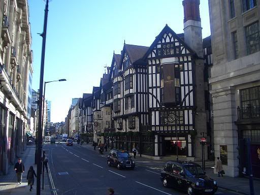
Liberty London Shows Flair for Fashion


Liberty & Co. has long been associated with the Arts and Crafts movement. William Morris' prints have become almost synonymous with the famous London shop, and Oscar Wilde once commented that Liberty was the “the chosen resort of the artistic shopper.”

The recent economic downturn has been difficult for the London store, and Liberty is responding to market pressures by cultivating a slightly more modern design aesthetic. Liberty's CEO, Geoffroy de La Bourdonnaye, is injecting some high fashion flavour into the store through a relationship between Liberty and Hermès.

The iconic french fashion house will be opening a "pop up" boutique in the centre of the store that will feature Hermès scarves and neckties.

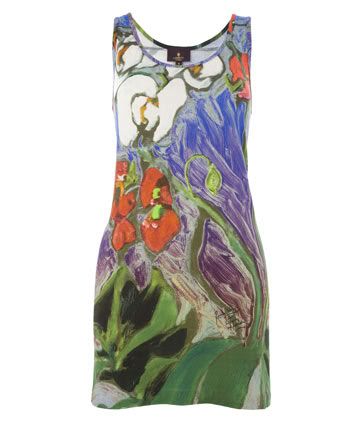
The theme of "romance and rebellion" will be continuing with a series of ready to wear prints created exclusively for Liberty by Rolling Stones rocker Ronnie Wood. Wood, who was last featured on this blog when his daughter married in a Pre-Raphaelite inspired gown, has become respected as an artist in his own right. I particularly enjoyed the print he created for the dress below:


I love Hermès (who doesn't?), and Ronnie Wood's prints do seem like a lot of fun. At the same time, I hope Liberty doesn't lose sight of their fabulous Arts and Crafts heritage in an attempt to remain hip.

Read more at the New York Times

Tuesday, August 18, 2009

William Morris and Islamic Art

Journalist Navid Akhtar has taken an opportunity to examine the influence that Islamic design had on William Morris.

Akhtar argues that Morris' designs are "inextricably linked to the curving sinuous arabesques of traditional Islamic Art," pointing out the strong connection between Morris' work and Turkish ceramics and Persian carpets.

Akhtar goes on to argue that Morris was influenced, not only by the aesthetics of Islamic art, but by the principles that guided that art. He even suggests that Morris' famous decorating maxim "have nothing in your house that you do not know to be useful, or believe to be beautiful,"--is drawn from a saying in the Koran that "God is beautiful and loves beauty".

While this might be a bit of a stretch, it's undeniable that Morris and many of his friends in the Pre-Raphaelite Brotherhood were strongly influenced by Islamic design elements (particularly the repetition and symmetry that can be found in many middle-eastern art). Akhter suggests that many of the notions that Morris held dear--such as the importance of social consciousness, usefulness and beauty in every day objects-- were also common to Islamic art.

I think it was very important to Morris that these ideals were universal, but it's also interesting to see that a new generation of Muslim artists using Morris as artistic inspiration. What are your thoughts?

You can listen to the full radio broadcast at the BBC.

Monday, August 10, 2009

BBC 4 The Pre Raphaelites

For those of you living in the UK, the BBC has released a 3-part documentary series on the Pre-Raphaelites to coincide with Desperate Romantics. Since Desperate Romantics is rather short on historical context, be sure to watch the documentary alongside the costume drama, especially if this is your first introduction to the Pre-Raphaelites.


The documentary, entitled The Pre-Raphaelites: Victorian Revolutionaries, features author Jan Marsh (author of Pre-Raphaelite Sisterhood) and a number of other art historians discussing the PRB's rise to fame, their landscape art and the eventual commercialisation of their work.

I really enjoyed the series, although I found it a little annoying that they kept insisting that the Pre Raphaelite Brotherhood somehow "sold out" when they began to find a market for their art. The series really pushes the notion that the Pre-Raphaelites were somehow the first artists to commercialise their work (and that this was a betrayal of their earlier, nobler ideals). Artists and writers have always wanted to profit from their work. It's pure romantic fantasy to imagine that there was some golden age of art where everyone indulged in art for art's sake without an eye toward profits. The PRB simply lucked out by being in the right place at the right time, and they took advantage of the technology that was available to them. I'm quite sure that if Sir Joshua Reynolds had lived through the Victorian era, he too would have been hawking his lithographs right alongside the former members of the PRB. You will remember that even the socialist William Morris was a businessman! It seems very hard for the BBC to conceive of the possibility that one might simultaneously be a romantic revolutionary and hope to pay the rent.

For those of you living in the UK, several of the episodes are available in streaming video online through the BBC Pre-Raphaelites mini site.

Episode 2, which covers the Pre-Raphaelites approach to landscape art, will be aired again on August 11 at 10:00 pm.

Monday, August 3, 2009

Desperate Romantics - First Impressions

I finally had a chance to watch the first two episodes of BBC's Desperate Romantics with Javier last week. We both really enjoyed it. Overall, I found it highly entertaining (and yes, it was quite accurately described by its producer as "Entourage with easels"). The production was a bit weak on the historical front, but I suppose this was done by the writers to broaden the appeal of the series.

The series focuses on the early years of the Pre-Raphaelite Brotherhood and follows their rise to fame.

I was pleasantly surprised with the casting, particularly that of Lizzie Siddal. The actress who plays Lizzie not only resembles Siddal a great deal, but she also does an excellent job of bringing life and pathos to the character. John and Effie Ruskin are also well-cast, and are more developed than I had anticipated, although the endless speculation about what was wrong with their marriage always gets to me--honestly, nobody has any idea what the problem was (biographers seem to constantly return to the idea that Ruskin was disgusted by Effie's body hair, but how could they know?). Nevertheless, much like the rumours about Michael Jackson, I suppose this gossip is just too juicy for scriptwriters to pass up.

Unfortunately, the characterization of most of the other major players is rather simplistic, though it is in keeping with the rest of the shows' approach. Aidan Turner is handsome and energetic as Dante Gabriel Rossetti, if a bit one-dimensional. William Holman Hunt's character certainly seems to have drawn the short straw in terms of personality. Most biographers of the Pre-Raphaelites tend to consider Hunt a bit of a blowhard, but he's painted with such a broad brush in this production that it borders on the ridiculous. I hope that the writers will add some nuance to his character in the remaining episodes. Perhaps the most promising character so far is that of John Everett Millais, who is played by Samuel Barnett. Millais' character is quite endearing, and it looks like we will be seeing more of him in tonight's episode.

The character I could sort of do without is Fred Walters--a fictional hanger-on that is meant to function as a bit of a window into the lives of the PRB. He's sort of an amalgamation of a number of real-life members of the brotherhood, but I really wish that they had included William Michael Rossetti in the story instead. William Michael has always seemed quite interesting to me, and he certainly did a great deal to contribute to the visibility of the Brotherhood. I suppose the writers felt that adding in another member of the Rossetti family would rob Dante Gabriel of some of his mystique, but I digress.

Overall, I'm definitely enjoying the series. It's so nice to finally see the lives of the Pre-Raphaelites dramatized! Desperate Romantics may fall a bit short on historical accuracy, but the story of the Pre-Raphaelite Brotherhood is so inherently exciting that the show can't help but be enormously entertaining.

I'd be extremely interested to hear from others who've had a chance to see the first few episodes. What were your first impressions? Were you pleased or disappointed? Do you think the show will revive interest in the Pre-Raphaelites?

Monday, July 6, 2009

The Pre-Raphaelites Brought to Life at Preraphaelites.org


The Birmingham Museum of Art (which houses the largest public collection of Pre-Raphaelite Art) has just unveiled their new website, Preraphaelites.org, which promises to offer the most intimate experience of the Pre-Raphaelites work that can be achieved outside of visiting the museum.

The website uses Microsoft’s Silverlight technology, which allows the viewer to expand the artworks as much as possible while maintaining the integrity of the image. It is a spectacular tool, and I can't wait to see more museums adopt this method of cataloguing the works in their collections.

I used Silverlight to take a closer look at Dante Gabriel Rossetti's Beata Beatrix, and I have to admit it was an extraordinary experience. The detail is incredible! I have only had the opportunity to view a few Pre-Raphaelite artworks in person, and this technology does allow you to get much closer to the work than they would ever let you get in person. (Even more than in France, where they are extremely permissive of museum guests getting quite close to the paintings!).

In addition to allowing you to see the finest details of many of the works in their collection, the website also points you to related works. In the case of Beata Beatrix, this leads you to a number of sketches of the work. They also seem to offer more detailsa about the works than other museum websites do, and if you register for the website, you can even discuss the paintings with other art fans online.

I originally heard about this project thanks to an email from the Communications Officer for Environment & Culture at the Birmingham City Council. I am so glad they emailed me and that the Council is getting the word out about this great resource! I can see why the Birmingham City Council is quite proud of this site. It really offers a unique opportunity for art lovers across the globe to see these works "up close and personal" and I think the site will generate a lot of tourism once people see what the museum has to offer.

Of course, nothing can replace the experience of seeing these works in person, but this new website does get awfully close. And for those of you planning to visit Birmingham Museum and Art Gallery, I strongly urge you to visit this website first. If there are any artworks you are hoping to see in person, you can actually request a viewing through the website! This is an amazing service. I'm used to having to write to museums, but this tool makes the entire process so much easier (plus it makes it seem like they actually want to let you see the works!). This is especially important to do if there are any lesser-known sketches that you would like to see in person, as these might be in storage at the time of your visit. Again, I can't possible stress enough what a great resource this is!

Kudos to the Birmingham Museum and Art Gallery for these great tools. It's so great to see museums putting their catalogue online and taking advantage of new technology that compliments, rather than detracts from, the artwork. I am a firm believer that giving public access to artwork generates a tremendous amount of interest. I hope this great site makes a new generation fall in love with the work of the Pre-Raphaelites.

Image courtesy Birmingham Museum of Art.

Thursday, June 25, 2009

Pre-Raphaelite Art at the Delaware Art Museum


I'm always on the lookout for great Pre-Raphaelite art online, and yesterday I came across the Delaware Art Museum's fabulous Pre-Raphaelite art gallery, which features the collection of Samuel and Mary Bancroft. The Delaware Art Museum has the largest permanent collection of Pre-Raphaelite works in the United States. The museum maintains their collection through the generous support of the aptly-named "Rossetti Circle" of art patrons. I would definitely join if I lived anywhere near Delaware! Anyway, it's a lovely, well put together website with an extensive collection of photos of Pre-Raphaelite art and art objects. I highly recommend taking a moment to enjoy what they have to offer.

I was particularly impressed by the Delaware Art Museum's education packet on the art of the Pre-Raphaelites. It's available for download here. This curriculum package covers the Pre-Raphaelites, William Morris and the Arts and Crafts Movement, The Aesthetic Movement--and pretty much everything else that is important to the study of Pre-Raphaelite Art. It's one of the best resources of it's kind that I have come across, and far superior to many books that I've read on the subject! If you are looking for some more information on the topic of the Pre-Raphaelites, it's definitely a great place to start.

Sunday, November 2, 2008

Edmonton Opera's Production of Wagner's The Flying Dutchman

Flying Dutchman
Last week the Edmonton Opera's season began with an ambitious production of Richard Wagner's The Flying Dutchman. I wasn't quite sure what to expect from our small opera company, but I was impressed! Overall I think it was a great success, although there were some inevitable hiccups.

First of all, the music was gorgeous: my husband and I were both captivated from the moment the orchestra started playing. Once the the curtain went up, many of the cast members had a difficult time being heard above the orchestra, which I suppose is an occupational hazard of performing Wagner. Thankfully, the Dutchman (Jason Howard)and Senta(Susan Marie Pierson)had voices that were capable of standing up to the music. I personally felt that Senta stole the show. From the moment she began singing(Act 2), she really demonstrated what a more powerful voice could do with the music. The chorus numbers were another highlight, as the larger number of voices meant that the singers weren't going to be drowned out by the music.

The Flying Dutchman tells the story of a sea Captain who is condemned to wander the seas for all eternity. Once every seven years he is permitted to leave the ship in order to search for a woman who can be faithful to him until death. If he accomplishes this task, he will be freed from the curse. Unfortunately, although he has been trying for hundreds of years to find such a woman, all of them have proved unfaithful (quite a sad commentary on womankind!).

One thing that constantly impresses me about the Edmonton Opera is the great set designs that they consistently manage to pull off. This time they staged the entire production in a Shaker-style meeting hall on stilts that appeared to be tilted dramatically. I kept wondering how the cast members managed to maneuver around the stage without falling down! It really was quite extraordinary.

Ultimately, I was very happy to see an opera like this being staged in Edmonton. Doing Wagner is always difficult, but I think it was definitely worth it. Hopefully we'll get the chance to see more Wagner in Edmonton!

"The Flying Dutchman" by Albert Pinkham Ryder courtesy Wikimedia commons.

Friday, October 17, 2008

Albrecht Durer Exhibit at the Edmonton Art Gallery

Photobucket
Last Thursday evening my husband and I headed to the Edmonton Art Gallery to take in the last of the Albrecht Durer exhibition. I'd been meaning to go for ages, but I'd never had the time.

This was my first visit to the Art Gallery of Alberta. I have to say I was rather disappointed. The exhibit itself was rather nice--the gallery had a large selection of Durer's prints, with some fairly good notes on the exhibition. But the overall atmosphere of the museum was lacking. Perhaps this was because the AGA is undergoing renovations, and the museum is currently being held in another location (the old Hudson's Bay Building in Downtown Edmonton).

The other thing that took me by surprise was the Museum's stand on photography. While taking a picture of one of the prints with my cellphone, I was informed by one of the museum's overzealous staff members that photography was not permitted in the museum. I had not seen the sign at the museum's entrance that said we couldn't take pictures, so I innocently reassured the fellow that there was no flash. It didn't matter, he informed me, visitors could not take photographs due to copyright reasons.

Now, being a blogger, I am fairly up to date on copyright issues. There cannot be any copyright on Durer's work--it's been nearly 500 years since his death! Nevertheless, one could hold copyright on Images of Durer's work, so the museum is apparently trying to ensure that they have the only images of the work and that public will have to pay for copies of their images--which is just silly, given the fact that there are numerous copies of Durer's work in the public domain (such as the one included in this post).

I honestly have never been to a museum that did not allow non-flash photography, so I was a little taken aback. Nearly every museum in Europe allows photography, so long as there is no flash used (which makes sense, right? Museums are supposed to protect art, not keep it from the public). I do realise that keeping the public from taking flash photography can be rather challenging. I have seen priceless works of art at the Louvre being snapped with full flash, and it always makes me cringe (especially since there are signs EVERYWHERE telling people not to take flash photos). As a result, I can understand why some museums might be tempted not to permit photography at all. Nevertheless, I believe it's important to allow photography. It's important that museums be exciting, open places--The AGA is more like a tomb where art goes to die.

But back to the art. The prints were spectacular. Both of us were amazed at the depth of Durer's prints, given the fact that he was born just twenty years after the advent of the printing press! Javier's favourite was Melencolia, simply because it had so much symbolism to dissect! It was fascinating.

I have a question for you all! One aspect of Melencolia wasn't explained in the gallery's exhibition notes. That was the grid in the upper right hand corner of the painting. It reminds me a little of Sudoku. The numbers all add up to 34 in every direction, but that's all I know! If anyone knows what it is, I would love to hear from you!

(image courtesy of Wikimedia)

Saturday, October 11, 2008

The Pirates of Penzance

There is no better satire of Victorian life than the musicals of Gilbert and Sullivan. And while I enjoy all of Gilbert and Sullivan's musicals, I definitely have a soft spot for Pirates of Penzance.

I never get tired of watching the 1983 film adaptation of Pirates of Penzance, starring Kevin Kline. It tells the story of Frederick, an upstanding young man who happens to have spent his youth among pirates. On his 21st birthday, he announces that he is going to leave piracy behind and devote himself (albeit regrettably) to the "extermination" of his former friends. Once he falls in love with a girl, whose father is a Major General. Everything seems to be going well for Frederick until his former pirates friends show up and hilarity ensues.

In the end, the girls' father, General Stanley, proves himself a "model of a modern Major General" by accepting the pirates, who, after all, "with all their faults" still "love their Queen." It turns out that what they really crave is to settle down for a life of "unbounded domesticity." Of course, it doesn't hurt things when it turns out the pirates are actually peers of the realm. Being a rather dotty, social climbing member of the nouveau riche, the General immeadiately instructs the pirates to: "resume your ranks and legislative duties, and take my daughters, all of whom are beauties!"

There is no question that Kevin Kline steals the scene as the Pirate King. His sense of humor and ability is reminiscent of his peerless work in A Fish Called Wanda. His on-stage athletics are pretty impressive as well!


My sister and I watched this film more times than I could possibly count--50 at least. One of our favourite activities was attempting to sing "I am the very model of a modern Major General." Not an easy feat! The following scene includes both "Modern Major General" and the General's little song about being an orphan--which of course instantly melts the pirates' hearts (being orphans themselves, and good Englishmen at heart, they are doubtless well-schooled in the works of Dickens. It would be unthinkable to rob an orphan of his only company).

Monday, August 18, 2008

Possessed: Announcing a New Pre-Raphaelite Musical!


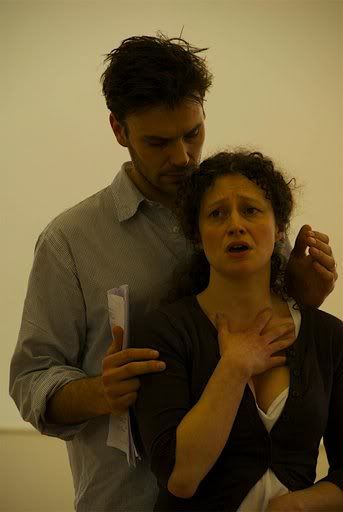
What do you get when you combine Pre-Raphaelite art, an infamous love affair, and music? Possessed is a new musical that examines the life of Jane Burden, from her discovery by Dante Gabriel Rossetti to her meteoric rise to become one of the most popular and iconic models of her age, almost omnipresent in the paintings of the Pre-Raphaelites, particularly those of Dante Gabriel Rossetti. Possessed focuses on the relationship between Jane, her husband William Morris ("Topsy") and Rossetti. The full cast also includes Bessy, the Morris's housekeeper, Lizzie Siddal, Mr. Carter (the foreman of Morris & Co.), and Jane and William Morris’ two daughters, Jenny and May.

Playwright Teresa Howard became inspired to research Jane’s story following a William Morris exhibit at the Victoria and Albert Museum back in 1996. For Possessed, Howard (who has written a number of other plays) has teamed up with composer and arranger Steven Edis, who has written and arranged music for numerous theatre and television productions.

Not surprisingly, art plays a central role in the production. During the course of the musical, stained glass windows depicting the tale of Tristan and Isolde are constructed on stage, symbolising the close relationship between art and life and alluding to the link between the story being played out on stage and the story of Tristan and Isolde.

The musical was presented on April 27 at the Oxford Playhouse and was a great success, generating a great deal of interest in the project. Hopefully full scale production of the musical will begin at the end of next year...I can’t wait!

To learn more about this production, visit the The musical's official website. For up to the minute news and information, visit their blog, Putting it Together.

Rehearsal photo of Anna Francolini as Jane Morris and Joseph Millson as Dante Gabriel Rossetti

Rehearsal Photo by Charles Girdham © 2008, reprinted with permission of Teresa Howard