While the Pre-Raphaelite Brotherhood regarded Jane Morris as a "stunner" it took a while for the rest of the world to accept her unusual beauty. In a time where conventional standards of beauty were powerful and unbending, Jane's strong features challenged the norm. Many regard the Pre-Raphaelite models as the first supermodels. They were certainly among the first to popularize a long, lean silhouette in a time when extreme curvaceousness was in vogue.
Jane Morris was a celebrity in the art world, and stories of her rare beauty and delicate constitution seem to have spread like wildfire. When novelist Henry James came to visit the Morris family in 1869, he seems to have been particularly fascinated by Jane and commented extensively on her appearance:
"Imagine a tall lean woman in a long dress of some dead purple stuff, guiltless of hoops (or anything else, I should say), with a mass of crisp black hair heaped into great wavy projections on each side of her temples, a thin pale face, a pair of strange, sad, dark Swinburnian eyes, with great thick black oblique brows, joined in the middle and tucking themselves away under her hair, a mouth like the "Oriana" in our illustrated Tennyson, a long neck, without any collar, and in lieu thereof some dozen strings of outlandish beads"(61-62).
The praise reserved for Jane Morris is rather remarkable. After meeting Jane at Kelmscott House, Bruce Glasier, a Scottish socialist exclaimed:
"I had heard of her great beauty and had seen her portrait in some of the reproductions of Rossetti's pictures, but I confess I felt rather awed as she stood up tall before me, draped in a simple white gown which fell from her shoulders down to her feet. She looked like a veritable Astarte--a being, as I thought, who did not belong to our mortal world"(85).
Of course, Jane Morris' looks did not appeal to everyone, and many were highly critical of her strong features and artistic style of dress. And even fans of the style admitted that it was a welcome fashion trend for women who were not conventionally beautiful. Mary Eliza Haweis, a woman's rights activist, and author of The Art of Beauty and The Art of Dress, confessed that the Pre-Raphaelites were "the plain girl's best friends." She declared that
"Morris, Burne-Jones and others, have made certain types of face, once literally hated, actually the fashion...A pallid face with a protruding lip is highly esteemed. Green eyes, a squint, square eyebrows, whitey-brown complexions are not left out in the cold. In fact, the pink-cheeked dolls are no where; they are said to have "no character" and a pretty little hand is voted characterless too. Now is the time for plain women. Only dress after the Pre-Raphaelite style and you will be astonished to find that so far from being an "ugly duck" you are a full fledged swan"(88-89).
Jane Morris actually reminds me of Audrey Hepburn, in a way. At the time when Audrey Hepburn became a star, voluptuous women were the beauty standard and long, lean women like Hepburn were often regarded as rather plain. Audrey always argued that her look was very "attainable." She once said that "Women can look like Audrey Hepburn by flipping out their hair, buying the large sunglasses, and the little sleeveless dresses.”
Work cited: Debra N. Mancoff. Jane Morris: the Pre-Raphaelite Model of Beauty San Francisco: Pomegrantate, 2000..
Monday, March 31, 2008
Jane Morris and Pre Raphaelite Beauty
Friday, March 28, 2008
St Bride by Duncan
John Duncan painted St. Bride in 1913. As with most of his works, it deals with Celtic themes. The painting depicts St. Bride or St. Brigit, patron saint of smithcraft, poetry, and healing. In ancient times, Brigit was the Celtic goddess of fire. When Christian missionaries arrived, they had a hard time persuading the people to stop worshipping Brigit, so they gave up and turned her into a saint. Duncan's painting highlights the continuity between the pre-Christian and Christian periods, using celtic motits in the landscape and in his subjects' clothing, while maintaining a contemplative mood in the painting.
Also, like many of his works (including Tristan and Isolde), St. Bride was composed of tempera on canvas. During Duncan's time, using tempera was rather rare--it had been popular during classical times and the middle ages but was largely replaced by oil paint in the modern age. Tempera is actually made of egg yolks mixed with pigments. Although Tempera colours are not as deep as oil paint, they do not fade or change with age. Did you know that many of the cave paintings in Europe were painted using tempera?. Many mummies were also decorated with tempera paint. Duncan's frequent use of tempera set him apart from many of his contemporaries and demonstrated his dedication to the Pre-Raphaelite/Arts and Crafts ideals of a return to nature.
John Duncan also designed this graphic, which was used by Patrick Gedde's magazine, The Evergreeen. Does it remind you of any other corporate logo? 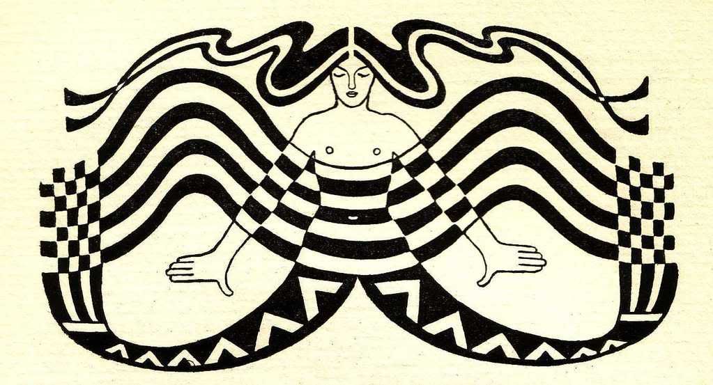
Thursday, March 27, 2008
John Duncan's Tristan and Isolde
Today I thought I'd share a bit about John Duncan. While Duncan does not have a great deal of name recognition, I'm sure most of you will recognize his painting of Tristan and Isolde, which is probably his best known work. 
Most of John Duncan's works show a strong Pre-Raphaelite influence, and he was extremely fond of painting Celtic subjects. Duncan (1866-1945) was born in Dundee, Scotland. The son of a cattle dealer, Duncan displayed talent for art very early and was enrolled at the Dundee School of Art at just eleven years of age. He spent much of his early adulthood traveling through Europe and studying the works of great artists, including Michelangelo, whose influence can be seen in his paintings.
Like many of our dear artist friends, Duncan seems to have led a rather unconventional, romantic and tragic existence. He was well known for claiming to hear "fairy music" while he painted--though what, exactly, he meant by this is not entirely known.
What we do know is that he fell desperately in love with a young girl who claimed to have fished the Holy Grail out of a well in Glastonbury. In spite of the heady romanticism of it all, their marriage ended tragically when Duncan's wife left him and took their daughters with her to South Africa.
It's a shame that Duncan seems best remembered for these two odd anecdotes. He produced a number of beautiful paintings that are still respected today (I will be posting some more tomorrow). In his own day, Duncan was well known for his writing on art, and was especially recognized for his work concerning children's art education. He also was a regular contributor to Patrick Gedde's influential magazine, The Evergreen. I would love to do more research on Duncan, but I've had some difficulty, as it appears that few books have been written about him. If anyone has come across a biography, let me know! Perhaps I'll have to be the first to write one!
Wednesday, March 26, 2008
Wren and Willow Interior Decorating and Design
![]()
Flipping through the pages of magazines like House and Garden and Architectural Diegest, I'm always disappointed at the showiness and general disposability of most home decor. If you watch decorators on the House and Garden network, it always seems people use a designer to help them apply the latest trends in decorating to their homes. Then twenty years later (often less), their homes are outdated and again require the services of an interior decorator. The whole process seems to me to be incredibly wasteful, and it's made me rather hesitant to encourage the idea of using an designer.
Well, I am happy to report that not all designers are there to encourage you to buy into flash-in-the-pan decorating trends! 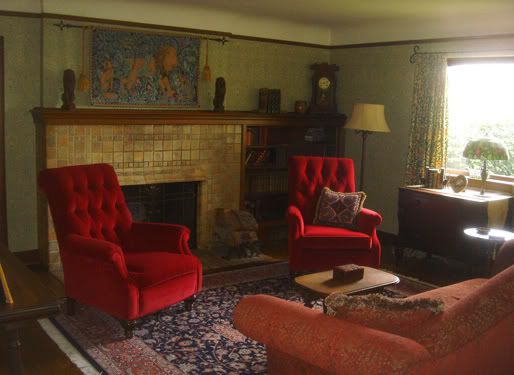 Yesterday I heard about this wonderful site from a highschool friend. Wren and Willow Interior Decorating and Design is a small interior design firm inspired by the William Morris maxim "Have nothing in your houses you do not know to be useful, or believe to be beautiful." The company's design projects have a decidedly Arts and Crafts flair, and promise to complement your home's architecture while "bringing the beauty of nature inside the home" to "create a warm and inviting atmosphere."
 I must say, I'm blown away by the use of these beautiful William Morris wallpapers and textiles. I particularly love the living room, where they're using "willow" wallpaper, "honeysuckle" curtains and the lion above the fireplace is of course from William Morris' Forest Tapestry. The tiling around the fireplace is also lovely. What a beautiful retreat! And the beautiful decor in these homes is timeless. If you love something, why not keep it forever?
Tuesday, March 25, 2008
Pre-Raphaelite Visions of Penelope
JR Spencer Stanhope was a follower of Pre-Raphaelite Painter Edward Burne Jones. I love his paintings, though critics have often noted that he was not as subtle an artist as Burne Jones. He is noted for his bold use of colour, which unfortunately doesn't come across in this copy of his painting Penelope, which he finished in 1864. The Pre-Raphaelites were a rather close knit circle, as you may have noticed, and Stanhope was actually Evelyn de Morgan's uncle!
Stanhope's Penelope is one of those paintings that has a real way of capturing the emotions of characters in a classic tale. As you will recall, Penelope was the wife of Odysseus in Homer's Odyssey, who waited patiently for him throughout his long travels. She is often associated with the virtue of faithfulness, since she remained dedicated to her husband in spite of the hoards of suitors that dogged her in his absence.
Penelope waited 20 long years for Odysseus to return from fighting the Trojan War. Stanhope's painting portrays Penelope weaving Odysseus' burial shroud (which you will notice is nearly complete--Peneope had promised her suitors that she would remarry once it was complete--but she tricked them by removing some of the stitches every night).
After Penelope's trickery is revealed, she meets an old beggar (Odysseus in disguise, of course). After a long talk with him, she concludes that she will only marry the man who can re-string Odysseus' bow and use it to shoot an arrow through 12 ax handles. After a series of dismal failures on the part of her suitors, Odysseus of course succeeds in a triumph somewhat reminiscent of Arthur's feat of removing the sword from the stone. He reveals himself to be her long lost husband, and after a final identity test, they are reunited.
This painting seems to capture Penelope's sadness quite well! The painting emphasises her emotions, whereas JW Waterhouse's portrays her dedication to her craft. In my opinion his painting is somewhat more artful than it is thoughtful. I love both paintings, but in this case, I think Stanhope's Penelope is my favourite.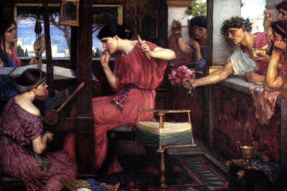
Monday, March 24, 2008
C.S. Lewis on Technology and Natural Law
"What we call Man's power over Nature turns out to be a power exercised by some men over other men with Nature as its instrument."--C.S. Lewis in The Abolition of Man
It's no secret that I love technology. I got my first computer back in University and I've hardly looked back since. Email is an indispensable tool. Without Facebook I would never be able to keep in touch with a lot of my friends. I love my ipod too! I wonder how I ever survived riding public transport without it.
Nevertheless, despite my abiding affection for the convenience of technology, I believe it raises serious concerns. I am not prepared to go as far as William Morris, who would have preferred to revert to as technology-free a world as possible. For one thing, even the stone-age utopia described in News from Nowhere includes technological innovations, however basic. Similarly, while I respect the Amish and way of life, I don't think it's possible to draw a line in the sand that will determine at which point technology becomes unacceptable (should we draw the line at electricity? Steam engines?). And I don't think that fleeing from the problem helps us address the root of the problem.
The problem with technology is, as Lewis points out in Abolition of Man, that “each new power won by man is a power over man as well.” For every benefit gained through new technologies, there is a price paid to those in power. For example, Facebook brings us closer to old friends, but this benefit often comes at the cost of our privacy (if you haven't heard of Beacon yet, give it a google--oh, wait a minute...that just feeds the system!). As Nicholas Carr has pointed out, the web is, at best, amoral. The reality of "man's power over man" in the world of technology is terrifyingly obvious. And short of homesteading in Alaska or Northern Canada (minus my blog, of course) it's impossible to escape. So what's a girl to do? Since I'm not about to give up my laptop, ipod or Facebook, I guess I'll have to think of another way to come to terms with my consumption of technology.
Back to C.S. Lewis. In The Abolition of Man, Lewis addresses the soul-sucking status of modern education. As Lewis wrote this series of lectures during World War Two, modern educators were busy trying training schoolchildren to see a world stripped of all the emotions and sentiments that might cloud their judgement--to a see a world beyond good and evil where costs and benefits were the ultimate measure of success. If we teach children moral relativity, we shouldn't be surprised when, Zuckerberg-like, they grow up to invent technologies that spy on us for their own financial gain. In this sense, I would have to pinpoint our liberal democratic educational system as the root of most of our problems as a society, including our runaway technologies. By positing self-interest as the highest good and permitting moral relativism, they promote dangerous narcissism.
What was Lewis' prescription for the self-interest that represents the malaise of modernity? The Tao, or Natural Law. The Tao is the law in our hearts. It is "the doctrine of objective value" "the belief that certain attitudes are really true, and others really false, to the kind of thing the universe is and the kind of things we are" (Lewis). Although the notion of the Tao might seem a bit quaint to those of us reared in the school of scientific materialism, it has a lasting appeal that is difficult to escape.
For Lewis, knowledge of the good is the beginning of critical thinking. Before we can properly engage in the modern world, we need to know what is true, good, and beautiful and be able to recognize it when we see it.
Our society has exchanged the mysteries of creation (man’s humanity, in particular) for knowledge about their quantitative processes. This doesn't mean that we as a society need to reject innovations and attempt to return to a pre-modern way of life. It means that there is value in retaining moral absolutes. Moreover, it means that we as a society need to return to reverence for the value, not only of creation itself, but also of humanity itself. Technological innovations need to be evaluated in terms of their continuity with the law that is written on our hearts and be used in a way that does not violate that law.
Sunday, March 23, 2008
An Easter Carol by Christina Rossetti
Happy Easter, everyone! I ran across this lovely Easter poem by Christina Rossetti this morning. Christina Rossetti was of course Dante Gabriel Rossetti's sister and a celebrated poet. She also served as a model for brother's paintings and played a role in the Pre-Raphaelite Brotherhood's inner circle.
An Easter Carol by Christina Rossetti
Spring bursts to-day,
For Christ is risen and all the earth’s at play.
Flash forth, thou Sun,
The rain is over and gone, its work is done.
Winter is past,
Sweet Spring is come at last, is come at last.
Bud, Fig and Vine,
Bud, Olive, fat with fruit and oil and wine.
Break forth this morn
In roses, thou but yesterday a Thorn.
Uplift thy head,
O pure white Lily through the Winter dead.
Beside your dams
Leap and rejoice, you merry-making Lambs.
All Herds and Flocks
Rejoice, all Beasts of thickets and of rocks.
Sing, Creatures, sing,
Angels and Men and Birds and everything.
All notes of Doves
Fill all our world: this is the time of loves.
Friday, March 21, 2008
The Beautiful and the True
"When public taste seems plunging deeper into degradation day by day, and when the press universally exerts such power as it possesses to direct the feeling of the nation more completely to all that is theatrical, affected, and false in art...it becomes the imperative duty of all who have any perception of knowledge of what is really great in art, and any desire for its advancement in England, to come fearlessly forward, regardless of such individual interests as are likely to be injured by the the knowledge of what is good and right, to declare and demonstrate, wherever they exist, the essence and the authority of the Beautiful and the True." (John Ruskin, Modern Painters I., 3.4). 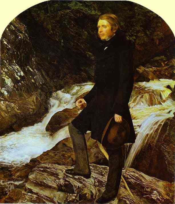
John Ruskin made this statement in May 1843, when he was just 24 years old. By the time of his death in January, 1900, his call for a return to "the Beautiful and the True" had come to represent one of the formative statements of the Victorian age.
Now here's a ribald tidbit: The Painting of Ruskin is by John Everett Millais, who had an affair with Ruskin's wife Effie shortly after completing this portrait. Effie later had her marriage annuled on the grounds that John Ruskin was "incapable of conusmmating" their marriage "by reason of incurable impotency." Effie and Millais were married one year later. Oddly enough, in keeping with the Pre-Raphaelite tradition of Rossetti and Morris, Millais and Ruskin remained friends!
Thursday, March 20, 2008
Petition on Behalf of William Morris Gallery
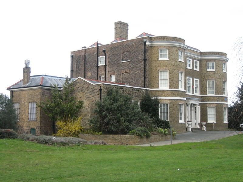
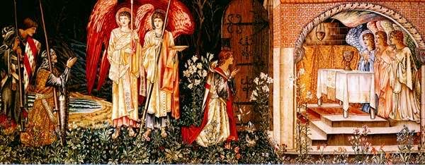
Edward Burne Jones' Holy Grail Tapestry (discussed in yesterday's post) is set to go to auction this evening. It's presence at the auction has caused quite a stir, and fans of William Morris' art have decided to use the recent media publicity that the auction has generated in order to give attention to the plight of the William Morris gallery.
The BBC reports that today as the Morris and Company tapestry goes to auction at Sothebys for £1 m pounds, a petition containing 11,000-signatures will be presented to the Waltham Forest Council, asking them to increase opening hours and hire more staff.
William Morris was a leading figure in the Arts and Crafts movement, known for his writing as well as his contributions to the art world. The museum and gallery is located at Walthamstow in what was Morris's family home from 1848 to 1856. The museum has been open since 1950 and contains £60 m worth of his work.
Unfortunately, the museum's hours have been drastically reduced in recent months, and the museums long time curator was sacked by the Waltham City Council because they felt it wasn't worth paying the money to keep him. I can understand why people in North America might not fully appreciate William Morris' contributions to the art world, but it seems hard to believe that the city council in Waltham--where Morris grew up, can't grasp the importance to keeping a museum dedicated to his work. I certainly hope that the petitioners are successful. I signed the online petition a couple of months ago.
In closing, I would like to extend my apologies to anyone who was trying to access my blog this morning! I was trying to switch over to publishing on a custom domain, but it didn't exactly work. I think I actually did it correctly, but it takes a day or two to update the DNS, and I really don't want to have to wait that long. I've learned my lesson...do stuff like that at night!
Wednesday, March 19, 2008
Led Zeppelin and Pre-Raphaelite Art
It turns out that gifted Led Zeppelin guitarist Jimmy Page has a thing for Pre-Raphaelite art! I read the news on Pre-Raphaelite Sisterhood yesterday and decided to do some more research into Jimmy Page's art collection.
I can't say that I'm that surprised...if you've ever listened to Led Zeppelin's music, you've probably noticed that the band was heavily inspired by Medieval/fantasy themes. Lead singer Robert Plant's favorite book was the Lord of the Rings and it's evident in their music. A number of their songs reference material from Lord of the Rings, including "Over the Hills and Far Away," "Misty Mountain Hop," "Battle of Evermore," and "Ramble On", with "Ramble On" being the most explicit.
Jimmy Page has stepped beyond admiration for the medieval and has become an avid collector of Pre-Raphaelite art (including at least one painting by Dante Gabriel Rossetti). All of this has come into the news in the last couple of days as Page plans to auction one of the tapestries in his collection at Sothebys--the final scene from Edward Burne Jones' Holy Grail Tapestry (pictured above).
The piece is expected to fetch around $2 million at auction. It was originally designed by Sir Edward Burne-Jones and woven by Morris and Company's tapestry weavers. It took three weavers a full two years to complete. **edit**I guess it depends on who you ask. The New York Times reports that the 24 foot wide tapestry actually took eight men two years.
According to Page's art dealer-to-the-stars, Paul Reeves, (who has many hats, it appears--he also designed clothing for the Rolling Stones and Beatles, but has been a full time art dealer since 1976) Page is forced to sell because the wood panels on his Thames Mansion are too weak to support the tapestry. It seems more likely that he is in financial trouble, since he also plans to sell a gigantic set of Arthurian round table and chairs, and two sideboards at the same auction.
source: cbc.ca
Tuesday, March 18, 2008
Voluntary Simplicity
I've been thinking about voluntary simplicity a lot for the past couple of days, except I wasn't aware of an actual movement. It started with a conversation my husband and I had about "affluenza." We both love beautiful things and want a lovely home, but we feel strongly that living in debt is too high a price to pay. We want to be debt-free and feel that this is one of the greatest gifts we can give our kids. After all, money is one of the biggest issues in most marriages, so why live beyond our means when we know it's one of the leading causes of marital strife?
Later, I came across the idea again while doing research for my other blog, Greener Chic. After writing about Tasha Tudor's simple lifestyle, I decided to poke around and see what grassroots movements existed that seemed similar.
After looking around, I found the book Your Money or Your Life . I think I'm going to get the book! The whole idea was reminiscent of William Morris' News from Nowhere, so I did a google search on the Arts and Crafts Movement and voluntary simplicity and came across this post by my friend Paula at The Beautiful Life! Great minds think alike, I guess!
There's nothing new under the sun, and "Voluntary Simplicity" is of course just a new name for a very old idea. Living simply has been advocated by many people throughout history, at least as far back as Jesus Christ himself.
I love Morris' vision of a more simple future, where people embrace a less complex existence:
"There were houses about, some on the road, some amongst the fields with pleasant lanes leading down to them, and each surrounded by a teeming garden. They were all pretty in design, and as solid as might be, but countrified in appearance, like yeomen's dwellings; some of them of red brick like those by the river, but more of timber and plaster, which were by the necessity of their construction so like medieval houses of the same materials that I fairly felt as if I were alive in the fourteenth century; a sensation helped out by the costume of the people that we met or passed, in whose dress there was nothing "modern"."--News from Nowhere
I'm not sure if Morris' vision of the future will ever come to pass, but it would be nice! Especially when I look around my city and see cardboard McMansions going up in droves.
Monday, March 17, 2008
Tasha Tudor
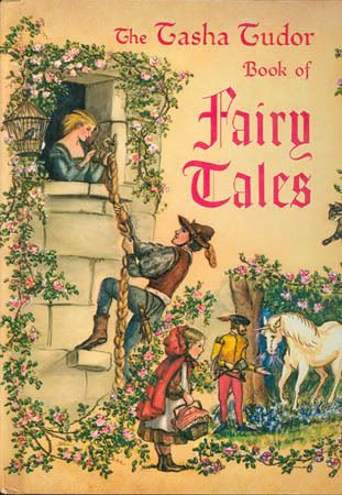 One of my favourite memories from childhood is of reading Tasha Tudor's beautifully illustrated books with my Mom. Some of my favourites were A Time to Keep, A is for Annabelle, Mother Goose, 1 is One and The Tasha Tudor Book of Fairy Tales--my favourite!
Tasha Tudor's Book of Fairy Tales was one of the first books I brought from home when I got married. Whenever I have time, I love taking a few minutes to read one of the short fairy tales and glance at the pictures.
Tasha Tudor is an inspiration to me. She's something of an icon, not only for her beautiful drawings--which grace the pages of more than one hundred children's books--but also for her simple lifestyle. I was captivated the first time I read about her way of life in a profile written in the pages of Victoria magazine (I can't recall the issue). 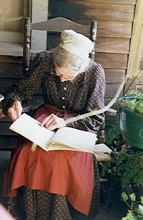
Tasha Tudor almost seems to have emerged from the pages of William Morris' utopian novel, News from Nowhere. Like Morris, she has spent her lifetime creating a more beautiful world through her passion and creativity. Tasha spends her days spinning and weaving flax into cloth, sewing beautiful old fashioned dresses, cooking on a woodstove, making her own candles, tending her goats, gathering fresh eggs from her chickens and growing vegetables in her garden.
Cellar Door Books is probably the best place to locate used or out of print books illustrated by Tasha Tudor, as well as pieces of her original artwork. I wish I had the money to buy one of her original works of art! They are so lovely! And quite affordable, when you think about it. You can also visit the Tasha Tudor and Family website to see what new things are going on in the Tudor family!
Thursday, March 13, 2008
Walter Crane
Well, it's been a busy week! I've been teaching tutorials all this week and I'm afraid I've neglected my blog!
Tonight I've decided to write a bit about Walter Crane, who is perhaps best known as an illustrator of fairy tales and children's books. Although Walter Crane is not as well known as William Morris, they were friends and Crane was a key character in the Arts and Crafts movement. Like Morris, Ruskin and others, Crane oftened lectured on drawing and design and was the art director at Reading College.
Crane's work was not well received by critics, which is perhaps why he turned to illustrating children's books. His drawings have a strong Japanese influence and are also reminiscent of Kate Greenway's work. He also collaborated with William Morris on illustrations for the Kelmscott book The Story of the Glittering Plain.
I love this quote from Walter Crane wrote about the Arts and Crafts Movement. He had a real passion for beauty that shows though in his writing:
The movement represents in some sense a revolt against the hard mechanical conventional life and it's insensitivity to beauty. It is a protest against that so called industrial progress which produces shoddy wares, the cheapness of which is paid for by the lives of their producers and the degradation of their users. It is a protest against the turning of men into machines against artificial distinctions in art, and against making the immediate market value or possibility of profit the chief test of artistic merit. It also advances the claim of all and each to the common possession of beauty in things common and familiar.
Later in life, Walter Crane moved beyond painting and drawing and moved on to designing sculptures, wallpaper, stained glass and textiles. The image at the right is actually one of his wallpaper designs. How beautiful!
Monday, March 10, 2008
The French Revolution as Seen Through the Lens of Classic Hollywood
Well, I had a busy weekend! We went snowboarding again on Friday—I can tell I’m improving, but I still fell down a couple of times (ouch!).
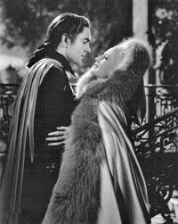
I saw the greatest old movie today! I’m a huge classic film fan and I can’t believe I’ve never seen the 1938 version of Marie Antoinette, starring Norma Shearer and Tyrone Power. Although it has its moments of melodrama (it is an old movie, after all) I actually preferred it by far to the new Kirsten Dunst version. I particularly enjoyed Robert Morley’s portrayal of Louis XVI and John Barrymore as the dying Louis XV I’m a sucker for the black and white costume films that MGM produced in the 1930s—they are simply luscious! The costumes are not terribly historically accurate—but they are a great example of the glamorous costume design that makes classic movies such a joy to watch. 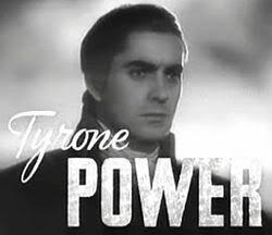
As a historian, I readily acknowledge that there are gaping historical “holes” in every film adaptation of Marie Antoinette’s life, but this one is charming and unpretentious (the fictitious love story between Marie Antoinette’s character and Tyrone Power adds some spice). Although it touches on her girlhood, it examines Marie Antoinette’s later life in more detail than the sprawling 2006 version. Much like the newer film adaptation, the tale is generous in its portrayal of the queen and the French people are generally depicted as a crazed and unruly mob.
In closing, I must confess to a certain fondness for stories about the French revolution. Most of what I've read and seen tends to portray the revolution in a highly unflattering light (I think every one of the authors wrote with a copy of Edmund Burke’s Reflections of the Revolution in France in one hand). I suppose writers saw the French Revolution as a good place to draw the line on revolutions (since the American revolution gets fairly positive press). The Scarlet Pimpernel was another of my favourite books growing up, and I adore the 1934 film version starring Leslie Howard and Merle Oberon (she is so incredibly elegant as Marguerite Blakeny!). A Tale of Two Cities is, of course, another must read/see. Again, the 1935 version is, in my view, the best, (Ronald Coleman's rendition of “Tis a far far better thing” speech is classic).
Friday, March 7, 2008
Bad Art and the Rise of Thomas Kinkade
I remember the first time I saw a Thomas Kinkade painting. My family was dining with a family from our church. At first, I thought it was the work of Mrs. Jones(name changed to protect her identity!). She replied that this was an original piece of art by the famous Thomas Kinkade that they'd been saving for for years. I was a little puzzled. I thought it looked like the paintings done by one of our neighbours, who took art classes to escape afternoons with her two dreadful toddlers. Why would they pay so much money for something that looked so...strange and amateurish?
Kinkade's art is pure kitsch, which is defined as "a tasteless copy of an existing style." Other members of this category include velvet paintings of Elvis and the hideous plaster statues posed ready to strike on suburban lawns (a natural successor to plastic lawn ornaments and those dreadful garden gnomes).
I read a fabulous review of Kinkade's art the other day by KNS Mare, entitled "A Critical Review of the Art of Thomas Kinkade." Mare points out several of the most disturbing aspects of Kinkade's paintings:
1. Every orifice in the pictures seems to exude what Mare describes as a "hellish glow" (which I can assume is the reason Kinkade is heralded as the "painter of light").
2. Chimney's are everywhere in his paintings. Have you ever noticed this? And the fires are burning whether its mid-August or January.
3. The vast majority of his paintings contain no people! This might be less disturbing if he was a classic landscape painter, but he isn't. Actually, I can tolerate his landscape paintings--they aren't bad. It's the creepy houses with no people that disturb me.
Clement Greenberg, wrote in 1939 that "Kitsch is mechanical and operates by formulas. Kitsch is vicarious experience and faked sensations." Kinkade's art certainly qualifies according to this. He is a superb marketer who sold 700 million dollars worth of merchandise in 2001. He might have once been an artist, but his immense popularity has led to the rapid degeneration of any artistic faculty he may have once had. He considers himself the "most relevant artist" of his day. He had this to say regarding the art at the Louvre: 'The Louvre is full of dead pictures by dead artists' (source). Perhaps Kinkade is the most relevant artists of our day--if so, I fear for our times.
I'm no art snob. I am totally unashamed of my love for Pre-Raphaelite art. Romanticism has often been regarded by critics as kitsch, but I think this arises out of self-conscious anxiety that anything that is too popular must be in bad taste (the divide between high and low culture). I like beautiful things and I'm not afraid to let it be known. I don't praise exhibitions of cracked toilets or other whim-worshipping junk categorized as fine art.
Nevertheless, I find Kinkade's art both banal and disturbing. I genuinely believe people buy Kinkade's art because they are searching for beauty in an ugly world. People look for beautiful things like dying men seeking water in the desert, but they can be easily satisfied by counterfeits. And unfortunately, I think his art is like a mirage in the desert that promises water and delivers sand. Just my two cents...
Oh, if you haven't seen Kinkade's art, you can visit his website, where serious fans of his art can collect nightlights and golf shirts inspired by his masterpieces.
Wednesday, March 5, 2008
Archive Meme

I've been tagged by Tracy at Pink Purl to do an archive meme with links to older posts. She's also given me the "You Make My Day" award, which made me smile.
Here are the instructions:
Link 1 must be about family. Link 2 must be about friends. Link 3 must be about yourself, who you are… what you’re all about. Link 4 must be about something you love. Link 5 can be anything you choose.
I think this is a great way to circulate some of the great older posts everyone has written, return to a few great places in our memories and also learn a little something about ourselves and each other that we may not know.
Post your five links and then tag five other people. At least TWO of the people you tag must be newer acquaintances so that you get to know each other better….and don’t forget to read the archive posts and leave comments!
It's a nice chance to look through my older posts, though I'm going to have to cheat a bit since most of my posts don't discuss family and friends in any detail.  1. Whenever I go home to visit, I love to go out to eat at the beautiful Indochine restaurant in Tacoma with my mom. I have some great memories of eating great asian fusion cuisine there, but let's face it--their drinks are AMAZING. I am normally a wine person, but their cocktails are gorgeous. It's my girlish side, but it's hard to turn down a "blue mermaid" with a fresh orchid floating on top. My mom and I just love this place. My husband is not as thrilled, since he doesn't like spicy food, but even HE agrees that their cocktails are the best he's ever tasted.
2. The second link is supposed to be about friends. I consider my favourite books friends, so I've chosen a post on Tolkein, C.S. Lewis and William Morris entitled Reading Fantasy for Pleasure. 
3. I'm passionate about making this world a better and more beautiful place, which is why William Morris and the Pre-Raphaelites have such a lasting appeal for me. Urban sprawl and the gradual death of the true, the good and the beautiful really get to me. I try not to get on a pedestal too often on this blog, but every once and a while my true self comes out! I think this post on William Morris and the Revival of Handicraft is one of those instances that reveals a little more of "what I'm about."
4. I love Keeping a Nature Journal. I've enjoyed sketching the animals and plants that I see when I'm outside since I was a little girl. It never hurts to have some inspiration and I find the Country Diary of an Edwardian Lady inspiring. 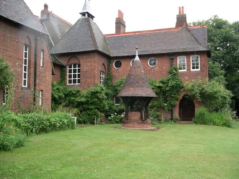
5. This is the random post! In January I wrote a post on William Morris and the Design of Red House. I am crazy about brick houses (I don't want to ever live in anything that is not made of brick or stone!). I think homes made of natural materials somehow just "look right" with the landscape. Red House is probably the house that started it all. Designed by Philip Webb, I think it's one of the best examples of Arts and Crafts Architecture. Plus, it was decorated by Morris, Burne-Jones and Dante Gabriel Rossetti! Imagine having so many artist friends to help you decorate your home!
I'm tagging Bebe at Peaches and Dreams, Paula at The Beauty of Life, Vivian at Vivian in Stitches, and my new friends Wanderlust and Pixie Dust, and Grace at The Beautiful Necessity . I look forward to reading your posts!
Monday, March 3, 2008
Decorating a la Morris
In my mind, I often associate William Morris with intricate patterns. I love his beautiful designs for textiles, wallpaper, wall and floor coverings so much that I often forget that he was a huge fan of plain surfaces. Many of our ideas of modern decorating are actually derived from the Arts and Crafts Movement, with its emphasis on clean lines and simple, useful decoration.
How to create a home with a Morris "feel"? Here are a few basic tips for Morris-inspired decorating:
1. Seek out quality furnishings that emphasise craftsmanship as opposed to stuffing your home with unnecessary clutter. For some fine examples of craftsman furniture, visit Treefrog Furniture.
2. If your home has damaged woodwork, paint it white to create a fresh "canvas." It creates a sense of lightness and brightness that was appreciated by Morris and his wife Jane, who painted the damaged paneling at Kelmscott Manor white.
3. Use local materials and designers if possible.
4. Adherence to the use of natural elements was a huge part of the Arts and Crafts Movement. Use natural materials like beautiful woods, brick and stone.
5. Nothings says neo-medieval like wrought iron! (Metal also has an incredibly earthy feel). One of my favourite re-interpretations of Medieval decorating (combined with Art Nouveau details) was the set design for Rivendell in Lord of the Rings. It was gorgeous! (you may have noticed that the Shire was heavily influenced by the Arts and Crafts Movement--take a second look at Bilbo Baggins hobbit hole! It looks like William Morris lived there!). I should do a post on Lord of the Rings set design...
6. Natural colours were another important aspect of the movement, and one that hearkened back to medieval times. Morris and others used paint schemes that were borrowed from nature, leaning heavilly on goldenrod yellows, burnished browns, cimarron and Indian reds, sage and moss greens, and a neutral palette of earthy tans, toasts, and beiges. Together, these natural colours create continuity between your home and the natural world.
7. Lighting should seem as natural as possible. Large windows are wonderful if you have them, otherwise, ligthen up your interior by choosing lighter colours and create soft (not harsh, bright) lighting with pillar lighting.
8. Decorate with books! Books are already useful, so try to make sure that they are beautiful as well. Invest in hardbacked books that you love to look at. Collect illustrated children's books. Find a bookcase you love, or better yet, build built-in bookcases!
9. Fill your home with beautiful art. This doesn't just mean paintings! Morris abhored the division in the arts between painting, sculpture, needlework and other forms of craftsmanship. Simply find beautiful things that suit your style.
10. Don't be afraid to blend! Start with one thing in the room your decorating that you LOVE. Then just gradually try to make sure that everything else in that room complements it (just another way of saying, have nothing in your houses that you do not know be useful or believe to beautiful).
Sunday, March 2, 2008
Weekend Musings

Well, our new couch finally arrived! It's been a couple of months and I've really been looking forward to getting it! It's not craftsman furniture, but it certainly is comfortable, and my husband and I both really liked the colour and style, which we thought went well with the Diego Rivera painting you can see hanging above. 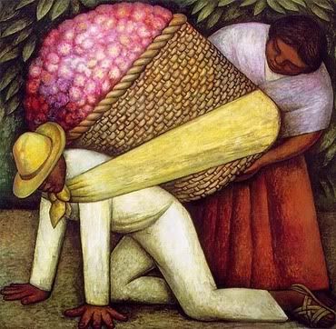 The painting, which you can't really see in the photo, is Diego Rivera's Cargador de Flores (The Flower Carrier), which we found at SFMOMA on our honeymoon in San Francisco (we wanted a souvenir of our trip and that was our favourite painting in the gallery). It's certainly not Pre-Raphaelite art, but I just love it. Diego Rivera uses such brilliant, rich colours his paintings seem to come to life. He painted The Flower Carrier in 1935.
The San Francisco Museum of Modern Art sells canvas editions of many paintings at very reasonable prices (it adds a whole layer of texture to your print). Most run around $100 dollars. This includes a process in which the museum artists "apply acrylic brush strokes to the canvas, replicating exactly the texture and contours of the original painting." Personaly, I think it's a great option, because it looks so real and most of us will probably never get to purchase an original work by an old master (Van Gogh's "Child With An Orange" is on sale this month at the European Fine Art Fair in Maastricht, the Netherlands for $30 m).

