
I was visiting the Sur la Lune forums the other day and noticed one of the readers asking about contemporary children's books with beautiful illustrations. My two favourite more contemporary children's book illustrators are Susan Jeffers and Nancy Ekholm Burkert.
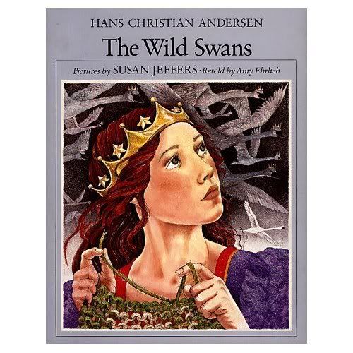
My Aunt Heidi gave me a copy of Hans Christian Andersen's The Wild Swans, illustrated by Susan Jeffers for Christmas in 1987. I had just turned six. I hardly looked at another gift that Christmas. I still remember having my mother read it to me and gazing for hours at the beautiful illustrations. I was utterly captivated by the idea of the beautiful young princess, Elise, who risks her own life to save her brothers.
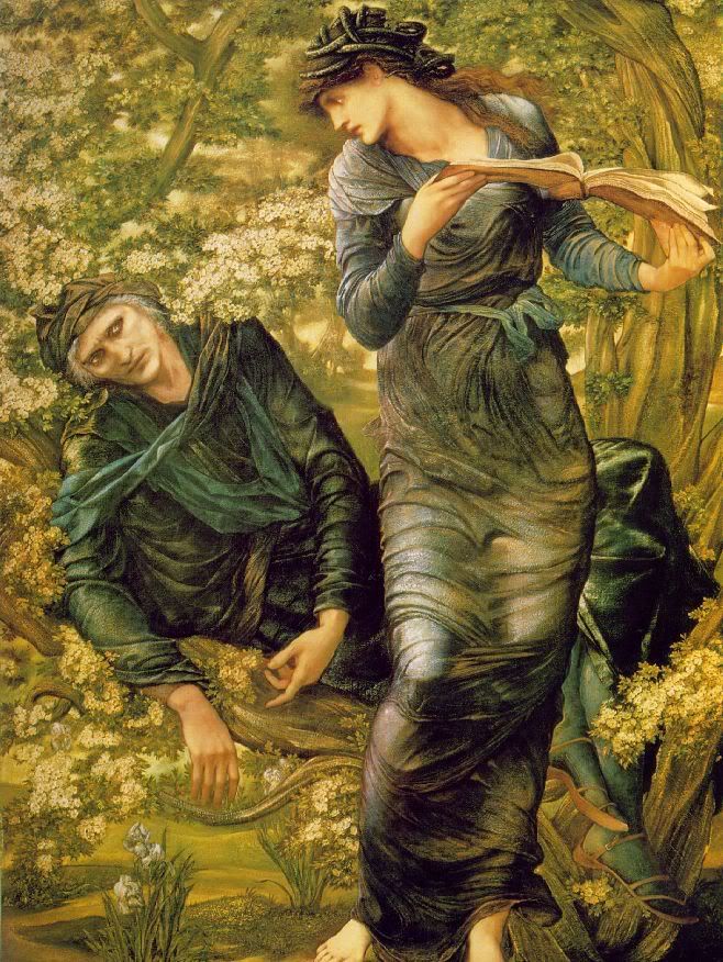
Years later when I pick up the book I still am filled with awe at the beautiful drawings. They make you feel like you're experiencing Elise's story--you can sense the coolness of the mossy forest floor and the cold, dark danger of the cathedral's graveyard and the warm spring breeze on the hilltop covered with roses in the last scene. There are definitely some parallels to Pre-Raphaelite art within the illustrations. Elise, the princess-protagonist of the tale, looks remarkably like Dante Gabriel Rossetti's muse, Lizzie Siddal, with alabaster skin and flowing red hair. Her clothing evokes Jane Morris' artistic dress.
While doing a bit of research on Susan Jeffers' illustrations, I discovered that The Wild Swans is being republished this fall in hardcover (you can pre-order it from Amazon for 12.23!).
Surprisingly, my own copy of the book is still in mint condition! It was one of my favourite books and I must have been really careful never to bend the pages. I had other favourite fairy tales, but they were my mom's books and I wasn't allowed to take them out of the living room--a good parenting idea, if you don't want your books to end up ruined by eager little hands!
Friday, February 29, 2008
Beautiful Children's Books: The Wild Swans
Thursday, February 28, 2008
The Pre-Raphaeilte Brotherhood's Attraction to the Medieval
One of my favourite aspects of Pre-Raphaelite art is its devotion to Medieval-inspired subjects, like the Knights of the Round Table. But interestingly, the Pre-Raphaelites were initially attracted as much to the way medieval artists painted as they were to the subjects they covered.
The Pre-Raphaelite movement began in 1848, when a goup of young artists decided to take on the conventions of the London art world. Dante Gabriel Rossetti, William Holman Hunt and John Everett Millais were the founding members of the brotherhood, which met regularly to discuss art. They shared a mutual distaste for the art of Raphael, Titian and the artists of the Renaissance.
Their least favoutite modern was Sir Joshua Reynolds (referred to as "Sir Sloshua," by Millais and Hunt, who felt his brushwork was lacking). Sir Joshua Reynolds was the first president of the Royal Academy and had established the academy's "rules" for painting based on the conventions of neo-Classical and late Renaissance art. He decreed that "subjects should be edifying, colors subdued, compositions either pyramidal or S-shaped"(Stewart), and so on.
The Pre-Raphaelites rejected the idea that art should be so formulaic. Subdued colours and pyramidal compositions were not natural and thus untrue--something that bothered them. In response they sought to turn to medieval or "primitive" art for inspiration, believing it to be more realistic, detailed and authentic. They did face some problems with this, however.
Since very few examples of medieval art remained, even in their own time, they had to frequently resort to using their imaginations. In order to access the Medieval, the artists turned to early literature for inspiration, most often using the Bible, Chaucer, and the tales of King Arthur. They also used the poetry of John Keats and Alfred Tennyson. This earned them a great deal of criticism from their contemporaries, who charged them with "idealizing the Middle Ages" (this same criticism is still launched at them today). William Morris made it quite clear in his writings that he in no way sought to return to the Middle Ages or to replicate Medieval art. Instead, he hoped to revive the spirit of the age, which he felt was more sincere and less artifical than that of his own time.
The Pre-Raphaelites' obsession with the Medieval grew with time and qualifies the Pre-Raphaelites as one of the last chapters in the Romantic movement. I will discuss Romanticism and the Pre-Raphaelites soon!
Source: Doug Stewart, "Incurably Romantic," Smithsonian, Feb2007, Vol. 37 Issue 11, p86-94.
Tuesday, February 26, 2008
William Morris Inspired Quilts
I know I was supposed to begin writing about Medieval influences on the Pre-Raphaelites, but I recently came across some beautiful artwork that deserves special attention.
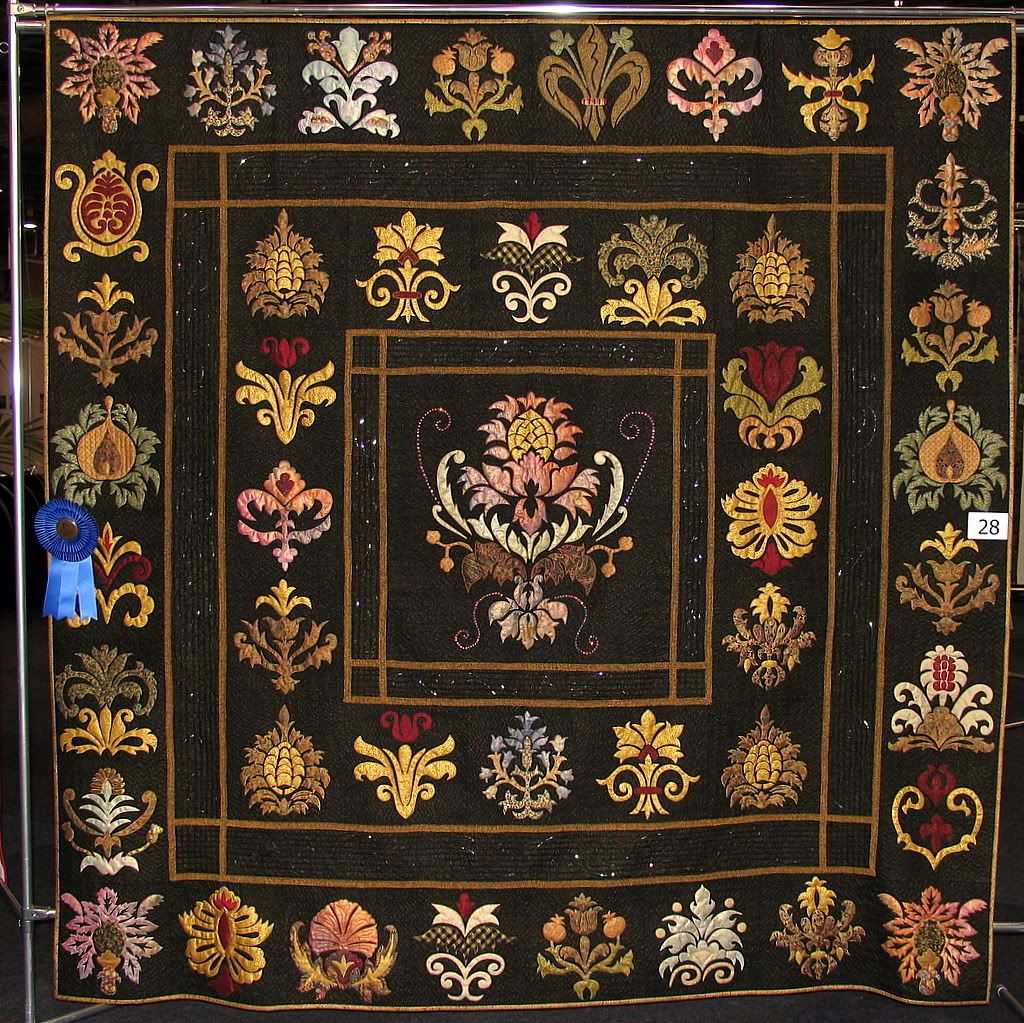
I received an email from Michelle Hill on Sunday about her interest in William Morris' designs. After paying a quick visit to her website I realized she is an incredibly gifted artisan. She cites William Morris as a major inspiration for her work and her designs often feature interpretations of his designs.
Her quilts are simply incredible and their spectacular design speaks for itself. Generally speaking, I am not a fan of quilts. I appreciate the hard work and patience quilting requires, and I often see old quilts that I find interesting from a historical perspective, but I have never seen a quilt that I would really want to have in my home. Most quilts simply do not fit with my aesthetic.
This is no longer true. Michelle's quilts are absolutely lovely and I think they demonstrate decisively that quilts need not be country western-ish! Her designs are more evocative of fine tapestry than of the majority of quilts. She has even done a quilted interpretation of the famed "Lady and the Unicorn" Tapestry! 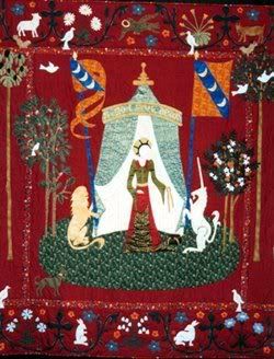 It never even occurred to me that you could create such beautiful art through quilting. Since I'm sure I can't afford to commission one of these lovely quilts, it appears I may actually have to learn how to do it myself!(Luckilly Michelle sells the patterns for her quilts). She has also created some smaller applique pillows based on Morris designs that would be good starter projects.
Michelle has won many awards throughout Australia for her quilts. Her entry for the "Festival of Quilts", called Renaissance (pictured above), won first place and "viewers choice" in the Professional Appliqué category of the Quilters Guild of SA Inc’s “Festival of Quilts.”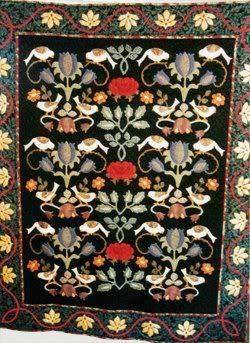 Inspiration for this quilt, called "Coffee with William Morris" came to Michelle over a cup of coffee in 2002. It includes elements of Morris' "Rose" and "Brompton" designs.
I hope you enjoyed these designs. Michelle has many other quilts on display at her website.
If you are interested in finding the patterns for these beautiful designs, they can be purchased through a number of fine retailers. For more info, please visit Michelle's website.
Monday, February 25, 2008
Trip to Banff and Lake Louise

We had a great time in Banff! The weather was amazing this week--it was quite warm and we had a wonderful weekend in the Mountains.
In the car on the way to Banff, Javier surprised me with the idea of snowboarding lessons (I'd been prepared for skiing lessons). We both decided it would be a good idea, since most of our friends snowboard. The drive to Banff was beautiful--I miss seeing the mountains so much sometimes! I would love to live in the Rockies, but property there is getting incredibly expensive. The average home in Canmore, a small town a few minutes from Banff that has traditionally had lower housing prices, is now $850,000! Living a rustic lifestyle is not as affordable as it sounds, unfortunately.
We arrived in Banff early Friday afternoon and after settling into our hotel, we spent the evening in the town of Banff and had a great dinner at St. James' Gate Pub (we liked it so well we ate there again on Saturday!).
After an early breakfast on Saturday, we had a full day of lessons at Lake Louise. .jpg)
It was absolutely beautiful--every time I fell down I had a great view of the mountains! I wasn't sure if I would enjoy it that much, but I loved it! (especially after seeing all the cute gear they have for girls now--when I was a kid in Seattle only guys really snowboarded, and there was basically no equipment for girls).
Snowboarding was a bit difficult for me to pick up, since I've done more skiing and it's really different. Plus, I fell a lot! I am in agony today (I think I bruised pretty much every square inch of my body), but I can't wait to go back. My husband is amazing--because he plays soccer and works out seriously, he's right as rain--it's incredible. I still can't believe he's not in pain. I'm just hoping that I will have recovered enough by next weekend that I'll be able to try again!
From the poll results, it looks like Medieval influences on the Pre-Raphaelites have won out, so I will begin posting on that topic tomorrow.
Friday, February 22, 2008
A New Poll

My husband and I are getting ready to leave for Banff this morning! Generally we just go to Banff to take in the scenery, but this weekend we've decided to take ski lessons and I'm really excited. We always try to go to Banff some time after Valentine's day, since it can be awfully busy Valentine's weekend. The weather is also finally decent enough that I don't think we'll freeze to death, which is a definite plus! I'll have to post a few pictures from our trip when I get back.
I'll be back with new posts on Monday. I'd like to start doing a few series of posts about specific topics and I've created a poll to help me figure out what you would like me to write about! Go ahead and vote, and if you have specific ideas, leave a comment, I'd love to hear your suggestions.
~Margaret
Thursday, February 21, 2008
William Robinson and the Wild Garden

William Robinson (1838-1935) did for the garden what William Morris did for interior design. The "wild garden" movement he started was so successful that many today do not realize the English Cottage Gardens they admire today are largely the result of Robinson's dedication to traditional gardening practices.
Born in Ireland in 1838, Wiliam Robinson took a fancy to gardening from an early age, and by 21 he was in charge of many greenhouses. The story goes that one day, the fires keeping the greenhouses warm burned out and the plants died. Robinson was discharged (Massingham, 61). Although he quickly found employment with the Royal Botanic Garden, Robinson had developed a dislike for hothouses that lasted him the rest of his adult life.
In the introduction to The Wild Garden, Robinson describes arriving in London just as the Royal Horticultural Society's Garden at Kensington was being constructed and the Crystal Palace was being landscaped. He commented that it was like "all the theatrical gardening Versailles reproduced in Surrey"(62). He found the repetitive patterns rather boring and complained that this "false and hideous art" had acheived such popularity that "all but the poorest cottage gardens" were following suit (62). Robinson was just beginning to discover the beauty of England's wildflowers and trees and he decided to make "wild gardens" his life's work. Over the next few years, Robinson toured France, Italy and the United States observing different gardening styles.
In 1871, Robinson founded his own gardening journal, called "The Garden." The premier issue contained articles by the likes of Oliver Wendell Holmes and John Ruskin, who remained a frequent contributor to the magazine (William Morris himself also wrote for The Garden). Robinson was an avid reader of Ruskin's work and it shows in his design philosophy.
Robinson's most famous contribution to gardening was his book The English Flower Garden, which he published in 1883. He encouraged his readers to aim for a less strictly structured garden, arguing that "the best kind of garden grows out of the situation, as the primrose grows out a cool bank"(69). While Robinson favoured "wild" gardens, he felt that grouping flowers together in an artful way was important. The greatest contribution of the book was probably the introduction of the "herbaceous border" which most gardeners are quite familiar with.
In 1884, the success of Robinson's gardening journal and his book had made him enough money that he was able to purchase Gravetye Manor, a beautiful Elizabethan home on several hundred acres near East Grinstead, Sussex. The only work he did on the house was to change the fireplace back to a wood burning one--Robinson hated coal, a symbol of industrialization--and refused to have it burnt in his home. The rest of his energies he devoted to transforming the gardens into a wild English paradise. He kept a diary of his plantings, which is published under the title Gravetye Manor, or Twenty Years of the Work round an Old Manor House. Today, Gravetye Manor is considered one of the most beautiful examples of the gardens of the Arts and Crafts Movement.
When William Robinson appeared on the scene, the Victorian obsession with patterned gardens was at its height. He championed the informal, or "wild" garden at a time when almost everyone saw formal, patterned gardens, populated with hothouse flowers as the most beautiful. William Robinson was ahead of his time. He couldn't have even known the full importance of preserving the heterogeneity of English horticulture at the time he wrote his books. His instinct to preserve native plants likely saved a large number of wildflowers from extinction. Like Morris and Ruskin, he was certainly ahead of his time.
Source: Betty Massingham, "William Robinson: A Portrait" Garden History, 1978.
Photo courtesy of Lynetter.com
Wednesday, February 20, 2008
William Morris and Kelmscott Manor
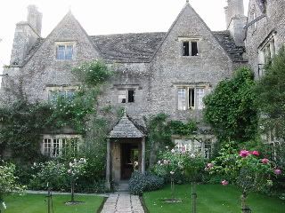
In 1871, William Morris and Dante Gabriel Rossetti signed a joint lease on Kelmscott Manor (not to be confused with Kelmscott House, Morris' home in Hammersmith), a Tudor farmhouse in the village of Kelmscott that had been built in 1571 of of local limestone. Kelmscott became Morris' country house, and is known today by those familiar with the stories of the Pre-Raphaelite circle as the place where Jane Morris and Dante Gabriel Rossetti spent their summers together at the height of their not-so-secret romance.
After signing the lease with Rossetti, Morris wrote his friend Georgiana Burne-Jones:"we have taken a little place deep down in the country...a beautiful and strangely naif house, Elizabethan in appearance...within a stone's throw of the baby Thames, in the most beautiful grey little hamlet called Kelmscott."
In keeping with his belief in preserving ancient buildings, Morris left the house as it was, though he had rotting floor-boards replaced. He and Jane invested a far greater portion of their time in redecorating the interior of the house. The house was filled with art objects from Morris and Company. Morris chose plain white, wool drapes for the drawing room and Jane also painted the walls white. Overall, the decor of the house is simple and elegant and blends seamlessly with the countryside.
Given the complicated nature of living arrangements at Kelmscott, Morris kept himself busy traveling to Iceland during the height of Jane and Rossetti's affair. He and his wife also kept seperate, beautifully decorated bedrooms. Rossetti painted this portrait of Jane, entitled "Water-Willow" after the Willows at Kelmscott, during their first summer together at the Manor, and it hangs in Jane's bedroom above an elaborate jewell casket given to her by Rossetti and Lizzie Siddal as a gift.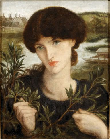
Morris' splendid seventeenth-century oak bed has also become quite famous for the way it was decorated by May and Jane Morris.
The poem "For the Bed at Kelmscott," by Morris is embroidered on the vallance.
The wind's on the wold and the night is a-cold,
And Thames runs chill twixt mead and hill,
But kind and dear is the old house here,
And my heart is warm midst winter's harm.
Rest then and rest, and think of the best
Twixt summer and spring when all birds sing
In the town of the tree, and ye lie in me
And scarce dare move lest earth and its love
Should fade away ere the full of the day.
I am old and have seen many things that have been,
Both grief and peace, and wane and increase.
No tale I tell of ill or well,
But this I say: night treadeth on day,
And for worst and best right good is rest.
If you are interested in visiting Kelmscott, be sure to check out their website!
Tuesday, February 19, 2008
William Morris and Japan
A while ago I posted a picture of the needlepoint project I'm working on that's based on William Morris' Trellis wallpaper pattern. I commented on how much it reminded me of Japanese art. Several of you, who clearly know much more about the subject than I could pretend to, pointed out that the Arts and Crafts movement was heavily influenced by Japanese art.
Well, it turns out the knife cuts both ways! Apparently, William Morris was a huge hit in Japan. 316 studies on Morris were published there between 1891 and 1975, the majority of which were written before the outbreak of the Second World War (Nakayama, 273). Early interest in Morris’ writings primarily had to do with his social thought, which was described in Japanese as “artistic socialism” (274). The 1930s were the golden decade for Morris studies in Japan. In 1934 as a celebration of the hundredth anniversary of his birth, an exhibition of the works of William Morris was held in Maruzen, Tokyo for the first time. Sadly, little of his art was available for display, save the Kelmscott Chaucer, which was described in the exhibition guide as “a rare book worthy of being called a national guest”(274).
One leading Japanese thinker chose to expand research on Morris’ philosophy to include education. Educationist Tatsuo Morito praised Morris’ views on education, using Morris’ writings in News from Nowhere to support his theory. Morito argued that, throughout his writings, Morris highlights the importance of becoming a well-rounded individual—not just an artist, but a thinker. Morito saw this as a direct endorsement of a liberal arts education, in spite of the fact that Morris was not considered an educator in the west (275). Unfortunately, given the rise of nationalism that was spreading like wildfire through Japan in the 1930s, the notion of a liberal arts education, much less a socialist education didn’t stand much of a chance and Morito’s educational theories were largely overlooked.
Although Morris social teaching excited curiosity in many in Japan, his overall philosophy of Arts and Crafts was more difficult for the Japanese to accept because of his negative view of industrialization. His influence on a variety of art movements was recognized, as was his contribution to social thought, but his views were considered rather too utopian to be of use in daily life. His ideas had a bit of revival as part of the criticism of industry, but many socialists shied away from his theories because it was feared that they would lead to a resurgence of “aristocratic tastes”(276).
Source: Shuichi Nakayam, “The Impact of William Morris in Japan, 1904 to the Present,” Journal of Design History, Oxford University Press, 1996.
Monday, February 18, 2008
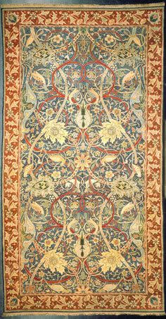
Bullerswood Carpet
I hope everyone had a good weekend! I'm feeling a bit better today and I've had some down time to browse through one of my favourite books on William Morris before I have to return it to the library!
As you know, I love textiles. I'm particularly fascinated by carpets because they say so much about a home. I think it says a lot about changes in modern society that today we tend to fill our homes with nondescript beige carpets, whereas in the past carpets were works of art that could tell a lot about the owner.
William Morris began experimenting with carpets shortly after moving to Kelmscott House, Hammersmith in the 1870s. Today, Hammersmith carpets can be recognized immediately by the hammer and capital "M" found alongside the border (I couldn't find an image of this, unfortunately). Although originally designed at Hammersmith (hence, Hammersmith carpets), Moris moved the operation to Merton Abbey in 1881 so that he could take advantage of the larger looms available there. On nice days, Morris would take the carpets outside and spread them on the ground so that he could get a sense of what they looked like all together! (Todd, 50). The designs were exquisite, but extraordinarily expensive, like many of William Moriss' other accomplishments.
Of his carpet designs, the Bullerswood carpet is probably my favourite. The design is versatile and goes well with a variety of decorating schemes. It was made for John Sanderson, a wealthy wool merchant who had invited Morris and Co. to refinish his home. Some historians believe that Morris wove the carpet himself, since he had given specific instructions that nothing was to be put into the house that he had not made himself. Nevertheless, many today believe that Morris' talented assistant John Henry Dearle had a hand in creating the carpet, given the boldness of the design (Todd, 50). The carpet was coloured using only vegetable dyes. Interestingly, it's been very well preserved because it is so large that the Victoria and Albert Museum has not been able to have it on permanent display, which has helped preserve the colours from light damage.
images courtesy of Victoria and Albert Museum.
Source: Victoria and Albert Museum.
Also see Pamela Todd. William Morris and the Arts and Crafts Home. San Francisco: Chronicle Books, 2005.
Saturday, February 16, 2008
My First Award!
I've been feeling under the weather for the past few days, so I've been on a bit of a hiatus. It's no fun to feel sick on Valentine's day! Oh well, we're going to Banff next weekend so I'm trying not to feel to sad about missing a nice Valentine's dinner out. My dear husband sent me roses in the morning so that cheered me (and he wrote a lovely poem as well--I wish I was better at writing poetry!). Oh, the other reason I haven't posted for a couple of days is that something is wrong with the wireless card in my laptop, so I haven't been able to get online.
I was instantly cheered this morning when I took a look at my blog and realized I'd received an award from Bebe at Peaches and Dreams today!
Thanks, Bebe! This is my first award so I'm quite excited. I'd like to pass this award along to Paula at The Beautiful Life, who inspires me with her creative needlework. Also to Brad, at Tree Frog Furniture, who always writes such informative and interesting posts on Arts and Crafts Furniture, and finally to Tracy, at Pink Purl, who always inspires with her creative posts.
Have a good weekend everyone!
Wednesday, February 13, 2008
Concept of Beauty in Pre-Raphaelite Art
Members of the Pre-Raphaelite Brotherhood, together with many of the artists who took part in the Arts and Crafts movement, had what many today would consider a very simplistic notion of beauty. Their vision is shared today by many traditionalists who will argue emphatically that modern art is devoid of beauty because it is not made up of beautiful elements.
There were three main principles that guided the hands of the Pre-Raphaelite painters. 1. The earnest study of nature (because nature is beautiful). 2. Intensity of feeling (feelings are natural and thus beautiful). 3. Contempt for forumulas in painting (formulas are artificial, and thus ugly).
In keeping with these priciples, the Pre-Raphaelitse painted what they felt were beautiful subjects. For example, the ideas of poets like Chaucer, Dante and Shakespeare were presumed beautiful and thus worthy subjects for paintings. Women were likewise considered to be obviously beautiful, and were often painted in medieval costume (one has only to read a very little of William Morris' writings in order to learn why medieval costume was considered to so beautiful to members of the Arts and Crafts and Pre-Raphaelite movements). The combination of these beautiful ingredients was thought to lead to a beautiful work of art.
I certainly find Pre-Raphaelite art to be beautiful. In many ways it's a refuge from the ugliness that surrounds us. I've noticed over time that while I can appreciate the works of many modern artists, I tend to choose more traditional artwork for our home.
Have you ever seen the film, American Beauty? I have to admit that I loved it, but several professors of mine at University hated it because they saw it as an attack on traditional notions of beauty.
You will recall the scene in which Ricky and Jane watch recorded camcorder footage of plastic bag floating in the wind, which prompts Ricky to remark "sometimes there's just so much beauty in the world that I feel my heart is going to cave in." So--was it, in fact, beautiful? My professors argued that it was most emphatically NOT beautiful. Their logic was quite traditional, and I'm sure William Morris would have agreed with them: Is a plastic bag beautiful? Well, I suppose not. Is a dirty city street beautiful? Um, no. Is garbage floating in the wind beautiful? Definitely not.
John Keats once wrote "beauty is truth, truth beauty. That is all ye know on Earth and all ye need to know." If you take Keats at his word, this can cause some problems. Are pictures of Auschwitz beautiful? Most emphatically not, in my view. Nevertheless, his statement on art has become more or less the maxim for modern art. Most modern art today is concerned with pursuing the "truth" no matter how brutal or ugly it may be. So, while I respect Keats' writing and am a huge fan of his poetry, for the moment I think I'll except the dictionary definition of beauty as the "combination of qualities that make something pleasing and impressive to look at, listen to, touch, smell, or taste." If I accept that definition of beauty, then I think it's fair to say that the plastic bag floating in the wind doesn't exactly add up to a beautiful moment.
Is this beautiful?
So, why does the plastic bag scene always bring tears to my eyes? Maybe the reason I cry during that scene is because I actually feel sorry for Ricky and Jane because that garbage floating in the street is as close as they can get to beauty. What do you think? Is the garbage beautiful? I would love to delve into this issue further in the future.
Tuesday, February 12, 2008
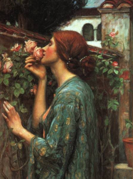
Roses and Valentine's Day
As Valentine's day approaches, I'm more and more drawn to the romance of roses. And it seems I'm not alone! There was an article in the paper yesterday that pointed out that in Saudi Arabia, the sale of red roses is forbidden at this time of year because red roses are associated with Valentine's day. This has led to a soaring black market in roses. Little wonder! Regardless of your religious persuasion, there is something irrisistable about roses.
Perfume is one of those things that it took me a while to appreciate. As a little girl, I remember watching my mother as she carefully chose her perfume as the final step of getting ready to go out. She wore perfume every day and it always matched the season and occassion perfectly. I loved looking at all the beautiful bottles arranged delicately on a mirror that sat on top of her dresser. She would let me try different scents out and I always loved deciding which one to sample next. She would always ask me if I wanted a perfume for Christmas, but I usually said no. I loved perfume, but it didn't seem important enough to choose as a Christmas present. Maybe it's because I could have all the perfume I wanted at home!
When I went to college, that's when my love affair with perfume started. I realized that I like a lot of older perfumes, especially Jean Patou's "Joy" and "1000." My friends thought it was hillarious that I had such a giant collection of perfumes, but they liked trying them too!
Since I've already revealed "Joy" and "1000" as two of my favourite scents, you've probably figured out that I'm a huge fan of rose-scented perfumes. My all-time favourtite, though is Nahéma. The first time I actually tried it was at the Guerlain Champs Elysees show room in Paris!(Every perfume lover should go there at least once!). It was my favourite scent that I tried that day and I fell in love. In addition to rose, it has notes of bergamot, mandarin, peach, cyclamen, lily, vanilla, sandalwood--and to me it's the ultimate rose perfume. The fragrance was created in 1979 and supposedly inspired by Catherine Deneuve. The name itself comes from “the daughter of fire”, from Scheherezade’s (of One Thousand and One Nights fame) tale of “two twin princesses, of equal beauty but of different nature.” It's a sexy scent that will definitely make you feel like a "daughter of fire."
If you like rose scents, here are a few others you might try:
Bal A Versailles--my mother's signature scent, by Jean Desprez. Sadly, it's difficult to find these days, except in a cologne. Last time I talked to the people at Nordstrom they said there's been some kind of property dispute over the roses used to make it!
Rose Absolue, by Annick Goutal--this fragrance comes in a wide variety of forms which is important if you really fall in love with a scent! You will want to try soap, bath gel, etc. and the possibilities are endless with this particular one. Also, all the scent in Annick Goutal's fragrances is totally natural, which makes it blend so much better with your own chemistry.
Joy, by Jean Patou--a total classic and comes in body cream, lotion, perfume, bath gel and lots of other lovely products.
Stella McCartney--I really love this one! It's new but it has a delightful, strong rose scent. Try the deodorant. It sounds weird, but it's fabulous! I can't live without it!
L'Occitane also makes a really lovely and more affordable rose fragrance that smells quite a bit like Stella but is all natural. Their bath products are amazing and I highly recommend this one.
Monday, February 11, 2008
The Artistic Monogram
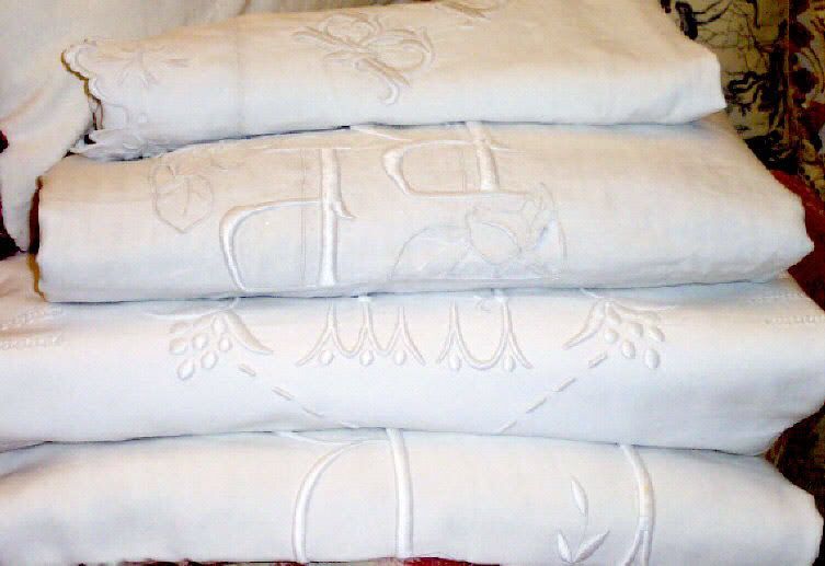
Generally, I find monograms to be in rather poor taste. It's something about the Lilian Vernon "get it monogrammed for two dollars extra" mindset that seems terribly tacky.
That being said, I adore the artful monograms that graced linens in the past. I remember reading about them in Miss Manners' as a kid and I was totally enthralled by the notion of someday possessing my very own set of monogrammed linens.
The practice of applying monograms is over three hundred years old. Before the 1700's, monograms were strictly limited to the nobility, who added monograms for much the same reason that hotels include them today--for identification. Because there was no such thing as machine weaving at that time, fabrics were incredibly costly and were as significant a part of a noblewoman's dowry as land. Intricate hand made designs of the crest of the noble family were carefully applied to the linens.
By the 1700s, however, things were beginning to change. Members of the growing middle class wanted to emulate the habits of the nobility, and they begin copying the custom. Most did not possess family crests, so they began to embroider their own initials into the fabric instead. Embroidery techniques were quite elaborate at times and often included applique, cutwork and drawn work. In an effort to create a more "crest-like" image, elaborate floral borders were often added.
In spite of the numerous innovations in monograms over the years, one thing that remained unchanged until recently was the custom of working the embroidery in white thread on white or ivory linen. As you will have noticed, this is more of an exception to the rule these days...most monograms use strongly contrasting thread in order to highlight the initials.
So, what did the Pre-Raphaelites think of monograms? William Morris was certainly a fan--Red House is crowned with a weathervane formed out of Morris' initials. Morris was more a fan of crests, though, which makes sense given his admiration for the medieval.
One company that keeps the tradition of fine hand embroidery alive is D. Porthault of France. The company was the linen provider of choice for royals on both sides of the Atlantic--the Windsors and the Kennedy clan reportedly slept on nothing else. Their fine linens cost a pretty penny, however. A set of King sheets with pillow shams will set you back a mere $2800. Perhaps you could invest a little time in learning to do embroidery yourself!
Image courtesy Linge de Berry Bedlinens
Sunday, February 10, 2008
New Needlepoint Project

I received my needlepoint kit from Beth Russell on Friday! I was so excited that I took pictures of the kit when it arrived. Right now I'm working on the leaves and vines in the design (they're the easiest part--the shading on the birds and flowers is more complex and I don't want to mess it up). I'm also looking forward to doing the actual trellis part, which uses the Gobelin stitch, something I haven't tried before.
Now that I have the design in my hands, I'm struck with how Medieval the pattern is, but also by how Japanese it looks. Perhaps it's from looking at all of the Japanese designs from Liberty yesterday, but I'm starting to notice that a lot of Arts and Crafts style is very influenced by Japanese design.
Here you can see where I've started stitching on the leaves! The design didn't fit on my frame properly, so I've had to turn it the other way. You can get a bit of a sense of the texture this way. I may have to take it easy with my stitching for the next few days--my wrist is killing me from what I've done so far--I'm thinking I'm much better suited to writing about art than I am to producing it!
Hope everyone has had a beautiful weekend!
Saturday, February 9, 2008
Liberty of London
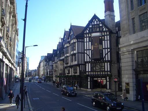
One of my favourite memories of my senior trip to England was going to Liberty of London. I had heard of the store before and it was on my list of must-see shopping destinations (along with Harrod's). The Tudor-style building itself is a London icon and was incredibly impressive. I was actually there on a mission to find William Morris' Strawberry Thief fabric for a friend of mine(unfortunately, I never got the chance--my friends weren't really interested in spending hours going through fabrics in the attic of Liberty!).
Sir Arthur Lasenby Liberty was born in Chesham, Buckinghamshire, England in 1843. Growing up, Arthur gained business experience working with his uncles in their small businesses selling lace and wine. Arthur's father was a draper and at 16, Arthur Liberty became apprenticed to someone in the field. Afterwards he specialized in women's fashions at Farmer and Rogers, where he quickly became manager. In 1875, Arthur opened his own store, Liberty and Co. in Regent Street, London where he sold fabrics and art objects from Japan.
In the beginning, Liberty worked with a number of popular fashions, but as time went on the store evolved its own style firmly rooted in the Arts and Crafts tradition. Later it was one of the first places to popularize Art Nouveau (in Italy, Art Nouveau was actually called "Stile Liberty"). The company's claim to fame was its large selection of fabrics that were immensely popular as dress fabrics between 1890 and 1920. 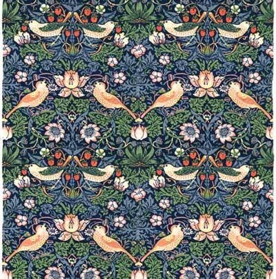
Liberty of London made Arts and Crafts and Art Nouveau styles much more accessible. Their products were much less expensive than those of Morris and Company because they had no strong commitment to avoiding mechanized labour. Thus, although their products were still costly (Liberty was and remains to this day, one of the world's leading department stores--not exactly Wallmart!), they broadened the market for Arts and Crafts goods significantly and made qualtiy goods available to the majority of the public. I wonder how William Morris would have felt about it? On the one hand, it would satisfy part of his mission--making beautiful things available to everyone. On the other, it would mean sacrificing his commitment to humane labour, something he was never prepared to do.
The image below is from Liberty's line of new fabrics for Fall/Winter 07-08. It is so refreshing to see such beatiful textiles being produced today!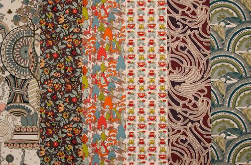
I'm personally very thankful for Arthur Liberty and his beautiful store. I think a lot of people would have never seen examples of Arts and Crafts and Art Nouveau style without him.
Arthur Liberty was knighted in 1913 and passed away in 1917,just before the completion of the store's magnificent Tudor-Style building.
For more information, visit Liberty's website
Image of Liberty Strawberry Thief Fabric picture courtesy of Beth Russell Needlepoint
Friday, February 8, 2008
Morris and Company
St. George's Cabinet, designed by Philip Webb and Decorated by William Morris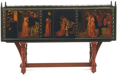
Over the past few weeks I've written quite a few articles on members of the Pre-Raphaelite movement and their work. It occured to me that, although I've mentioned Morris and Company numerous times, I still haven't done a profile of the Company.
Morris, Marshall, Faulkner & Co. (1861-1875) and its successor Morris & Co. (1875-1940) were furnishings and decorative arts manufacturers and retailers founded by designer William Morris. Morris began the venture upon completing the decoration of his home in Bexleyheath known as Red House. Morris had been disappointed to discover that it was nearly impossible to find simple, quality furniture and accessories for his home. As a result, he enlisted the help of his artist friends, Dante Gabriel Rossetti, Edward Burne-Jones and Philip Webb in designing his home's interior. When he was finished decorating, Morris got together with several of his friends, including Ford Madox Brown, Edward Burne-Jones, Charles Faulkner, Dante Gabriel Rossetti, P. P. Marshall, and Philip Webb, and in 1861 they established the firm of Morris, Marshall, Faulkner & Co., dedicated to providing simple handcrafted, medieval inspired designs for home interiors.
The firm set up shop at 8 Red Lion Square, London and was organized with a kiln in the basement, a showroom and offices on the first floor, and a workshop in the attic. The place had the air of a "medieval workshop" and the designs the firm prodcued were intended to "revive a sense of beauty in home life" and "to restore the dignity of art to ordinary household decoration"(Morris, as quoted in Todd, 9). The company was quite successful and wealthy patrons were drawn in by Morris' artistic vision and eccentric genius. Author Henry James was deeply impressed by the artistry of the Company's products, and said of Morris himself that "everything he has and does is superb and beautiful"(Todd, 10).
Morris was both a talented artist and a eager businessman and Morris, Marshall and Falkner experienced a fair amount of commercial success. The firm soon expanded to carry a number of different textile products, including tapestries, decorating fabrics, carpets and embroideries, combined with mural decorations, carvings, stained glass, metalwork, ceramics, furniture and light fixtures.
Morris was also not opposed to exhibiting the work of the company at the International Exhibition of 1862. The firms' exhibit was styled after a Medieval court, featureing a sofa designed by Dante Gabriel Rossetti along with six of Morris' own furniture designs, including the elaborate "St. George's Cabinet" designed by Philip Webb and decorated by Morris in Gilt and vignettes of St. George slaying the dragon (pictured top). Although Art Critics pounced on the Pre-Raphaelites immediately--one critic from The Building News scoffed that the pieces were "no more adapted to the wants of living men, than medieval armour would be to modern warfare, middle-aged cookery to civic feasts, or Norman oaths to an English lady's drawing room"(12). Despite such criticisms, the exhibition led to several lucrative commissions from the Church of England, St. James' Palace and the South Kensington Museum (today known as the Victoria and Albert Museum).
This Lovely Stained Glass Angel Was Designed by Edward Burne-Jones for the Salibury Cathedral in 1878
In 1875, the original company disbanded as many of the artists sought to pursue "solo careers" as artists. The company was reformed under Morris' sole guidance as Morris and Co. In 1881 the firm moved production to the Merton Abbey Workshops, which had previously been a silk-weaving factory and printing press on the River Wandle. Morris loved the new shop, which he jokingly referred to as "kindergarten for adults"(108). As the years went on, the popularity of Morris and Company's beautiful products only continued to grow. However, Morris himself was continuously troubled by the fact that his beatiful artwork was unattainable for most of the English people. His vision of affordable, beautiful furnishings remained a dream--only the wealthy could afford to buy his products because the lack of machine production necessitated higher prices. Throughout the history of the firm, Morris resisted introducing machinery, but this made his firm's work very expensive.
Morris and Co. was purchased by Arthur Sanderson of Sanderson and Co. in 1927. Sanderson purchased Morris' designs and continues to print Morris' fabrics and textiles to this day (they even make William Morris paint!). To see their products, visit their website. If you are interested in purchasing Morris and Co. designs, you can search their list of distributors.
Source: Pamela Todd. William Morris and the Arts and Crafts Home. Chronicle Books: San Francisco, 2005).
Cabinet image courtesy Victory and Albert MuseumStained Glass image courtesy William Morris Gallery
For tomorrow: a portrait of Liberty of London, the prestigious Regent street department store that popularized the work of the Arts and Crafts and Art Nouveau designers. Did Liberty do more harm than good by introducing these designs at lower prices and betraying Morris' vision of machine-free production?
Thursday, February 7, 2008
William Holman Hunt's Lady of Shalott
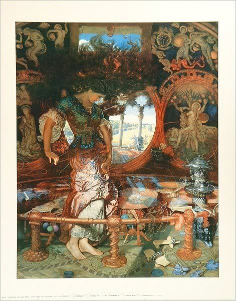
I have a belief, based on my own experience, that many fans of Pre-Raphaelite art are first drawn in by the story and paintings of the Lady of Shalott. Most people are familiar with Tennyson's beautiful poem, and the images of the Lady of Shalott are iconic. As Grace at The Beautiful Necessity noted a few days ago, images of the Lady of Shalott have inspired a host of artists, writers and musicians (most notably, in my view, Loreena McKennit's fabulous version).
Many of the Pre-Raphaelites painted the ill-fated lady, but today I have decided to include one of my favourite paintings of her from the period, one you may not have seen before.
This painting of the Lady of Shalott was first exhibited in 1905 and was the last (and in my opinion, best) of William Holman Hunt's works. It stands out in my mind for several reasons. First, it shows her at her loom, which I think is the most magical part of the story. Who can forget the first lines of the poem: "there she weaves by night and day a magic web of colours gay." Her wild hair and unraveled yarn foreshadow the disintigration of her life and add an air of drama to the picture that is less pronounced in most of the paintings of her. Plus, I love the wild look in her eye--it certainly seperates her from the majority of other paintings of the Lady of Shalott, most of which are more Ophelia-like (somewhat crazed, but resigned to their fate). Finally, the lady's face is very different from the visages found in William Holman Hunt's other paintings--it is far more lovely and looks as if it was inspired by the drawings of Edward Burne Jones.
The artist, William Holman Hunt is widely regarded today as one of the founding members of the Pre-Raphaelite Brotherhood. Like William de Morgan, he began his artistic training at the Royal Academy, but soon became weary of the conventions of Victorian art. After discovering the writings and art theory of John Ruskin he soon became a full-fledged member of the Pre-Raphaelite Brotherhood. His most famous work of art is The Awakening Conscience--a celebrated, and in my view, rather over-rated piece that demonstrates Hunt's devotion to artistic symbolism. Overall, he is definitely my least favourite of the Pre-Raphaelites. He had a hard time acheiving artistic success during his lifetime because both the press and the public found his works unattractive (a harsh blow for a Pre-Raphaelite artist who was supposed to be creating works of simple beauty). I confess that I'm not overly fond of the majority of his paintings, but I love this particular one.
William Holman Hunt's life was filled with scandal. After his first wife's death, he wanted to marry her sister, but this was illegal in England at the time so he was forced to travel abroad in order to marry her. This in turn caused a major rift within the Pre-Raphaelite Brotherhood, as another member artist, Thomas Woolner, was married to Aice Waugh, the third sister! (source: Wikipedia). To set the record straight, Hunt wrote an autobiographical account of the Brotherhood, entitled Pre-Raphaelitism and the Pre-Raphaelite Brotherhood, that placed special emphasis on his important role within the movement.
Today William Holman Hunt's Lady of Shalott hangs in the Manchester Art Gallery. 
Hunt's most famous work, the Awakening Consicence
Images courtesy Wikipedia Commons
Wednesday, February 6, 2008
William de Morgan
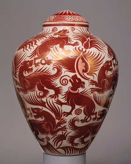
I ran across a picture of this lovely William de Morgan vase on the Metropolitan Museum of Art's website today. The simplicity of his designs is so graphic and modern that it actually reminds me of some of Picasso's ceramic work. Anyway, after doing a bit of browsing, I thought I'd do a small profile on William de Morgan and his contribution to the Arts and Crafts Movement (I've been neglecting ceramic artists so far).
Born in 1839, William de Morgan was a key figure in the Arts and Crafts Movement. He studied at the Royal Academy Schools, but left his studies after meeting William Morris. Shortly afterward, he left his studies to work for William Morris' firm of Morris, Marshall, Faulkner & Co. designing stained glass and painting furniture panels. Through his friendship with Morris, de Morgan came into contact with the Pre-Raphaelite Brotherhood and met his future wife, Evelyn Pickering (Evelyn de Morgan).
De Morgan became an innovator in ceramics after noticing that firing silver paint produced iridecense in stained-glass. De Morgan applied the technique to ceramics and created the now well-known luster glaze (which can be seen on the vase pictured above). De Morgan was especially inspred by Iznik (Turkey) and Persian ceramics, in addition to Italian maiolica and sixteenth-century Hispano-Moresque pottery.
In the 1870s, De Morgan began to focus more on creating decorative tiles. The best example of his work in tiles is perhaps found in his commission to copy Sir Frederic Leighton's collection of Persian tiles for the Arab Hall at Leighton House, London, in 1879. In 1882, he moved his studio to a workshop in Merton Abbey, where he produced and decorated hollowware and continued to experiment with luster glazes.
In 1887, Willilam de Morgan married leading female Pre-Raphaelite artist Evelyn Pickering, who is known today by her married name, Evelyn de Morgan (source: Wikipedia). William assisted his wife with her painting by developing a painting technique that used glycerine to produce bright, clear colours (source: Illusions Gallery).
Although William de Morgan is celebrated today for his contribution to the Arts and Crafts movement, his greateset commercial success during his own lifetime was as a writer, not an artist. The De Morgan Centre reports that although he only started writing when he was 65, his five bestsellers guaranteed a secure retirement for himself and his artist wife, Evelyn.
Like many of the artists of the Pre-Raphaelite movement, including of course his close friend William Morris, de Morgan was multi-talented. Not only was he an amazing ceramic artist and accomplished writer, de Morgan also designed and built his own pottery kilns and studio equipment and was an accomplished chemist (this is not suprising since it takes chemical knowledge in order to develop colouring for glazes). He even developed a new system of gears for bicycles and wrote the Admiralty during the World World War I to suggest how they might go about destroying U-Boats!
(photo courtesy of the Metropolitan Museum of Art website).
Tuesday, February 5, 2008
Royal School of Needlework

I was looking at some of Paula's lovely embroidery over at The Beauty of Life this morning and it inspired me to do a little research on the Royal School of Needlework (because I would definitely need to take some of their classes if I ever wanted to be able to do embroidery myself!).
The Royal School of Needlework was founded in 1872 by Princess Helena, Queen Victoria's daughter and wife of Prince Christian of Schleswig-Holstein in order to preserve the art of hand embroidery and needlework that was disappearing in the wake of the Industrial Revolution. Not surprisingly, William Morris played a significant role in establishing the school, as did his daughter May and friend Sir Edward Burne-Jones. Morris was hired by the Royal School of Needlework to create some of the first designs used by the school.
The school started out small on Sloane street with space for only about 20 students. By 1903 the school had grown to 150 students and moved to Exhibition Road, close to the Victoria and Albert Museum. The school has been at Hampton Court Palace since 1987 and now features fine views of the Palace gardens (thanks, Wikipedia). Although day classes are offered, the school continues to train young people between the ages of 18 and 26 (alas, I will be too old next year to attend!) with a 3-year apprenticeship in design and all embroidery techniques. Apprentices also learn teaching skills and gain experience in the professional workrooms, which undertake many original commissions and restorations. Beth Russell of Designers Forum, whose designs I constantly recommend on this blog, is probably the most famous student of the school. She's also the reason that I know about the Royal School of Needlework. I read her books religiously (they contain a lot of Arts and Crafts philosophy and history) and she mentions the RSN in several of her books. It sounded like a paradise for fans of handcrafts!
Tracy Franklin is also RSN trained, and her embroidery work is positively stunning. She has published a number of books on embroidery, including a beautiful book on goldwork, New Ideas in Goldwork(she has also written on whitework and advanced embroidery techniques).
Today the Royal School of Needlework has an archive of over 30,000 images covering every period of British history. There are also over 5,000 textile pieces, including 1,000 pieces of lace, plus silkwork, whitework, Jacobean embroidery and many other forms of embroidery and needlework.
The Royal School of Needlework offers "embroidery classes for everyone in the beautiful surroundings of Hampton Court Palace." I will definitely setting some time aside to take one of the RSN classes next time I'm in London! (Perhaps something flashy like goldwork on canvas!). If you happen to be visiting in London, and have some extra time on your hands, try taking one of the day classes available at the school.
Here's what the Royal School of Needlework has to say about their embroidery classes:
In small, friendly class groups with highly skilled and experienced tutors learn to work traditional techniques and discover the subtlety of embroidery and its potential as an art form. The classes are all practical “hands-on” stitching.
One, two or three day Classes are held regularly throughout the year at weekends and on week days during the Easter and summer vacations. Classes cover a wide range of techniques including design and painting.
Class Times: 10.00 am to 4.00pm, with lunch from 1.00pm to 2.00pm
Refreshments: Morning coffee break at about 11.10am. Tea, coffee and soft drinks provided. Bring your own lunch to eat at the RSN or in fine weather picnic in the gardens. The Palace Coffee Shop and Tiltyard Restaurant are available for meals and snacks.
Materials: Designs and packs of materials are provided for all classes. The cost of these kits is additional to the class fee and varies depending on the technique. Kit costs range from approximately £12.00 to £35.00 and the more expensive kits contain metal threads.
Please see the Royal School of Needlework's website for more details
Photo courtesy of Tracy Franklin's website
Monday, February 4, 2008
News from Nowhere by William Morris
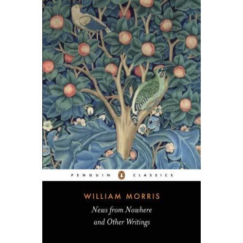
We watched the Superbowl with friends on Sunday, and I have to say that betting on games certainly makes them more exciting! (my husband I wagered a hot chocolate from Starbucks, not exactly high stakes, but enough to keep me interested). I won our little bet (which sort of made me sad--the Patriots have such nice uniforms), but that's life.
This week promises to be quite busy. I am trying to get as much work done on my thesis, but blogging is so much more fun! I'm also trying to make time to read News from Nowhere, William Morris' Utopian novel. So far it's very intersting. It's the first futuristic fantasy I've ever read where the future is neither an apocalyptic nightmare, nor a science fiction inspired workers paradise where machines do everything for us. I guess it's somewhat predictable that Morris envisions a future that looks a lot like the 15th century! All work is creative and pleasurable and people work for the pure joy they take in their labour, rather than for pay. It's a beautiful idea, though I'm not quite sure how it would translate into real life.
The story, set in our time (approximately--they have bridges that were built in 2002 that are supposed to be new) offers a totally different vision of the future than I've ever found in other science fiction, or even in Utopian fantasies. For Morris, the ideal society is pretty much like it was in the Middle Ages, except without a government to spoil everything. People continue to work hard, but they do labour that they enjoy and try to keep the land in as pristine a state as possible (everyone lives in cottages with little gardens. Morris certainly envisioned sustainable architecture as part of his vision of the future--as little land as possible is used and the city of London has basically been allowed to return to the wild, with trees growing where the largest suburban areas of Morris' day were located). Everyone is also well fed and there doesn't seem to be much competition (except over who can produce the most beautiful handicrafts).
Morris wrote News from Nowherein response to Edward Bellamy's Looking Backward: 2000-1887set in roughly the same time period in the future. Bellamy's book took a totally opposite view of the future that is more familiar to today's science fiction readers. In Bellamy's socialist utopian future, technology has led to drastically reduced working hours for and developments like community kitchens for busy housewives help lighten the work load. Everyone retires with full benefits at age 45 (see Wikipedia).
William Morris couldn't stand Edward Bellamy's concept of the future (which is still, I would argue, the prevailing view of where technology is leading us--even though most inventions just leave us with more work to do and less time to do it in). He felt that work was an important part of life and that what mankind really needed to do was to slow down and appreciate living. This reminds me of another great book I took a look at this weekend:In Praise of Slow:How a Worldwide Movement is Challenging the Cult of Speed, by Carl Honoré. The author basically argues that Western society's (and it's not just the West!) obsession with speed has caused us to lose out on a lot of the basic pleasures of life--food, love, leisure, etc. I think he would probably agree with Morris that work is not man's curse, it's the lack of pleasure that we so often take in what we do.
Hmm. Well, that's all for now! I will try to remember to write a bit more about News from Nowhere when I get closer to finishing it!
Saturday, February 2, 2008
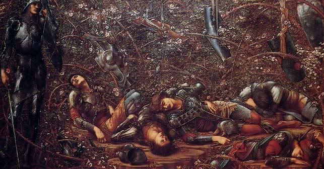
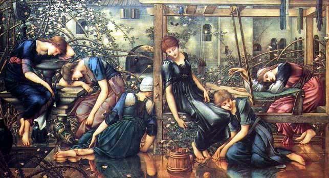
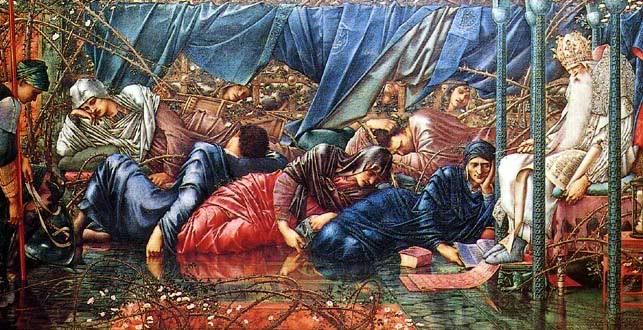
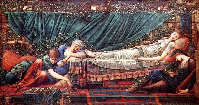
Sir Edward Burne Jones' Briar Rose/Sleeping Beauty Paintings
I also love Sir Edward Burne-Jones' paintings. They always have an element of the fantastic in them. I love art that tell a story and so many of his paintings and woodcuts do! This series, entitled "Briar Rose," is among my favourites. I think it also shows his artistic talent at its best and most mature.
Burne-Jones's had a longstanding intrest in the story of Sleeping Beauty (or Briar Rose). He first did a tile panel of the story in 1864. Later, in 180 he did a small series of oil paintings for William Graham. In 1890 (nearly thirty years after the first series) Burne-Jones created a large set of four oil paintings that told the story of Sleeping Beauty (Briar Rose). The series was purchased by Alexander Henderson, who later became the first Lord Faringdon, and installed in Buscot Park, Oxfordshire (where they still hang today). Burne-Jones's interest in the Sleeping Beauty story of the Briar Rose began as early as a tile panel in 1864. A small series of oil paintings for William Graham followed, and then a larger set of four oils, finally completed in 1890 before being bought by Alexander Henderson, later 1st Lord Faringdon, and installed in Buscot Park, Oxfordshire.
Burne-Jones' friend William Morris composed verses to accompany each of the paintings.
One thing that always bothers me about this series is that you never see Briar Rose wake up! Why do you think that is? You see the prince in the first picture, but the rest of the pictures focus on the sleeping kingdom. Perhaps he just wants to leave the final scene to our imaginations? Hmmm. Nevertheless, they are lovely, lovely paintings (you can click on the pictures to see them full size).
The Briar Wood
The fateful slumber floats and flows
About the tangle of the rose.
But lo the fated hand and heart
To rend the slumberous curse apart.
The Council Chamber
The threat of war, the hope of peace
The Kingdom's peril and increase.
Sleep on, and bide the latter day
When fate shall take her chains away.
The Garden Court
The maiden pleasance of the land
Knoweth no stir of voice or hand,
No cup the sleeping waters fill,
The restless shuttle lieth still.
The Rose Bower
Here lies the hoarded love the key
To all the treasure that shall be.
Come, fated hand, the gift to take
And smite the sleeping world awake.
Friday, February 1, 2008
William Morris Forest Tapestry
I've been waiting on pins and needles (pardon the pun) for my trellis kit to arrive! In the meantime, it never hurts to drool over the other interesting things out there. Today I've been reading about tapestries.
One of William Morris' greatest legacies was his revival of a number of art forms that were on the brink of extinction at the end of the 19th century. Chief among these were his fabulous tapestries. 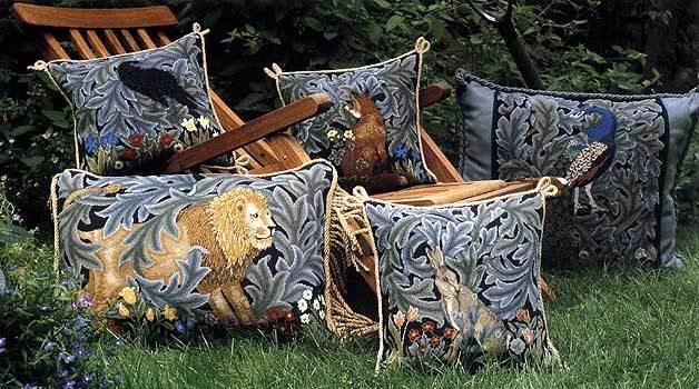 The Forest Tapestry, created in 1887 was designed by Morrs, Philip Webb and John Henry Dearle. It was later woven out of wool and silk on cotten warp in the Merton Abbey workshops by Morris and Co.'s three most senior weavers. It is believed that John Henry Dearle, Morris' most talented assistant and an expert in the art of natural dyes, created the floral details for the tapestry. The animals were drawn by Morris' friend (and designer of Red House), Philip Webb. Morris wrote the inscription that was written across the original: "The Beasts that be in woodland waste, now sit and see nor ride nor haste" (the verse was later published under the title "The Lion" and included in a volume of poetry by Morris entitled Poems by the Way (1891).
The design went on to become one of the most popular in the history of Morris and Company. The original now hangs in the Victoria and Albert Museum.
I've also included a photo of Beth Russell's fabulous needlepoint adaptations. I usually can't stand animals in needlepoint designs, but I think these come across as regal and decidedly un-tatty. I especially love how she's displayed them! If you're interested in making one of these cushions yourself, you can purchase it through her website, or find the design in her book, Traditional Needlepoint
In closing, it's been really fun to read everyone's posts on seven things about themselves! Thanks for joining in!

